Recommendations actions allow you to offer recommendations to your customers in a slideshow or slider across any channel.
Follow these steps to add a recommendations action that uses a single recommendation strategy or a slotted recommendation compound strategy to an experience.
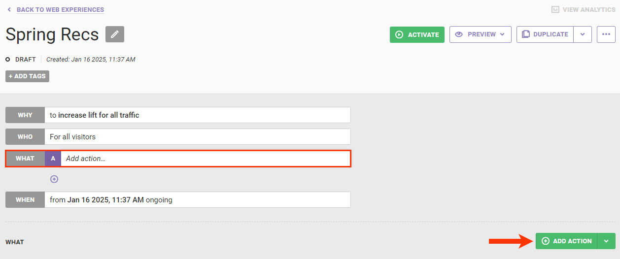
- Create a new Web experience.
- Configure the WHY and WHO settings.
- Click WHAT and then click ADD ACTION.
- Click Product Recommendations on the Action Type panel.
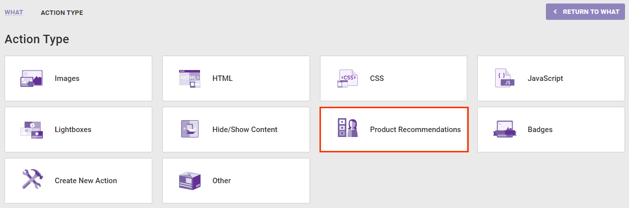
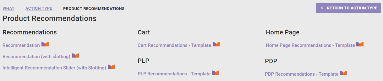
- Click the type of recommendations action that you want to use. If you select an action that includes slotting, refer to Configure a Recommendations Action with Slotting for the appropriate steps for that action type.
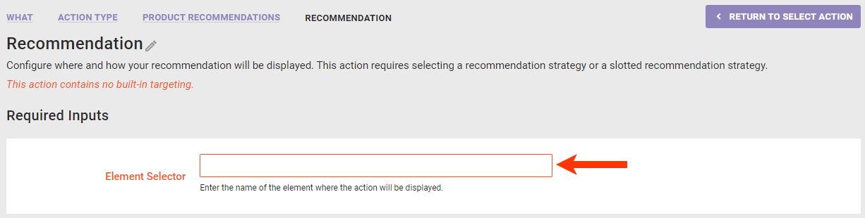
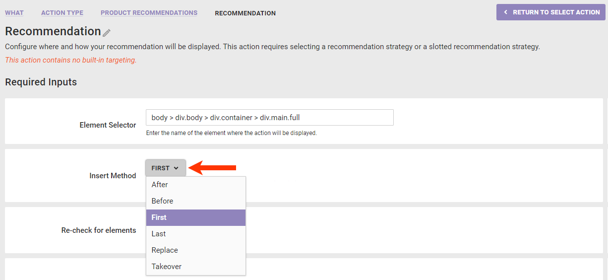
- Determine where on the page of your site you want the recommendations action to appear.
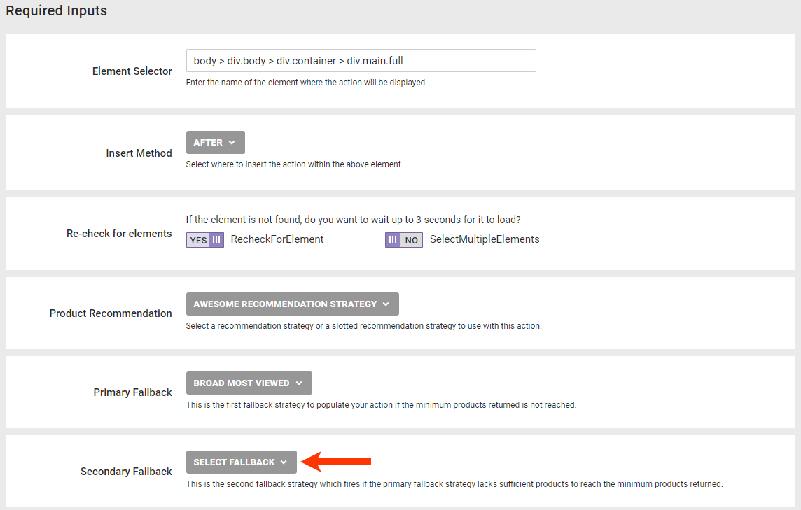
- Input the element selector identifying where on the page the recommendations action should appear. See Working with Element Selectors for more information.
- Select an option from Insert Method to determine where the action should be inserted relative to the element selector you input in the previous step.
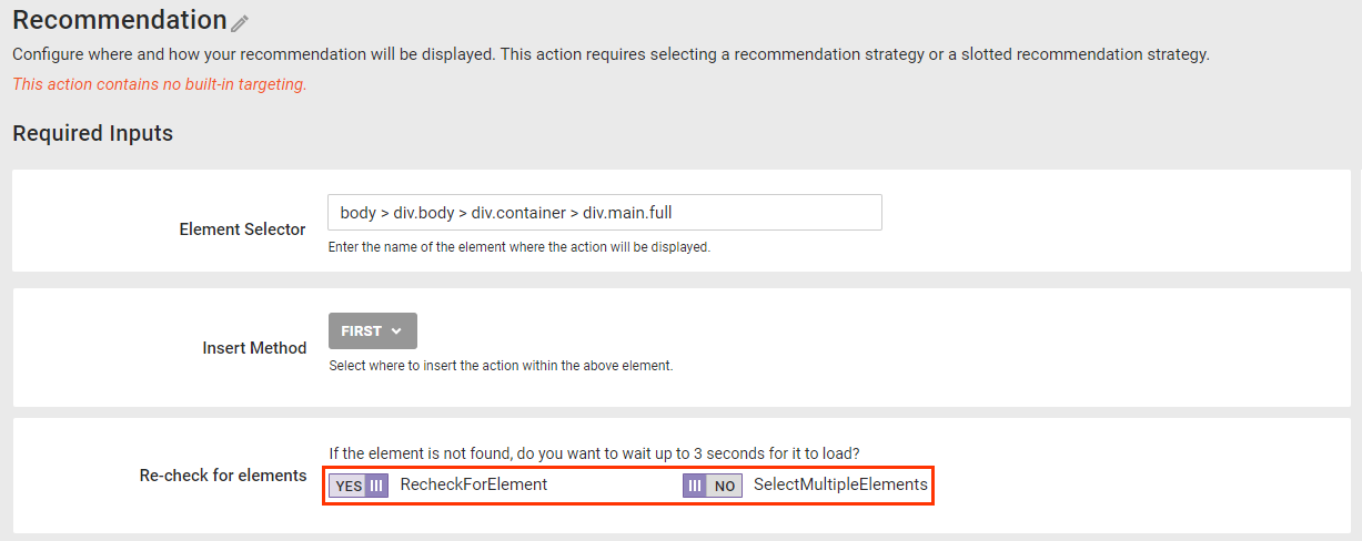
- Toggle RecheckForElement to NO if you do not want Monetate to recheck for the selected node for up to 3 seconds if it doesn't find it immediately. Toggle SelectMultipleElements to YES if you want Monetate to display the recommendations at every occurrence of the selected node on the page if it finds multiple occurrences.
- Input the element selector identifying where on the page the recommendations action should appear. See Working with Element Selectors for more information.
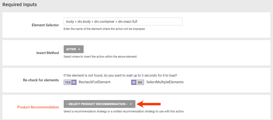
- Configure the Product Recommendations settings.
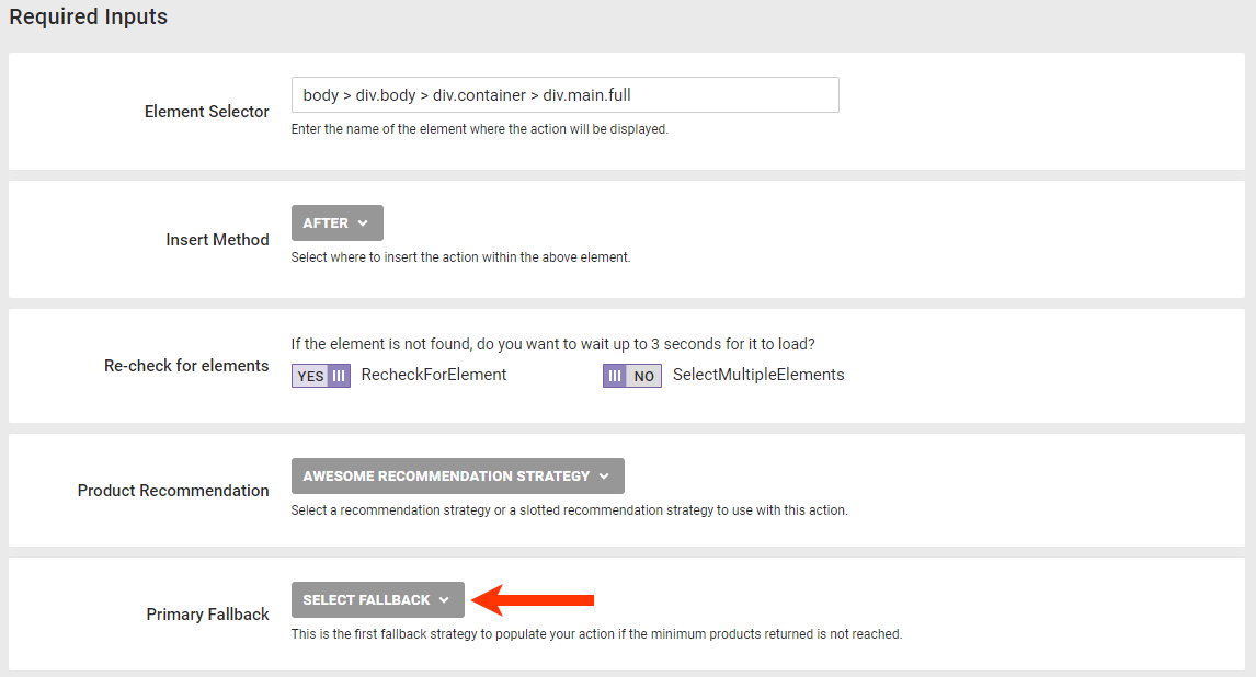
- Select from Product Recommendation the recommendation strategy or slotted recommendation that you want the action to use.
- Select from Primary Fallback the recommendation strategy that you want used first to supplement the strategy or slotted recommendation that you selected in the previous step if it can't identify enough products to meet the minimum or the maximum recommended products.
- Select from Secondary Fallback the recommendation strategy that you want used if your selections in steps 7a and 7b can't identify enough products to meet the minimum or the maximum recommended products.
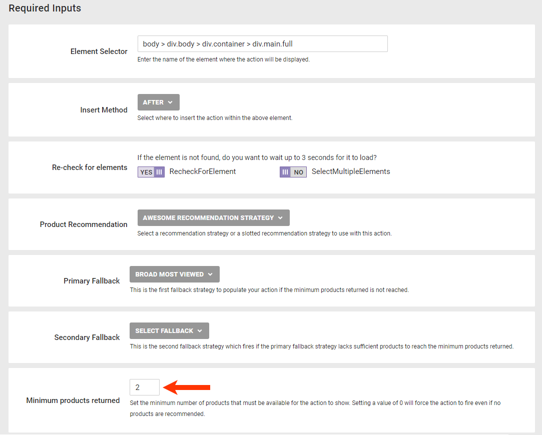
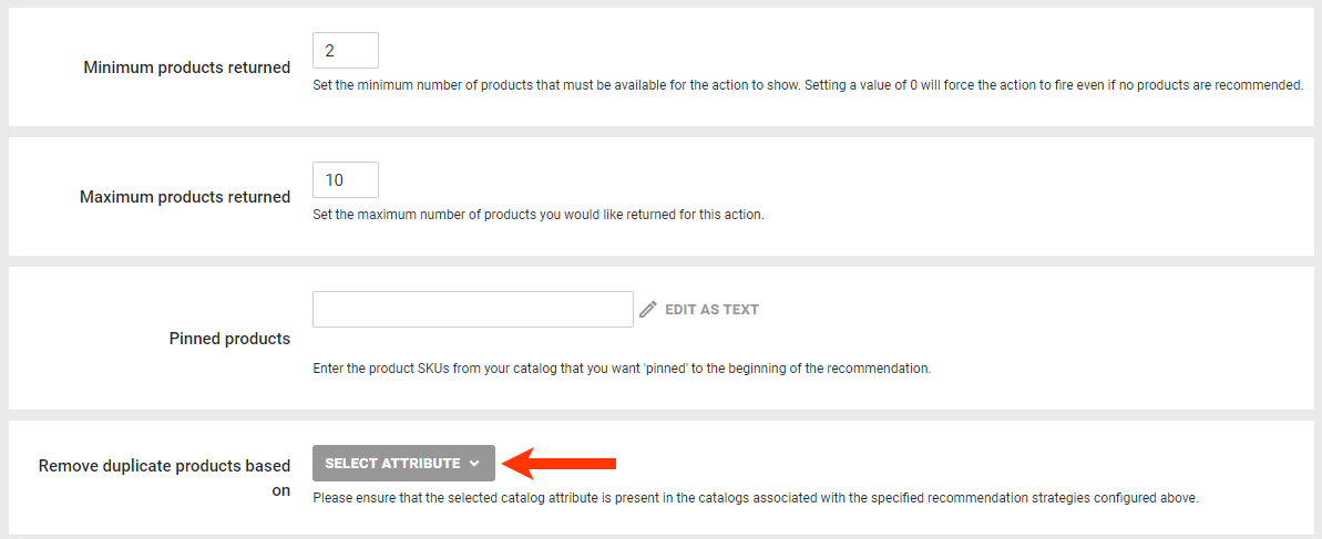
- Enter into Minimum products returned the minimum number of recommended products that the product recommendation source(s) must identify for the action to appear on your site.
-
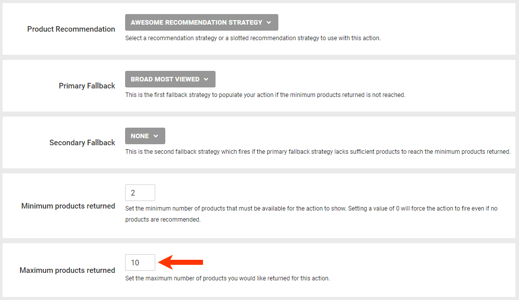
Enter the maximum number of products to include in the recommendations results.
- Select from Product Recommendation the recommendation strategy or slotted recommendation that you want the action to use.
- Configure the recommendation slider's content.
-
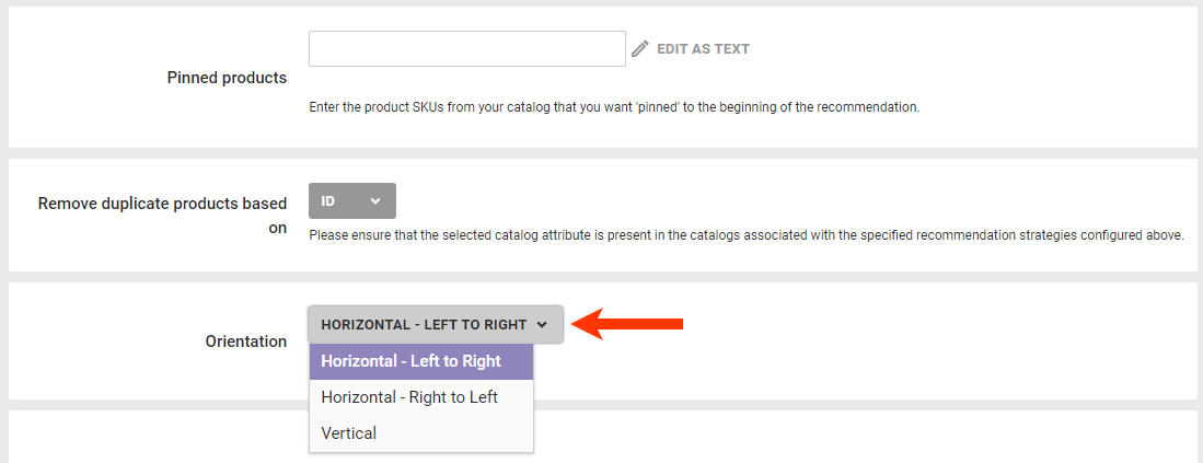
Optionally, enter into Pinned products the value of the
idattribute for each product that you want to always appear at the beginning of the recommendations results.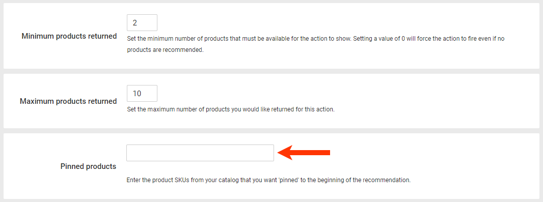
- Optionally, select a product catalog attribute on which duplicate recommended products are removed from the results.
- Select the movement of product images in the recommendations slider.
-
Optionally, enter into Pinned products the value of the
- Optionally, modify the HTML template in Slider Container Template to build the slider structure.
- To add slide navigation buttons, use the attributes
data-prev-buttonanddata-next-button. If you include optional arrow images, you must include elements with the attributedata-prev-buttonanddata-next-buttonfor them to appear. - To add location-related dynamic text, select an option from SELECT DYNAMIC TEXT, and then paste the code snippet into the code editor.
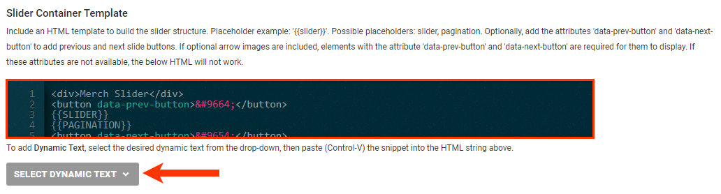
- To add slide navigation buttons, use the attributes
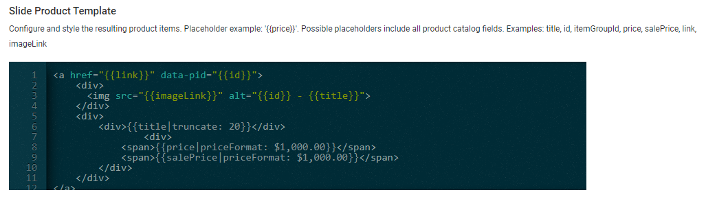
- Optionally, modify the HTML template in Slide Product Template to build the product slides. See Modifying the Slide Product Template for more information.
- Optionally, revise the CSS that is appended to the DOM in a
<style>or<link>element, or click CHOOSE SAVED CSS or UPLOAD CSS to insert code into the editor.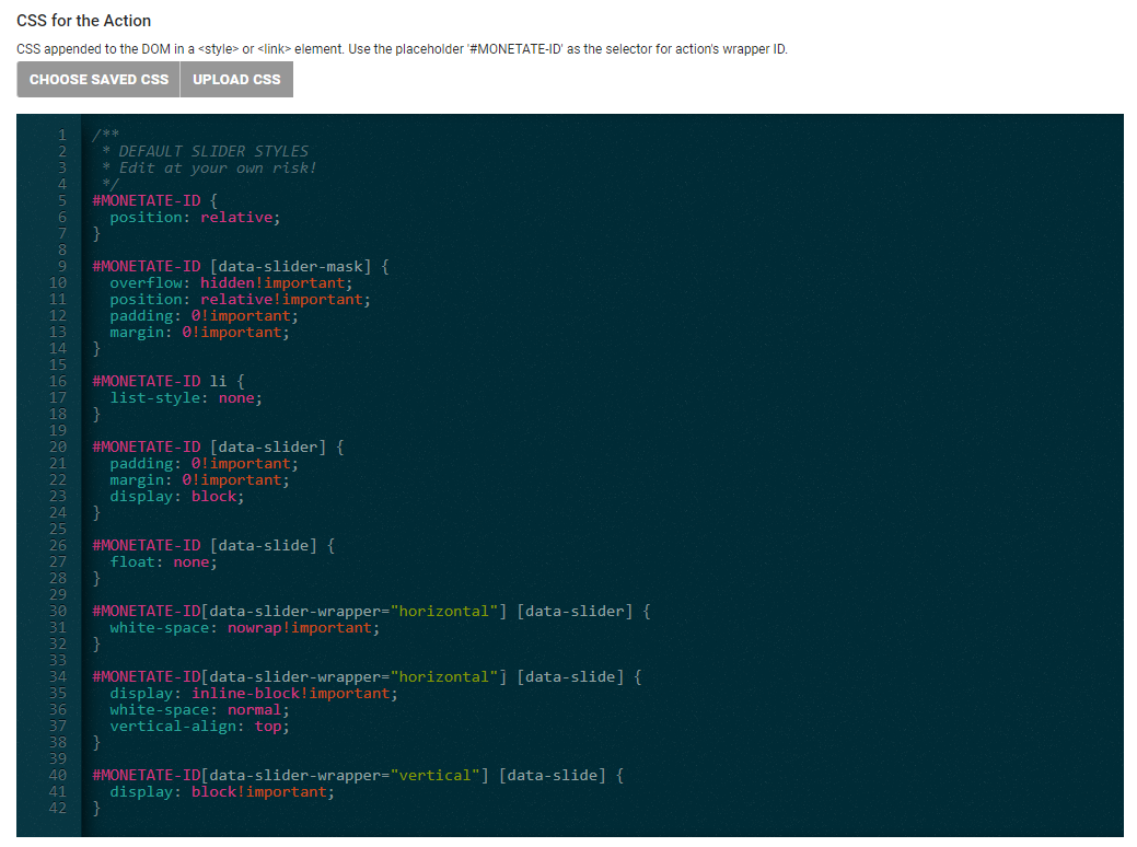
- Configure the visibility options for the recommendations in the Visible Slides code editor. See Modifying the Visible Slides Template in this documentation for more information.
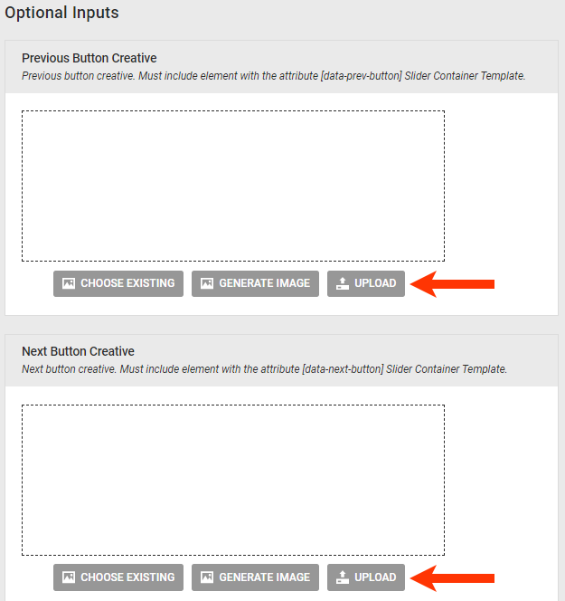
- Optionally, add image files to be used for the slider navigation buttons by clicking CHOOSE EXISTING, GENERATE IMAGE, or UPLOAD for the Previous Button Creative field and the Next Button Creative field, respectively.
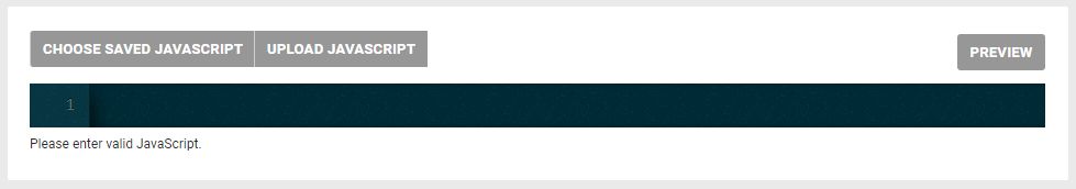
- Optionally, configure the action with JavaScript.
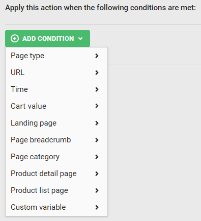
- Click ADD CONDITION, select an attribute category, and then select and configure an option to set any conditions that must be met for the action to fire. See Action Conditions for more information.
- Click CREATE.
- Configure or modify the WHEN settings for the experience.
Ensure that you preview the experience before you activate it to ensure it works as you expect.
Modifying the Slide Product Template
You can modify the slide product template using placeholders that contain valid values, such as {{price}}. In addition to price, possible placeholder values include all product catalog attributes, including title, id, itemGroupId, salePrice, link, and imageLink.
You can also modify the slide template with these code snippets:
truncate— Sets the maximum number of characters of the returned data that appear before the rest is truncated (for example,{{title|truncate: 20}})priceFormat— Formats a price based on a template of 1,000; supports currency symbols before or after the price, comma separators, and infinite decimal places to accommodate such prices points as EUR 1.000,00 (for example,{{price|priceFormat: $1,000.00}})appendParam— Adds parameters to a URL; added with a question mark (?) if the URL has no existing parameters or added with an ampersand (&) after the URL's existing parameters (for example,{{link|appendParam: source=monetate}}and{{link|appendParam: source=monetate&experience=intelligentRecommendations}})
Modifying the Visible Slides Template
You can use a variety of JSON code snippets to modify the Visible Slides template, which determines various factors for the movement of slides within the slider.
Use the autoRotateDuration snippet to determine how long the slider pauses in milliseconds before automatically advancing to the next slide display. The default value is 0, which disables autorotation.
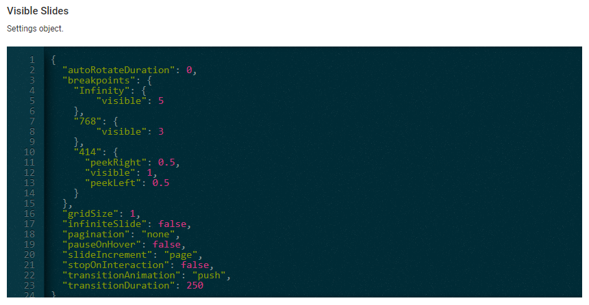
The breakpoints snippet determines the breakpoints and how many slides are visible or partially visible. Consider this example:
{
  "breakpoints": {
    "Infinity": {
      "visible": 5
  },
  "768": {
    "visible": 3
  },
  "414": {
    "peekLeft": 0.5,
    "visible": 1,
    "peekRight": 0.5
  }
}
This code results in the following behavior:
- When displayed on a screen up to 414 pixels wide, one full slide appears with half a slide to the left and to the right of it "peeking"
- When displayed on a screen sizes 414–768 pixels, three full slides appear
- When displayed on a screen 768 pixels wide or greater (established by
Infinity), five full slides appear
Use gridSize to enable a grid layout. The default value is 1. For example, a value of 3 sets three rows for a horizontal slider or three columns for a vertical slider.
The infiniteSlide snippet determines if the slider scrolls infinitely or stops at the end. The default value is false.
The pagination snippet determines if page navigation buttons appear. The value options are as follows:
none— No pagination appears; default settingdots— Displays a single dot for each slidedots-page— Displays a dot for each page of slides (for example, three dots appear in a slider with 18 total slides that appear six slides to a page)thumbnails— Creates a thumbnail version of each slide
Use pauseOnHover to determine if the slider pauses autorotation on slide hover if autoRotateDuration is set. The default value is false.
The slideIncrement snippet determines if the slider transitions by page or by single slide. The value options are as follows:
page— Slider transitions by page of slides; default settingsingle— Slider transitions one single slide at a time
Use stopOnInteraction to determine if the slider stops autorotating when the customer interacts with it if autoRotateDuration is set. The default value is false.
Use transitionAnimation to set the animation style for transitioning between slides. The value options are as follows:
push— A slide moves in from the side for a horizontal slider and from the bottom for a vertical slider; default settingfade— The current slide fades out and the new one fades innone— No animation is used
Use transitionDuration to determine how long the slide transition animation lasts in milliseconds. The default value is 250.