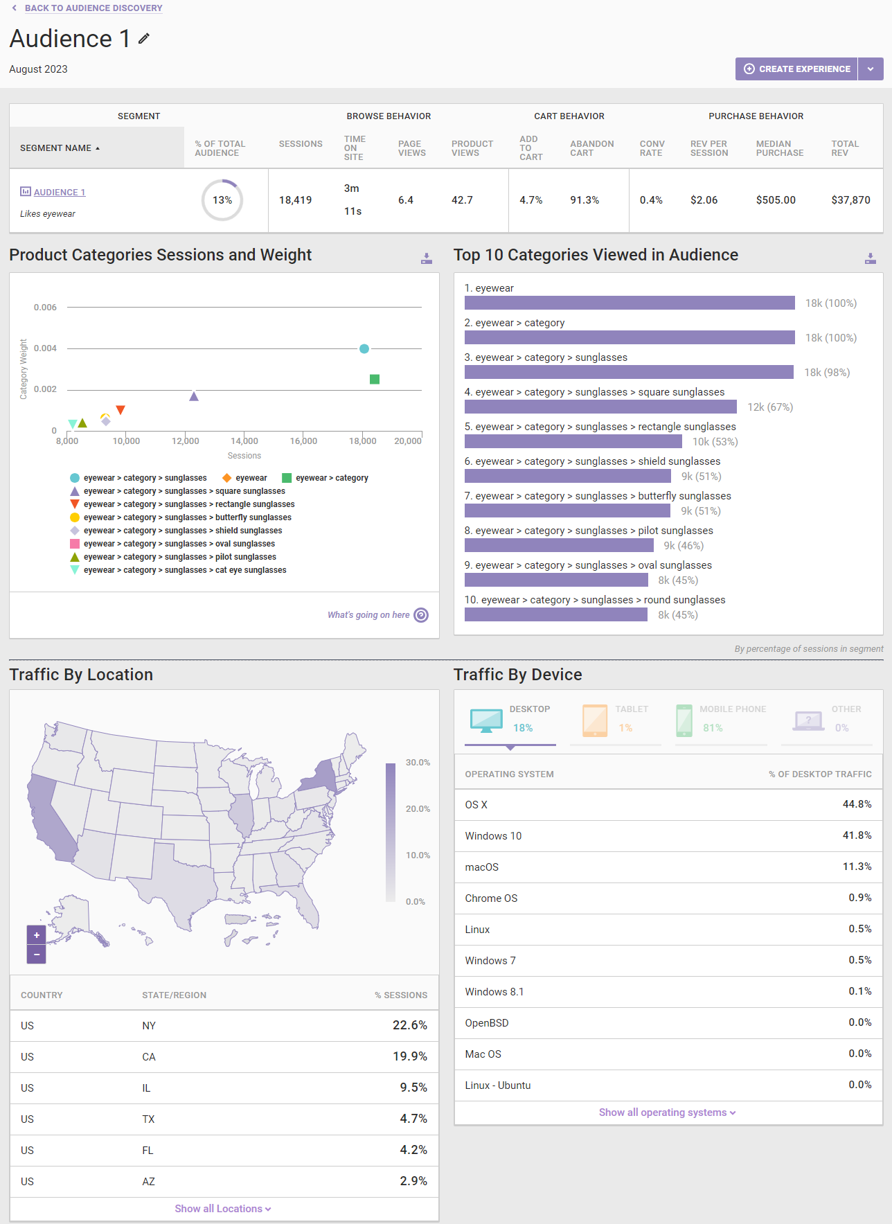
Click the name of an audience either in the Discovered Audience Overview pane or in the Audience Metrics pane to open its details page. On it you find various charts with greater detail about the product categories in which those customers are interested along with traffic demographics.
You can edit the audience's name by clicking on the pencil icon.

Product Categories Details
In addition to the metrics for the audience that appear on the main Audience Discovery page, the audience details page includes two graphs to help you better understand what types of products the audience was interested in.
Product Categories Sessions and Weight
Audience Discovery groups customers together based on the product categories they view while browsing your site. Viewing a product within a category makes a customer more likely to be grouped into an audience.
The categories displayed in the Product Categories Sessions and Weight graph are those that add the most weight to this audience. In short, the higher the category weight, the more likely a customer is to be in this audience.
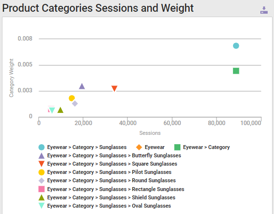
The x-axis of the graph shows the number of sessions that are viewed within a given category. The y-axis shows category weight.
The machine-learning algorithm that sorts customers into audiences can also sort a new customer by looking at the product categories that the customer viewed. It then adds some weight for each of those categories, the y-value, to each audience. Customers are classified into whichever audience has the highest weight.
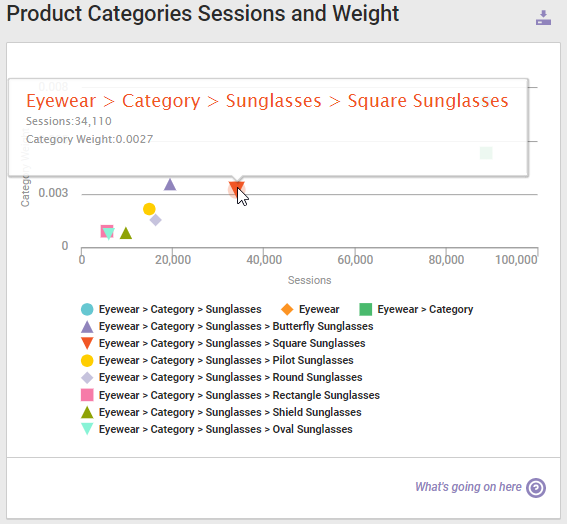
Place your mouse pointer on any symbol on the graph to view a popup that shows that category's total sessions and category weight.
You can download the graph by clicking the download icon in the top-right corner above the graph and then selecting a file type.
Top 10 Categories Viewed in Audience
The Top 10 Categories Viewed in Audience graph displays the categories that were most viewed by customers in the audience.
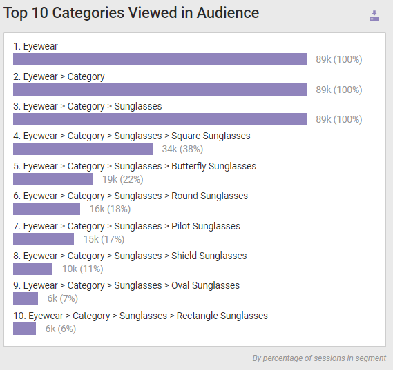
You can download the graph by clicking its download icon and then selecting a file type: PNG image, JPG image, or PDF.
When viewing these two charts, keep in mind that typically the weights match up with sessions—the most viewed categories are also those with the highest weights. This means that you can get the insights you need into the audience by studying the Top 10 Categories Viewed graph.
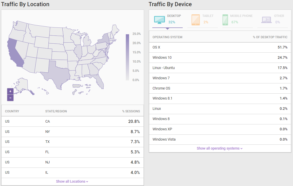
Traffic Details
At the bottom of the Audience Details page you find traffic details of the audience. Traffic By Location shows the percentage of the audience by territory or state, and Traffic By Device shows audience percentages by both device type and operating system.
You can return to the main Audience Discovery page by clicking BACK TO AUDIENCE DISCOVERY at the top of the page.