Fixed-position, or "sticky," content, especially in navigational elements, is common on many sites. They allow easy access to a site's core functionalities regardless of where a visitor may be on a page's content. Although some people believe that a fixed navigation bar is unnecessary or distracting, especially on a mobile layout where screen real estate is sparse, fixed navigation bars have become increasingly commonplace on the Web.
Fixed Navigation Bar
A fixed-position navigation bar remains positioned at the top of the viewport as the visitor scrolls, allowing them to have constant access to vital information. Most often, navigational elements are fixed. See CSS Positioning to learn more about fixed positioning.
Interactive Sticky Elements
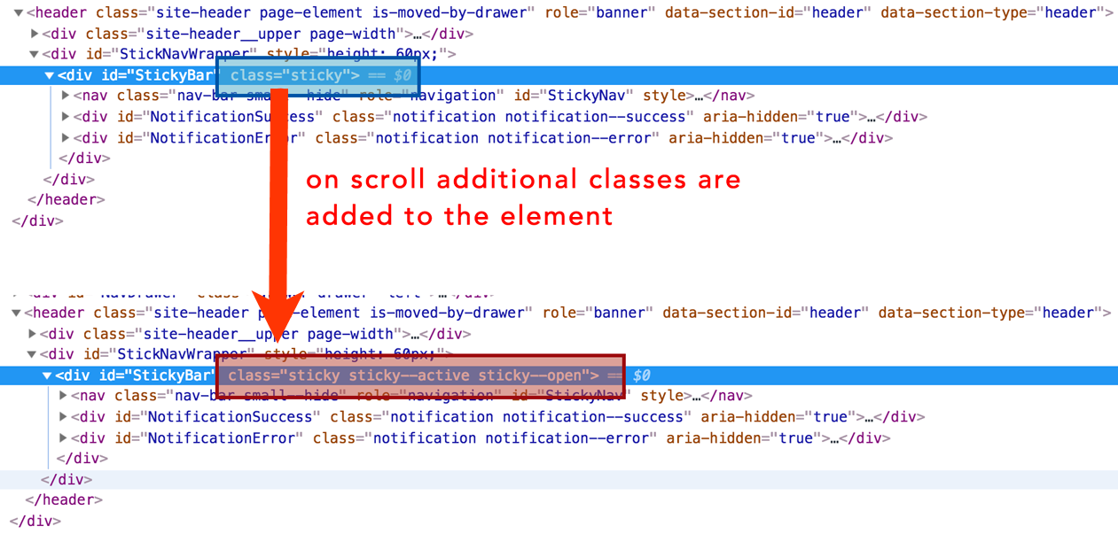
Some fixed navigation bars combine CSS and JavaScript to create interactive layouts in which sticky elements on the page become fixed to the viewport after the visitor scrolls past a certain point on the page. This design allows content to be inserted above the navigation bar, such as a header section or banner image that doesn't impact the customer experience once they scroll past it. Visit How TO - Sticky/Affix Navbar from W3Schools to view a good example.
In modern CSS3 you can achieve this same effect with a single CSS position property: position: sticky;. You can read more about this property on CSS-Tricks.
Building a Sticky Banner in Action Builder
You can use the Image option or the HTML – Optional JS option on the Insert Content tab in Action Builder to create an action that scrolls with the page by using CSS to position the banner as a fixed element on the page with position: fixed;. Building such an action is relatively straightforward but may involve certain nuances depending on the existing structure of your site.
Adding a Buffer to the Body
If you're inserting a fixed-position banner, it's fixed to the viewport. This element is now out of the typical flow within the DOM and isn't subject to the behavior of other elements. It stays attached to the viewport regardless of where the visitor is on the page. This means it's likely to cover up some content.
The solution is relatively simple for a banner that's a standard height. Hypothetically, if the sticky banner is 100 pixels tall and 100% the width of the screen, it could overlap the top 100 pixels of content on your site and thus cover up something important or render an element inaccessible to a visitor.
To ensure the visitor can scroll to the very top of the page and still access all the content without any of it covered by the fixed element, you must add some padding to the top of the <body> element with the following CSS:
body {
  padding-top: 100px;
}
With banners of different heights, you must change out the height of the offset padding to accommodate the vertical room taken up by the sticky banner.
Layering and the z-index Property
Because fixed content doesn't obey the standard rules of normal content in the DOM, it can layer over or under other content. This layering is controlled by the CSS property z-index. See The Z-Index CSS Property: A Comprehensive Look from Smashing Magazine for more information.
The z-index property determines the stack level of an HTML element within the DOM. The stack level is the element's position on the Z axis. A higher value corresponds to the top of the stacking order, and an element with a lower value is lower in the stacking order and potentially beneath other elements if its position is fixed.
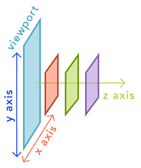
To prevent layering issues, sticky elements are typically positioned high in the stack level with a z-index value above other elements so that nothing is layered above it so that the visitor can view and interact with that element at any time.
Inserting Content into an Existing Sticky Element
Once you locate an existing sticky element, you need to delve into the CSS properties to see exactly which element is using fixed positioning so that you can choose where to appropriately insert the new content. Next, you must determine which elements on the page are used to create the offset spacing to prevent overlapping content issues.
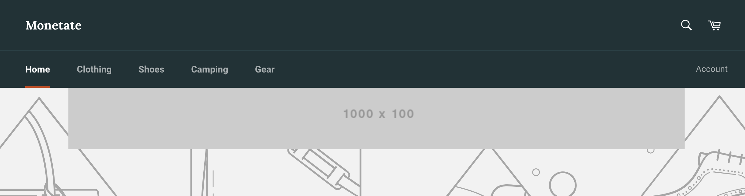
Identifying #StickyBar is fairly straightforward in this example. As a visitor scrolls down the page, the main navigation bar becomes fixed.
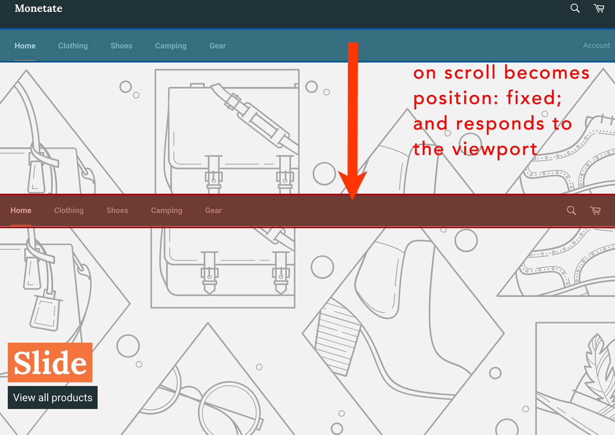
You can see this happening in the DOM. As the visitor scrolls past a certain threshold, the class sticky gets additional classes of sticky--active and sticky--open.
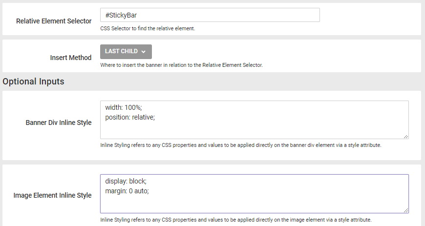
After you identify the selector, you can insert the content using Action Builder and then identify what CSS needs to be tweaked to provide the appropriate offset padding to prevent overlap issues. Configure the action with the element selector and some basic CSS properties to center it as demonstrated in this screenshot.
This configuration is only a starting point. Some overlapping issues exist with the main hero image on the home page and likely with other content on other pages.
To resolve this issue, you must identify the element on the page that has the offset for the existing sticky navigation element. Inspect the DOM for a padding-top or margin-top equivalent to the height of the navigation bar.
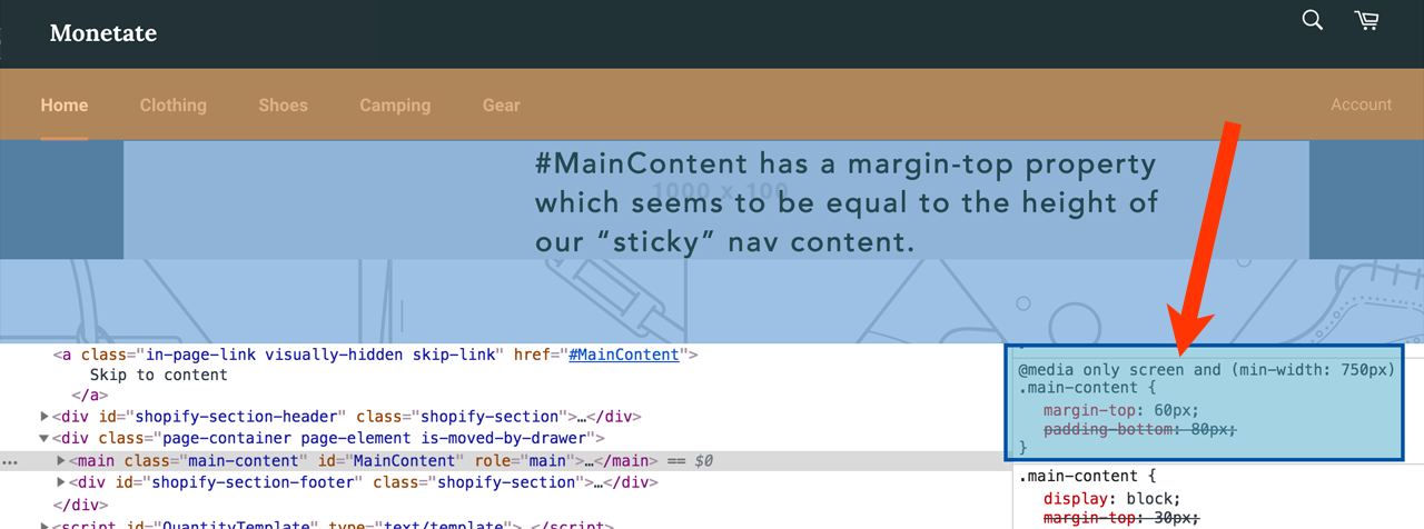
Next, you must override the offset with a value that's equal the height of the existing navigation (in the example code, 60 pixels) plus the height of the inserted banner (in the example code, 100 pixels).
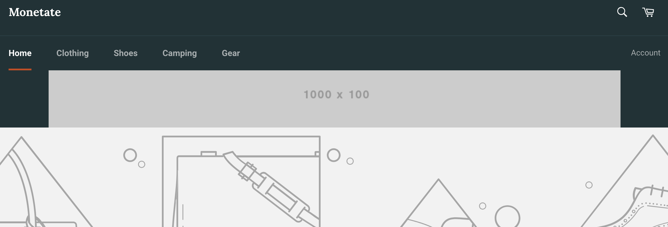
This change yields a fully functioning banner below the navigation.
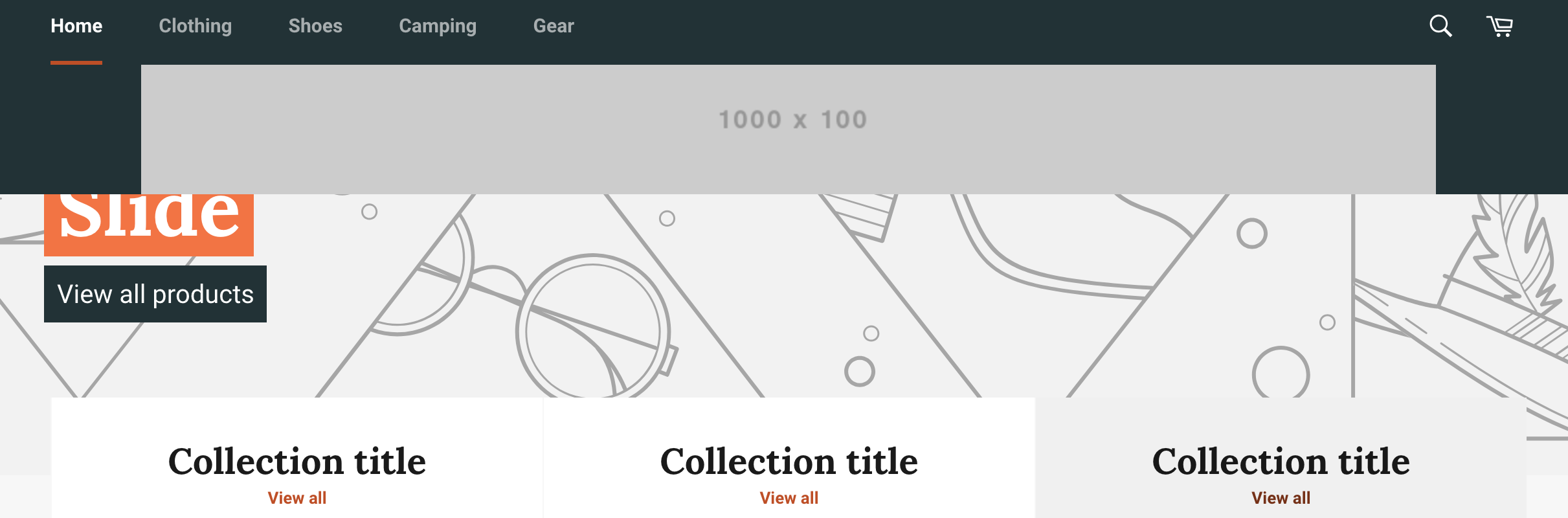
It scrolls with the page as the visitor interacts with it so that the banner content is visible throughout the visitor's experience.