Content Builder Overview

Use Content Builder to build layered content to use in experiences across multiple channels. Create layered content that can include dynamic text that you can use in banners, badges, or other formats to fit the needs of experiences that you build. Once you create content for use in a Web experience, you can leverage Content Builder to easily modify your content for a mobile-friendly experience as well.

View of Content Builder

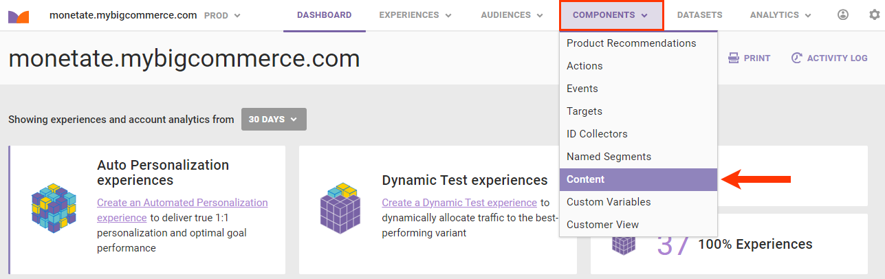
All files created or modified in Content Builder are saved to Content Manager, which you access by selecting CONTENT from COMPONENTS in the top navigation bar.

Callout of the Content option in the COMPONENTS menu of the top navigation bar

For more information about Content Manager, see Content Manager Overview.

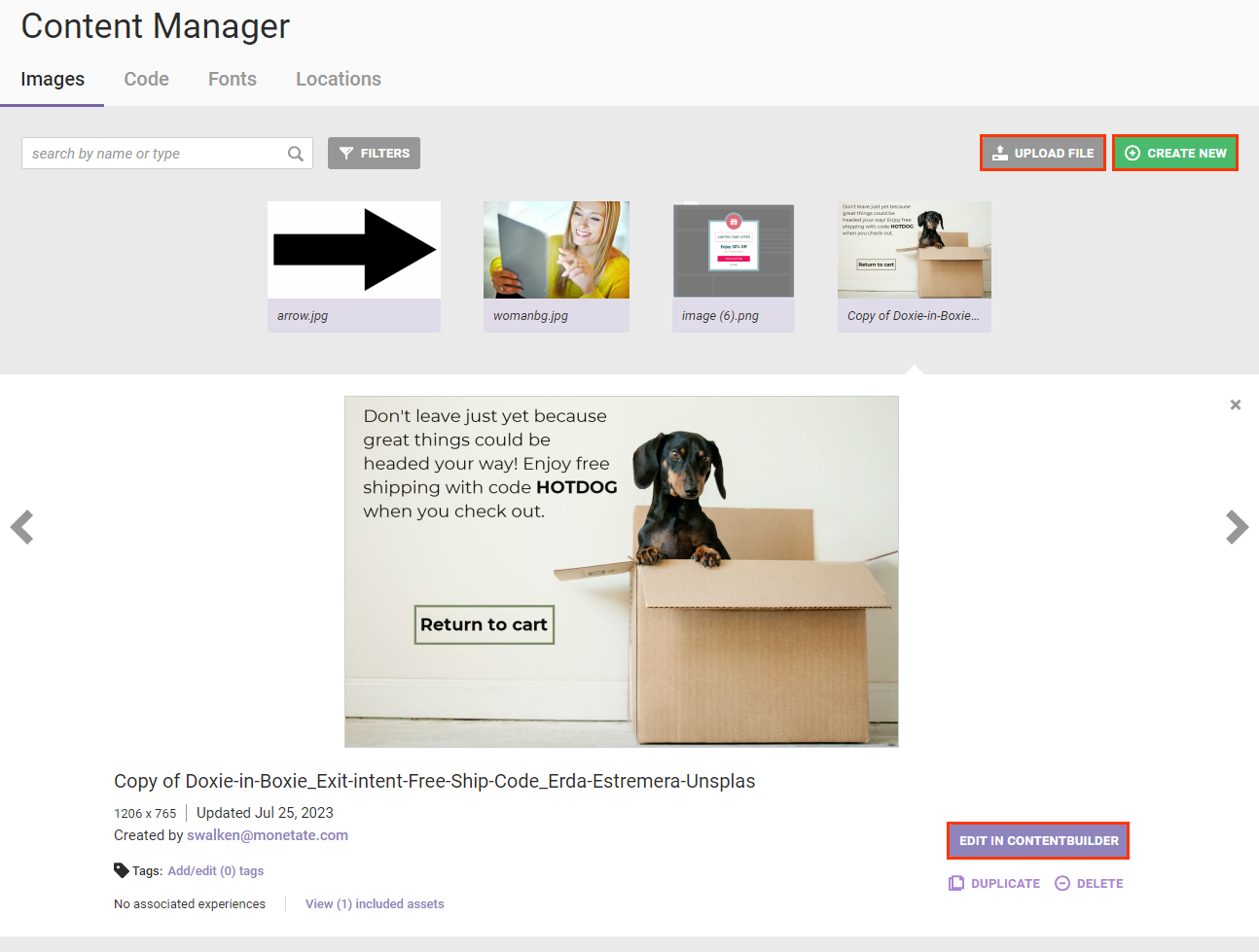
To launch Content Builder, first open Content Manager and then take one of the following actions:

  • Click UPLOAD FILE to upload an image file.
  • Click CREATE NEW to create a new image.
  • Click an image in Content Manager, and then click EDIT IN CONTENT BUILDER.
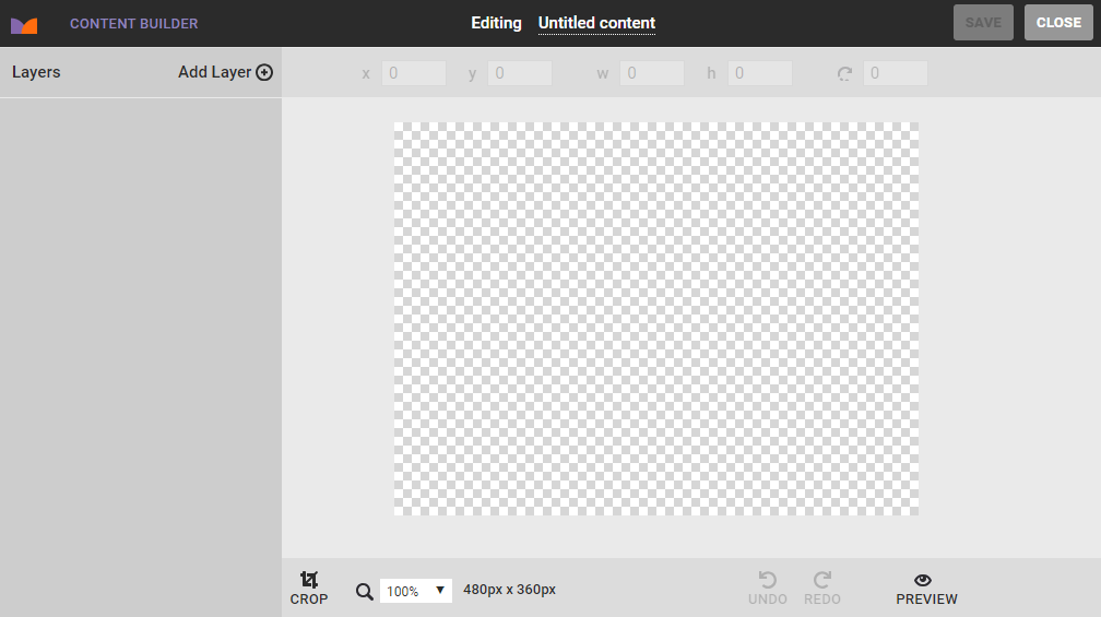
Callout of the UPLOAD FILE button, the CREATE NEW button, and the 'EDIT IN CONTENT BUILDER' button in Content Manager

Workspace

The Content Builder workspace includes a number of tools for creating and editing image files.

View of Content Builder with various tools numbered to correspond with the numbered list that follows this image

Some of the workspace tools include the following:

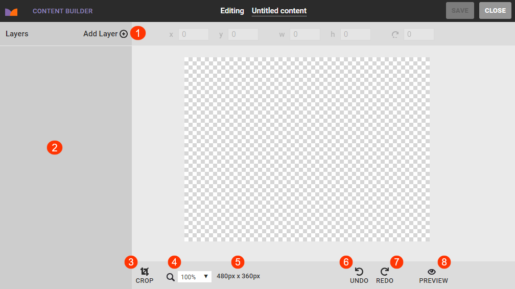
  1. Add Layer: Select from this menu a type of layer to add to the canvas.
  2. Properties panel: Use the settings that appear in this panel that are specific to the layer you're working on to cutomize it.
  3. Canvas size: Click to change the width and height of the canvas in pixels.
  4. UNDO: Click to undo changes one step back at a time.
  5. REDO: Click to restore changes one step forward at a time.
  6. Zoom: Select an option to enlarge or decrease the canvas view.
  7. CROP: Click to adjust the canvas size on the vertical, horizontal, or diagonal axis.
  8. PREVIEW: Click to preview the image as it will appear with all changes saved.

Working with Layers

Use the options in the Add Layer menu to add images, text, rectangles, click zones, and maps to the canvas.

Clients that have the Open-Time Email feature can also add a map layer and a Web Snap layer when working in Content Builder. See Adding a Map in Use Location-Based Dynamic Text and Click Zones as well as Create Web Snap Content for more information. Contact your dedicated Customer Success Manager (CSM) if you want to add the Open-Time Email feature to your account.

Image Layer

This layer option allows you to add images to the canvas. You can upload an image using your computer's file explorer; by dragging and dropping an image file into Content Builder; or by selecting an image from Content Manager.

Callout of the 'Add New Image' options in the properties panel of Content Builder

After you add the image, you can resize it, adjust its opacity, as well as add a border and shadow.

Callout of the Style options that appear in the properties panel when the user is working with an image layer

Text Layer

Use the Text option in Add Layer to add text with high-resolution, anti-aliased fonts.

The properties panel for a text layer contains options that allow you to change the background color and opacity as well as to add and adjust a border and shadow to the text field.

Callout of the Style options that appear in the properties panel when the user is working with a text layer

Click within the text field to activate the text insertion cursor and to access the text editor palette, which includes standard options for adjusting how the text appears. The font options available include any fonts uploaded to Content Manager.

The text editor palette does not include methods to apply boldface or italics to text. If you want text to appear boldfaced or italicized, then you must select a font option with that style already applied (for example, Helvetica Bold or Verdana Italic).

Callout of the text editor palette above a text field

For more information about adding dynamic content to the layer, see Add Dynamic Text to Creatives.

Rectangle Layer

The Rectangle option gives you the opportunity to add a quadrilateral to the canvas that you can style a variety of ways.

Callout of the Style options that appear in the properties panel when the user is working with a rectangle layer

You can resize the shape by using your mouse cursor to drag a corner or side. For more precise measurements, enter the width and height dimensions in pixels into w and h above the canvas.

Callout of the w and h fields

To make the rectangle layer a button or other linked element, click the additional options menu (...) and then select Add link.

Callout of the addional options menu for a rectangle layer, with a callout of the 'Add link' option

You can then complete the fields that appear in the properties panel to configure the URL linkage. These same fields appear when you create a click zone layer.

Click Zone Layer

Select Clickzone to add a hyperlinked region to a specific area of the canvas. A click zone layer works even if it doesn't have the top priority over other layers.

Callout of the click zone layer on the canvas, and callout of the Link options that appear in the properties panel when the user is working with a click zone layer

Complete the fields in the properties panel to configure the URL and related interaction properties, such as the URL loading in a new browser window, the same browser window, or in a pop-up window.

The click zone linkage can be static or dynamically tied to the customer's location and relying on URLs uploaded to the Locations Manager within Content Manager.

Callout of the DYNAMIC button and the dynamic location-based URL options in the Link settings of the properties panel when the user is working with a click zone layer

See Adding a Dynamic Click Zone in Use Location-Based Dynamic Text and Click Zones for more information.