When you're creating an experience, you define its goals in the WHY settings. In defining the goals, you define the following:
- The key performance indicator (KPI) that you want to focus on in the experience
- The level required (90%, 95%, 99%) to reach confidence
Monetate can notify you when each KPI reaches confidence within an experience. If you've chosen to automatically push winning tests to 100% of site traffic, the platform does so when the following are achieved:
- The experience reaches the selected confidence level for one or more of the selected goals and metrics
- The experience goal reaches confidence with positive or neutral results
- The experience has no negative lift for any metric with statistical confidence
To enable this setting for an experience, click the additional options menu (...) in Experience Editor, and then click Configure Auto-promotion.
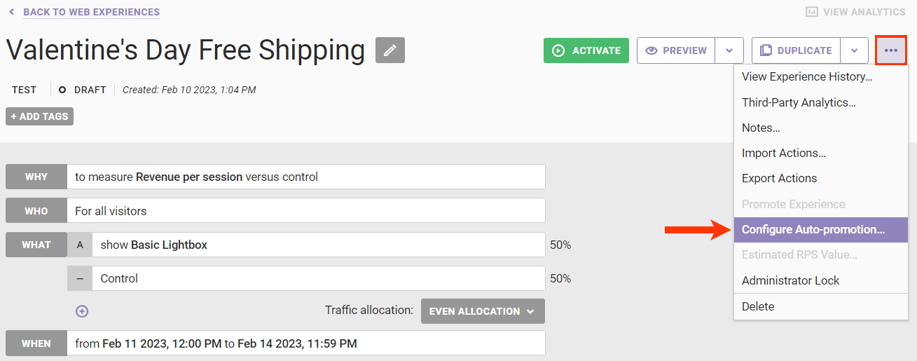
See Enable Auto-Promotion for Experiences for more information.
Accessing an Experience's Metrics Results
Follow these steps to access metrics results for an experience.
- Click ANALYTICS in the top navigation bar, and then select Experience Results.

- Search for the experience's entry on the Experience Analytics list page.
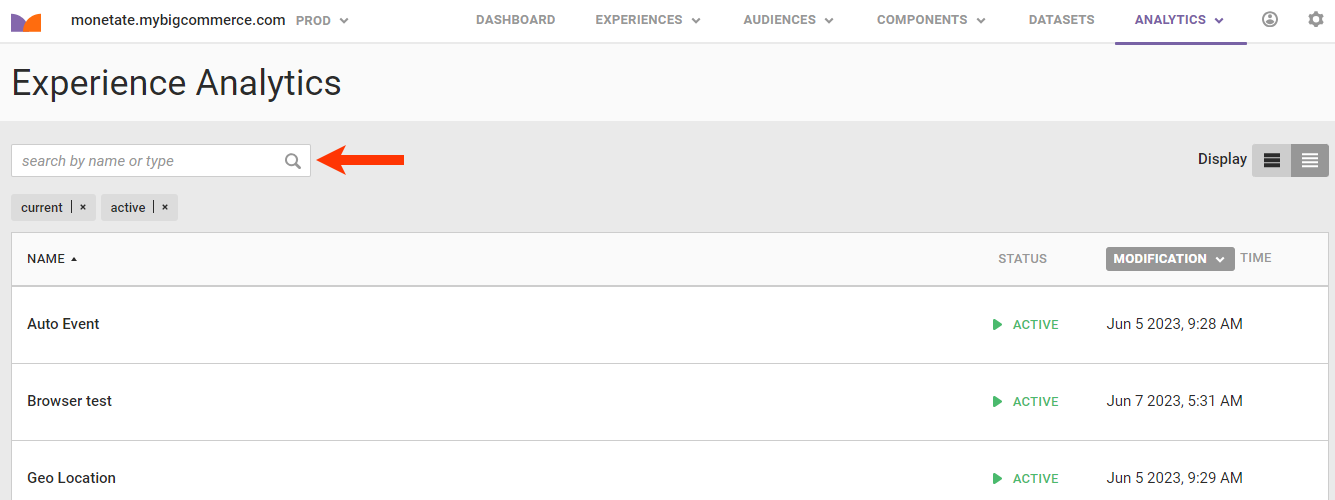
- Click the experience's name.
The Experience Results page opens on the Metrics tab unless the experience hasn't been active for at least 24 hours. In that situation, the Real-Time Counts tab opens. See Real-Time Counts to review what data appears on that tab.
The Metrics Tab
The Metrics tab of the Experience Results page displays information about the performance of each metric included in the experience.
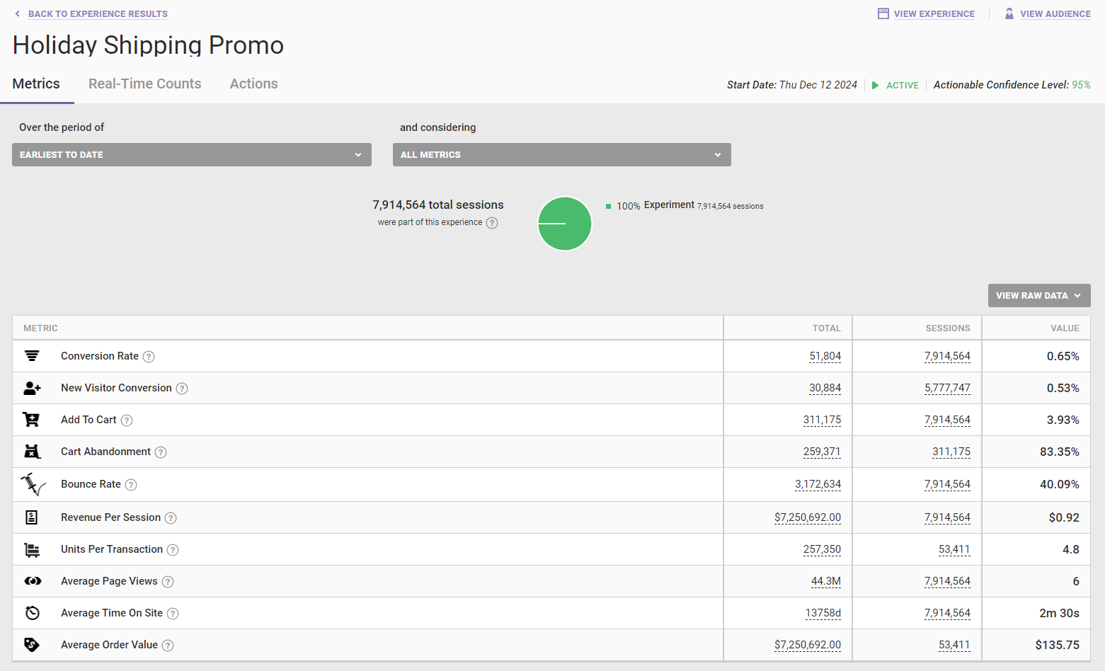
Monetate reports statistical confidence for each KPI within an experience rather than at the experience level itself. Experience level confidence offers little insight to marketers for some metrics, such as New Visitors, because the sample size for an experience may be larger than that of the KPI. By default, the experience results displays the cumulative results of the experience.
To view a line graph with a breakdown of the experiment and control for any metric in the experience, select an option from and considering. Select an option from Over the period of to change the date range for the results graphed.
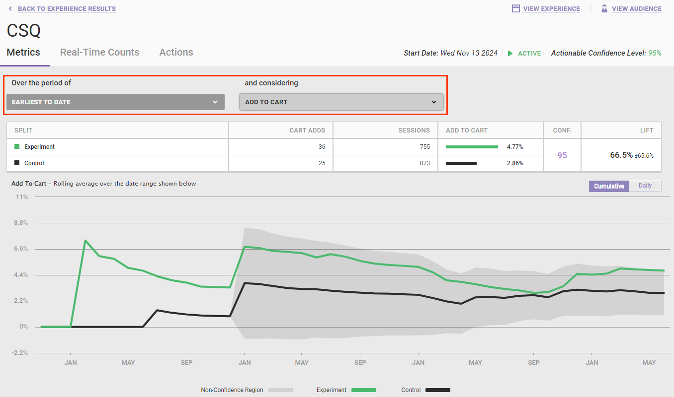
The graph is broken into three distinct parts: the dark shaded non-confidence region, a green experiment line, and a black control line. The non-confidence region is widest where there are the fewest samples and the highest level of variance in the data. If the experiment line is completely contained inside the gray non-confidence region, the metric has not yet reached a confidence of 95%. When the experiment line breaks out of the non-confidence region, either positively or negatively, the metric has reached at least 95% confidence.
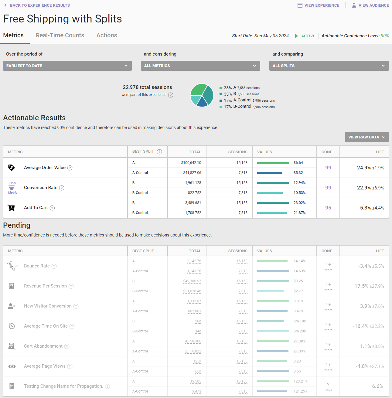
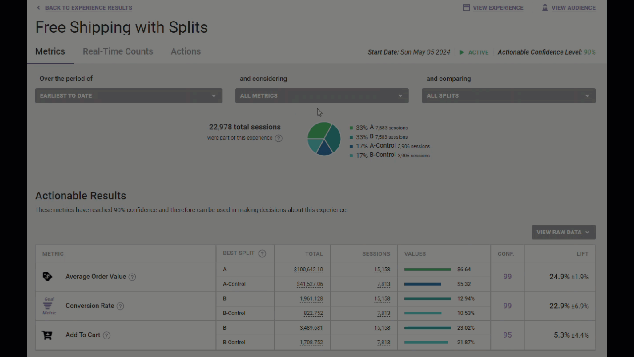
Actionable Results and Pending Tables
If not all the metrics have achieved 95% statistical confidence, then the Metrics tab is divided into the Actionable Results table and the Pending table. The Actionable Results table contains those metrics that have reached confidence, and the Pending table contains those metrics that haven't yet reached confidence.
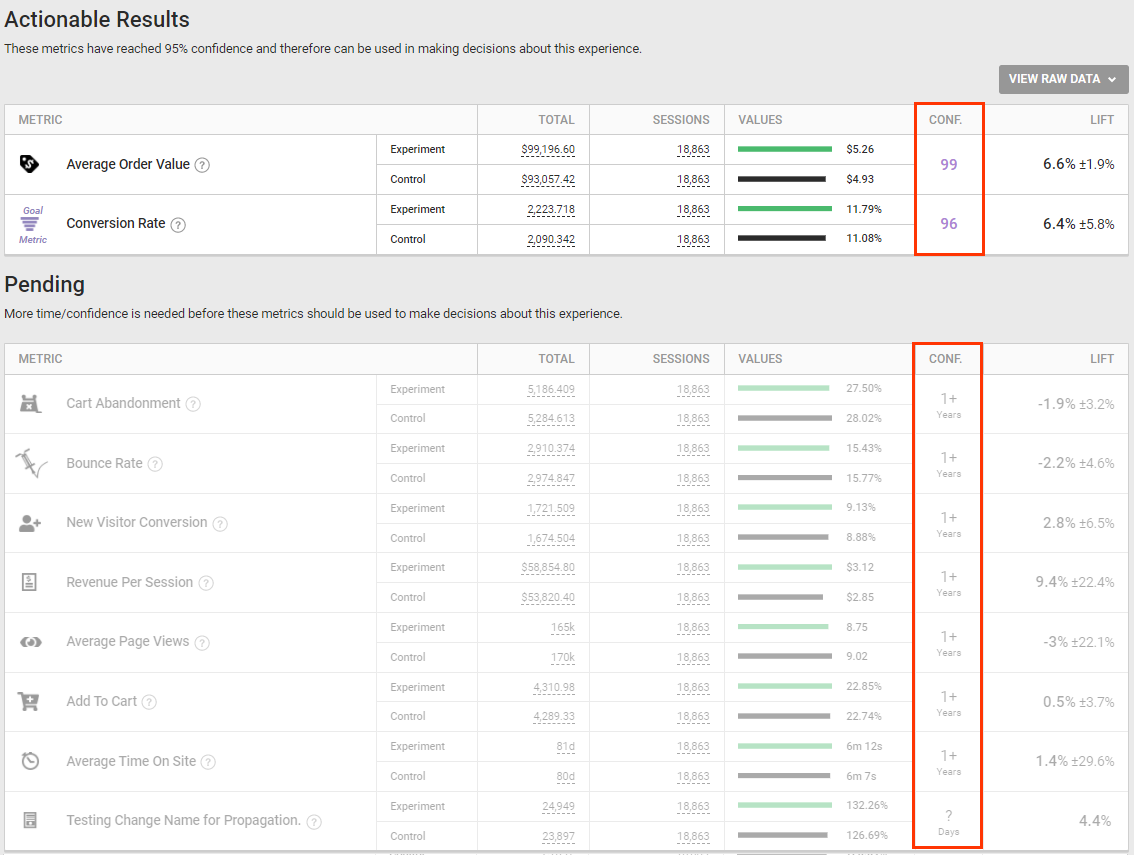
The Pending table includes for each metric the time to reach confidence, which is the number of days or months needed to determine if the current performance difference is statistically significant at the desired confidence level.
Metrics for Experiences with Splits
The analytics displayed on the Metrics tab for an experience with splits compares the control group with each individual split independently.
To view the graph for an individual metric's performance, first select it from and considering. Next, select an option from and comparing if you want the graph to show the comparison of some combination of splits.
The default view is the cumulative average over time of how the metric has performed. Click Daily above the graph to view the daily values.
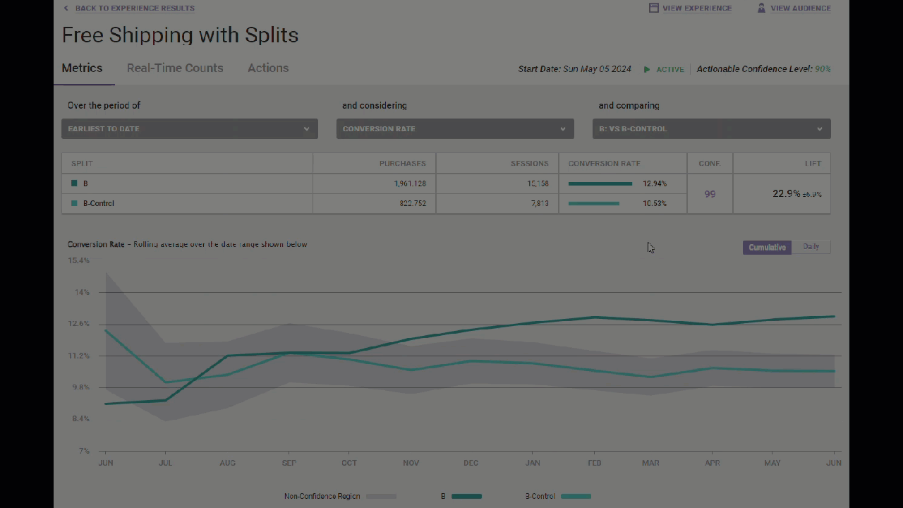
You can change the time range of the data charted by selecting an option from Over the period of.