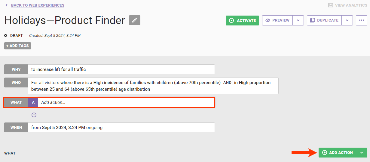
Follow these steps to configure the action that adds a Product Finder questionnaire to a Web experience.
- Create a new Web experience, and then configure the WHY and WHO settings.
- Click WHAT and then click ADD ACTION.
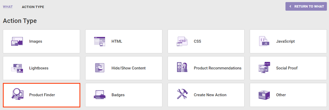
- Click Product Finder on the Action Type panel.
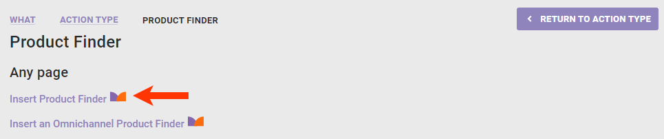
- Click the Product Finder action template that you want to use.
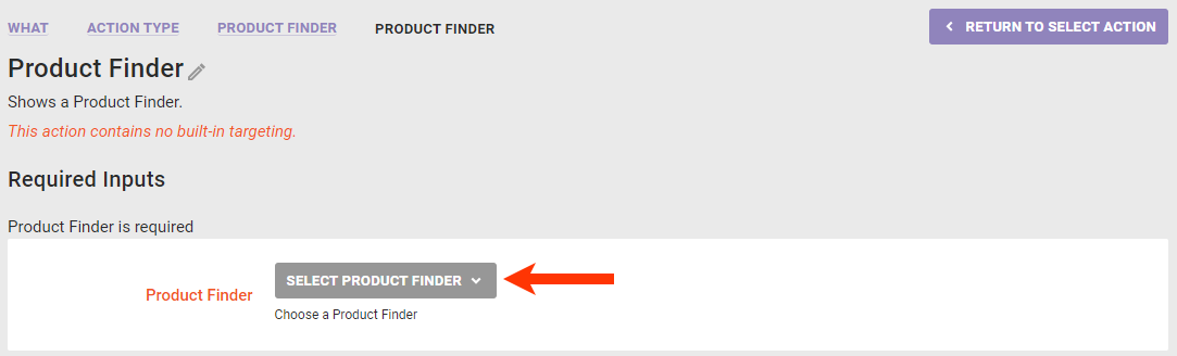
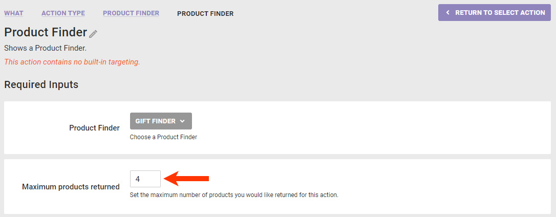
- Select the Product Finder questionnaire that you want to use.
- Input the maximum number of recommended products that you want displayed in the questionnaire results.
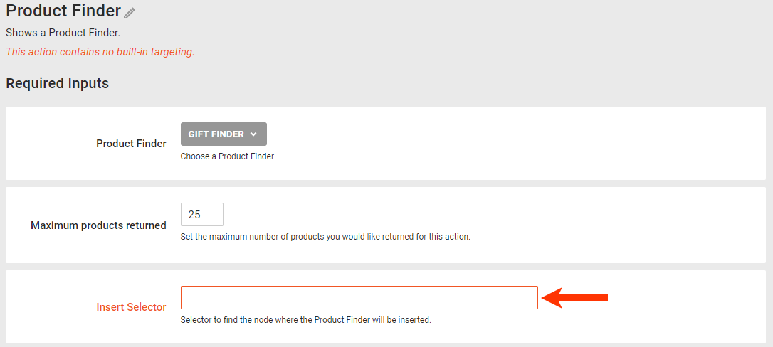
- Configure the settings related to where on the site the questionnaire should appear.
- Input the selector that identifies where on the page on your site the questionnaire should appear.
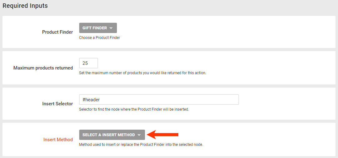
- Select where the questionnaire should appear in relation to the selector you input in Insert Selector.
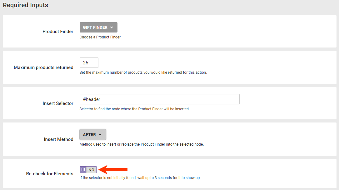
- Toggle Re-check for Elements to YES if you want the action to keep checking the page every 50 milliseconds for up to 3 seconds if it doesn't immediately find the selector.
- Input the selector that identifies where on the page on your site the questionnaire should appear.
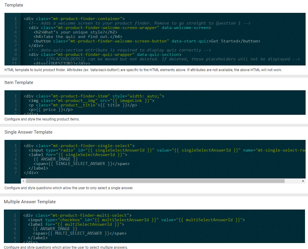
- Modify the HTML code in any of the four templates to customize the questionnaire's appearance. See Modifying the Templates in this documentation for specifics about each template.
- The code in the Template editor controls the Product Finder container.
- The code in the Item Template editor controls the appearance of the product recommendations.
- The code in the Single Answer Template editor controls the appearance of questions and answer options of which the customer can only select one.
- The code in the Multiple Answer Template editor controls the appearance of multiple-choice questions.
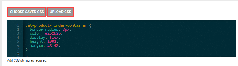
- As necessary, input CSS to style the action. Copy and paste the code into the CSS editor, or click CHOOSE SAVED CSS or UPLOAD CSS to insert CSS. See Styling the Product Finder for a sample stylesheet.
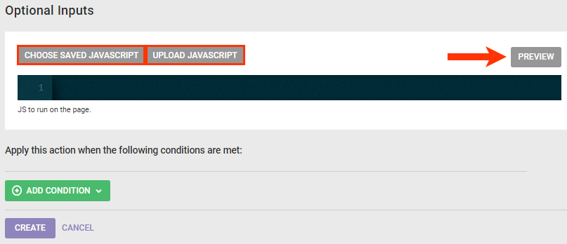
- Optionally, click CHOOSE SAVED JAVASCRIPT or UPLOAD JAVASCRIPT to add JavaScript content to the action. Click PREVIEW after you add the JavaScript to ensure it works correctly.
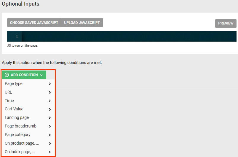
- To specify where and when the action fires, click ADD CONDITION, select one of the options, and then type into the respective input field the necessary information to complete the condition. Repeat as needed to add the necessary action conditions to meet your needs for the action.
- Click CREATE.
Complete the experience by configuring the WHEN settings. Next, either preview the experience to ensure you satisfied with the settings, or activate it.
Modifying the Templates
The four templates allow you to customize the questionnaire's appearance.
Customizing the Product Finder Container
The HTML code in the Template editor determines the look of the container in which the Product Finder action appears.
<div class="mt-product-finder-container">
  <!-- Adds a welcome screen to your product finder. Remove to go straight to question 1 -->
  <div class="mt-product-finder-welcome-screen-wrapper" data-welcome-screen>
    <h2>What's your unique style?</h2>
    <h4>Take the quiz and find out.</h4>
    <button class="mt-product-finder-welcome-screen-button" data-start-quiz>Get Started</button>
  </div>
  <!-- data-quiz-section attribute is required to display quiz correctly -->
  <div class="mt-product-finder-quiz-wrapper" data-quiz-section>
    <!-- {{PLACEHOLDERS}} can be moved but not deleted. If deleted, these placeholders will not be displayed -->
    <div>{{QUESTION}}</div>
    <div>{{INSTRUCTIONAL_TEXT}}</div>
    <div>{{ANSWERS}}</div>
    <div class="mt-product-finder-button-container">
      <button class="mt-product-finder-back-button" data-back-button>Back</button>
      <button class="mt-product-finder-next-button" data-next-button>Next</button>
    </div>
  </div>
  <!-- data-result-section attribute is required to display Product Finder results correctly -->
  <div class="mt-product-finder-results-wrapper" data-result-section>
    <!-- data-result attribute is needed to display content when results are found -->
    <div class="mt-product-finder-result" data-result>
      <div class="mt-product-finder-result-bold-text">Here are your results</div>
      {{PRODUCTS}}
    </div>
    <!-- data-no-result attribute is needed to display content when no results are found -->
    <div class="mt-product-finder-no-result" data-no-result>
      <strong>Oops!</strong>
      <div>It doesn't look like anything was found</div>
    </div>
    <button class="mt-product-finder-restart-button" data-restart-button>RESTART</button>
  </div>
</div>
The key attributes in this template are as follows:
data-quiz-section— Adds the functionality to display the questionnairedata-next-button— Adds the functionality to navigate forward to the next question in the questionnairedata-result-section— Adds the functionality to display the recommended products that are the result of the answer(s) selecteddata-result— Adds the functionality to display whatever content is within this element when the answer(s) selected result in recommended productsdata-no-result— Adds the functionality to display whatever content is within this element if no recommended products are the result of the answer(s) selected
Ensure that you don't delete any of the attributes listed above when modifying the template. Doing so can causes the Product Finder action to malfunction.
You can delete any of the following attributes if you don't want to the customer to have the navigational option within the questionnaire that the attribute defines:
data-back-button— Adds the functionality to navigate backward to the previous question in the questionnairedata-restart-button— Adds the functionality to navigate back to the beginning of the questionnaire, with all previous answers cleared
Finally, you can delete the data-welcome-screen attribute if you don't want the questionnaire to begin with an introductory message for customers before the first question.
See Product Finder Style Guide for more ideas to customize the Product Finder container.
Customizing the Welcome Screen
The optional data-welcome-screen attribute gives you the opportunity to introduce a customer to the Product Finder questionnaire that compels them to take the full questionnaire rather than exit before answering the first question. You can craft the message that appears as well as customize the button that advances the customer forward to the first question.
<div class="mt-product-finder-welcome-screen-wrapper" data-welcome-screen>
    <h2>What’s your unique style?</h2>
    <h4>Take the quiz and find out.</h4>
    <button class="mt-product-finder-welcome-screen-button" data-start-quiz>Get Started</button>
  </div>
If the customer clicks the button to restart the questionnaire, then they're returned to the first question, not to the welcome screen.
The code for the welcome screen appears by default in the Product Finder container HTML template. Therefore, if you don't want to include it in the action, you must remove the code for it.
Customizing the 'Results Found' Message
The data-result attribute adds the functionality to display whatever message you want a customer to see when the answer(s) that the customer selected result in product recommendations. You can modify the message text included in the Product Finder container template however you see fit.
<div class="mt-product-finder-result" data-result>
      <div class="mt-product-finder-result-text">Check out these fab finds that match your preferences</div>
      {{PRODUCTS}}
    </div>
When configuring an action that uses a Product Finder questionnaire that shows results after the customer has answered all the questions, you can optionally modify the template so that a Restart button accompanies the "Results Found" message and product recommendations.
    <div class="mt-product-finder-result" data-result>
      <div class="mt-product-finder-result-text">Check out these fab finds that match your preferences</div>
      {{PRODUCTS}}
      <button class="mt-product-finder-restart-button" data-restart-button>Restart</button>
    </div>
This button gives the customer the option to revisit the questionnaire from the beginning, select different answers, and receive different recommendations.
Customizing the 'No Results Found' Message
The data-no-result attribute adds the functionality to display whatever message you want a customer to see if there are no recommendations resulting from the answer(s) selected. You can modify the "No results found" message text included in the Product Finder container template however you see fit.
    <div class="mt-product-finder-no-result" data-no-result>Sorry! We can't recommend any products based on the info you provided. Want to try again?</div>
    <button class="mt-product-finder-restart-button" data-restart-button>Restart</button>
As you can see in the code snippet above, the Product Finder container template includes coding for a button to restart the questionnaire to accompany the "No results found" message.
When configuring an action that uses a questionnaire set up to show results each time the customer answers a question, you should modify the template so that a Back button accompanies the "No Results Found" message instead of a Restart button. Here's an example of the code modified to do just that.
    <div class="mt-product-finder-no-result" data-no-result>Sorry! We can't recommend any products based on the info you provided. Want to try again?</div>
    <button class="mt-product-finder-back-button" data-back-button>Back</button>
Customizing the Results
The HTML code in the Item Template editor controls the appearance of the product recommendations returned either at the end of the questionnaire or after the site visitor answer a question.
<div class="mt-product-finder-item" style="width: auto;">
  <img class="mt-product__img" src="{{imageLink}}">
  <p class="mt-product__title">{{title}}</p>
  <p>{{price}}</p>
</div>
Including Values from Product Catalog Custom Fields
If the questionnaire that you selected for the action you're configuring includes product catalog custom fields and you want to display the value from any of those custom fields, then you must include a {{CustomFieldName}} placeholder in the results template. You must include this placeholder for each custom field that you want displayed in this action.
For example, you're configuring a Product Finder action that uses the Holiday Gift Finder questionnaire. This Product Finder questionnaire is set up to include values from the LowStockLevel and FreeShipping custom fields.
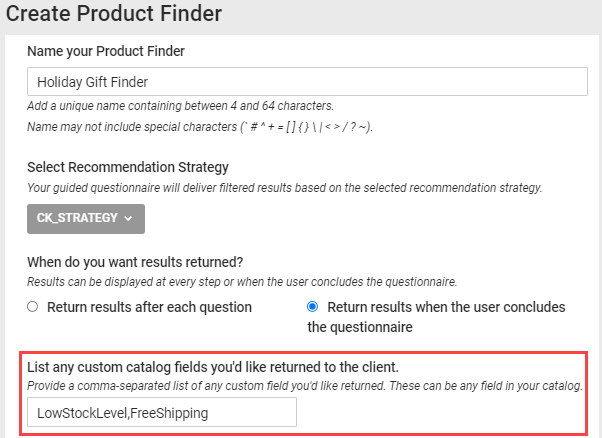
You only want to include the value of the FreeShipping custom field, which is either Yes or No, with the other product information displayed for recommendations. Therefore, you could modify the code in the Item Template editor as shown here.
<div class="mt-product-finder-item" style="width: auto;">
  <p class="mt-product__title">{{title}}</p>
  <p class="mt-product__title">Qualifies for free shipping: {{FreeShipping}}</p>
  <img class="mt-product__img" src="{{imageLink}}">
</div>
Ensure that you match the spelling and case of the custom field name that you input into the placeholder with the spelling and case of the custom field name as it appears in the product catalog.
Customizing the Questions and Answers
The code in the Single Answer Template editor controls the appearance of questions for which the site visitor can only select one answer.
<div class="mt-product-finder-single-select">
  <input type="radio" id="{{singleSelectAnswerId}}" value="{{singleSelectAnswerId}}" name="mt-single-select-radio">
  <label for="{{singleSelectAnswerId}}">
    {{ANSWER_IMAGE}}
    <span>{{SINGLE_SELECT_ANSWER}}</span>
  </label>
</div>
The code in the Multiple Answer Template editor controls the appearance of multiple-choice questions.
<div class="mt-product-finder-multi-select">
  <input type="checkbox" id="{{multiSelectAnswerId}}" value="{{multiSelectAnswerId}}">
  <label for="{{multiSelectAnswerId}}">
    {{ANSWER_IMAGE}}
    <span>{{MULTI_SELECT_ANSWER}}</span>
  </label>
</div>
The {{SINGLE_SELECT_ANSWER}} and {{MULTI_SELECT_ANSWER}} placeholder in each respective template is necessary for answer text to appear.
The {{ANSWER_IMAGE}} placeholder is necessary if any of the questions in the questionnaire include images, either with or without text, as answer options.
Coding Image-Only Answer Options
If you want the answer options shown to customers to display images only, first ensure that the questionnaire selected for the action includes images for each answer option for each question. If not, then follow the steps in Adding Images to Answer Options in Create a Product Finder Questionnaire.
Next, remove the {{SINGLE_SELECT_ANSWER}} placeholder and the {{MULTI_SELECT_ANSWER}} placeholder from its respective template to prevent any answer text from appearing.
Here's an example of the single-answer template code modified to display image-only answer options.
<div class="mt-product-finder-single-select">
  <input type="radio" id="{{singleSelectAnswerId}}" value="{{singleSelectAnswerId}}" name="mt-single-select-radio">
  <label for="{{singleSelectAnswerId}}">
    {{ANSWER_IMAGE}}
  </label>
</div>
The multiple-choice answer template code for this example could be modified as follows.
<div class="mt-product-finder-multi-select">
  <input type="checkbox" id="{{multiSelectAnswerId}}" value="{{multiSelectAnswerId}}">
  <label for="{{multiSelectAnswerId}}">
    {{ANSWER_IMAGE}}
  </label>
</div>
You must maintain the input type="radio" in the single-answer template and the input type="checkbox" in the multiple-choice answer template even though these input interface elements don't appear for the customer. Input selection buttons are hidden by default for answer options that include images.
Adding a Questionnaire Progress Bar
You can add a progress bar to a Product Finder questionnaire by inserting specific HTML and CSS code into the Product Finder action template.
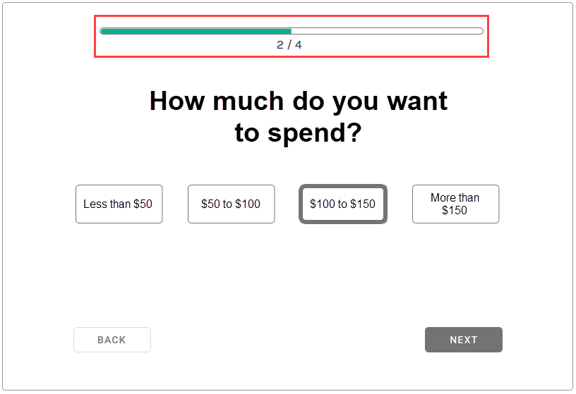
Insert into the Template editor this HTML code after <div class="mt-product-finder-quiz-wrapper" data-quiz-section>.
<div data-progress-bar class="mt-product-finder-progress-bar-container">
  <div style="width: {{PROGRESS_BAR_PERCENTAGE}}%"></div>
  <div>
    {{PROGRESS_BAR_COMPLETED_QUESTIONS}} / {{PROGRESS_BAR_TOTAL_QUESTIONS}}
  </div>
</div>
The {{PROGRESS_BAR_PERCENTAGE}}, {{PROGRESS_BAR_COMPLETED_QUESTIONS}}, and {{PROGRESS_BAR_TOTAL_QUESTIONS}} placeholders in this HTML code only work if they're placed under an HTML element that has the data-progress-bar attribute.
To style this optional progress bar, insert the following CSS code into the action template's CSS editor.
.mt-product-finder-progress-bar-container {
  width: 500px;
  border: 1px solid #747474;
  border-radius: 10px;
  height: 10px;
  margin-bottom: 32px;
  text-align: center;
}

.mt-product-finder-progress-bar-container > div:first-child {
  background-color: #D8D8D8;
  border-radius: 10px;
  height: 8px;
}
You can further customize the optional progress bar by adding JavaScript for it to the Optional JavaScript console in the action template.
Styling the Product Finder
You can use the CSS in this code sample as a guide for styling the Product Finder action you're configuring.
.mt-product-finder-container {
  border-radius: 3px;
  color: #2b2b2b;
  display: flex;
  height: 100%;
  margin: 2% 4%;
}

.mt-product-finder-quiz-wrapper {
  flex-grow: 1;
  flex-basis: 0;
  border: 1px solid #979797;
  padding: 2% 3%;
  display: flex;
  flex-direction: column;
  align-items: center;
}

.mt-product-finder-welcome-screen-wrapper {
  flex-grow: 1;
  flex-basis: 0;
  border: 1px solid #979797;
  padding: 5% 3%;
  display: flex;
  flex-direction: column;
  align-items: center;
}

.mt-product-finder-welcome-screen-wrapper > * {
  margin: 0px;
  margin-bottom: 20px;
}

.mt-product-finder-welcome-screen-button {
  background-color: #3D3D3D;
  color: #FFF;
  min-height: 34px;
  width: 195px;
}

.mt-product-finder-results-wrapper {
  flex-grow: 1;
  flex-basis: 0;
  border: 1px solid #979797;
  padding: 2% 3%;
  display: flex;
  flex-direction: column;
  align-items: center}

.mt-product-finder-h1-text  {
  font-size: 32px;
  font-weight: 600;
}

.mt-product-finder-products {
  display: grid;
  grid-template-columns: repeat(4, 25%);
  grid-gap: 10px;
  margin-top: 16px;
}

.mt-product-finder-item {
  text-align:left;
}

.mt-product-finder-item p {
  margin: 0px;
}

.mt-product__img {
  height: 130px;
  width: 120px;
}

.mt-product__title {
  font-size: 14px;
  text-align:left;
  width: 120px;
  word-break: break-all;
}

.mt-product-finder-question {
  font-size: 32px; margin-bottom: 16px;
}

.mt-product-finder-instructional-text {
  font-size: 21px; margin-bottom: 16px;
}

.mt-product-finder-single-select, .mt-product-finder-multi-select {
  align-items: center;
  display: flex;
  margin: 8px 16px 0px;
}

.mt-product-finder-single-select.has-answer-image, .mt-product-finder-multi-select.has-answer-image {
  margin-top: 76px;
}

.mt-product-finder-answer-image {
  border-radius: 50%;
  height: 100px;
  width: 100px;
}

.mt-product-finder-single-select.has-answer-image input[type=radio] + label,
.mt-product-finder-multi-select.has-answer-image input[type=checkbox] + label {
  border: 3px solid transparent;
  border-radius: 50%;
}

.mt-product-finder-single-select.has-answer-image input[type=radio]:hover + label,
.mt-product-finder-multi-select.has-answer-image input[type=checkbox]:hover + label {
  border: 3px solid #747474;
}

.mt-product-finder-single-select.has-answer-image input[type=radio]:checked + label,
.mt-product-finder-multi-select.has-answer-image input[type=checkbox]:checked + label {
  border: 6px solid #747474;
  margin: -3px;
}

.mt-product-finder-single-select.has-answer-image input[type=radio] + label span,
.mt-product-finder-multi-select.has-answer-image input[type=checkbox] + label span {
  position: absolute;
  top: 118%;
}

.mt-product-finder-single-select input[type=radio] + label span,
.mt-product-finder-multi-select input[type=checkbox] + label span {
  border: 1px solid #747474;
  border-radius: 3px;
  cursor: pointer;
  display: flex;
  align-items: center;
  justify-content: center;
  min-height: 44px;
  width: 98px;
  word-break: break-all;
}

.mt-product-finder-single-select input[type=radio]:hover + label span,
.mt-product-finder-multi-select input[type=checkbox]:hover + label span {
  background-color: #E7E7E7;
}

.mt-product-finder-single-select input[type=radio]:checked + label span,
.mt-product-finder-multi-select input[type=checkbox]:checked + label span {
  border: 6px solid #747474;
  margin: -2px;
  background-color: #E7E7E7;
  color: #747474;
  font-weight: 600;
}

.mt-product-finder-single-select input,
.mt-product-finder-multi-select input {
  display: none;
}

.mt-product-finder-answers .has-answer-image label {
  position: relative
}

.mt-product-finder-answers .has-answer-image label span {
  position: absolute;
  display: block;
}

.mt-product-finder-answers > div {
  display: flex;
	justify-content: center;
  flex-wrap: wrap;
}

.mt-product-finder-button-container {
  margin-top: 100px;
  display: flex;
  width: 100%;
}

.mt-product-finder-back-button {
  background-color: #fff;
  border-radius: 3px;
  border: 1px solid #979797;
  min-width: 100px;
  min-height:34px;
}

.mt-product-finder-next-button {
  background-color: #737373;
  border-radius: 3px;
  min-width: 100px;
  min-height:34px;
  margin-left: auto;
}

.mt-product-finder-next-button-disabled {
  background-color: #CCCCCC;
  cursor: auto;
}

.mt-product-finder-restart-button {
  background-color: #737373;
  margin-top: 72px;
  min-height: 34px;
  width: 195px;
}

.mt-product-finder-result {
  text-align: center;
}

.mt-product-finder-no-result {
  font-size: 24px;
  margin-top: 72px;
  text-align: center;
}