To deliver the best customer experience for your customers, you may want to limit certain Monetate experiences to certain device types. This Action Builder and Web experience use case includes building an action to display a particular banner and adding it to an experience so that the banner appears only when a customer arrives on your site using a mobile device.
Inspecting the Site in Device Mode
Follow these steps to use the Google Chrome browser and its Developer tools (DevTools) to gather key information about your site that you'll need for the action you build.
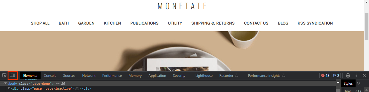
- Load a page of your site in the Chrome browser, launch Chrome DevTools, and then click Toggle Device Toolbar in the top navigation bar.
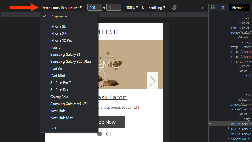
- Click Dimensions at the top of the window, and then select a mobile device option.
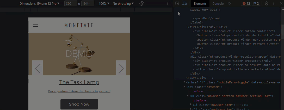
- Find an element on the page that appears only on mobile devices. First, click Inspect to the left of Toggle Device Toolbar in Chrome DevTools, and then place your mouse pointer on various elements to find one that only appears on mobile devices.
- In the Styles panel of Chrome DevTools, find the
@media only screen and (max-width: [value])property, and then copy and preserve the information for later use. If the@media only screendoesn't appear in the CSS in the Styles panel, it may in the CSS for a theme that's applied to the element. Click the theme link to view and, if necessary, search for the@media only screen and (max-width: [value])property.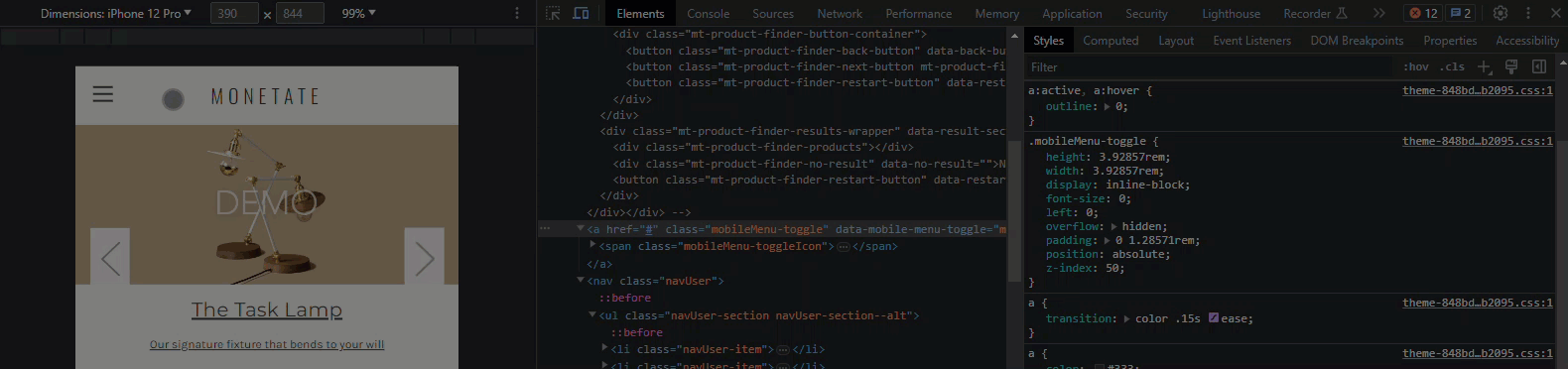
Once you've recorded the @media only screen and (max-width: [value]) property, you can build the banner action in Action Builder.
Building the Banner Action
Follow these steps to create the banner action in Action Builder.
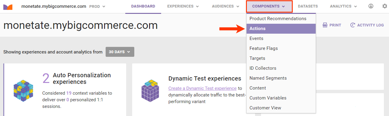
- Click COMPONENTS in the top navigation bar of the Monetate platform, and then select Actions.
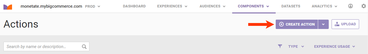
- Click CREATE ACTION.
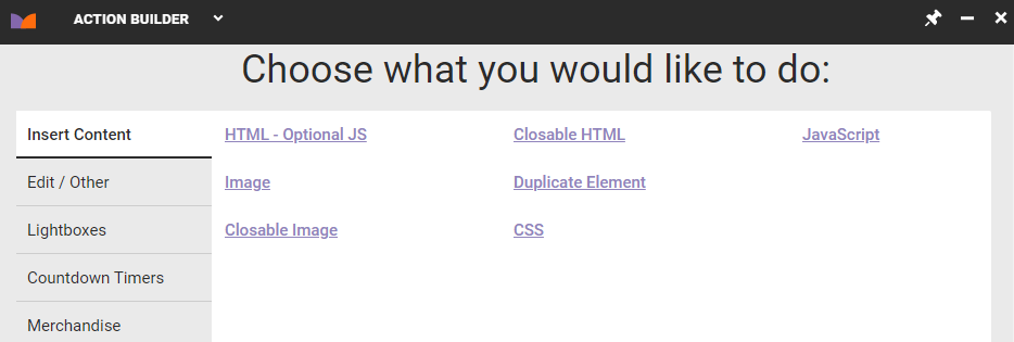
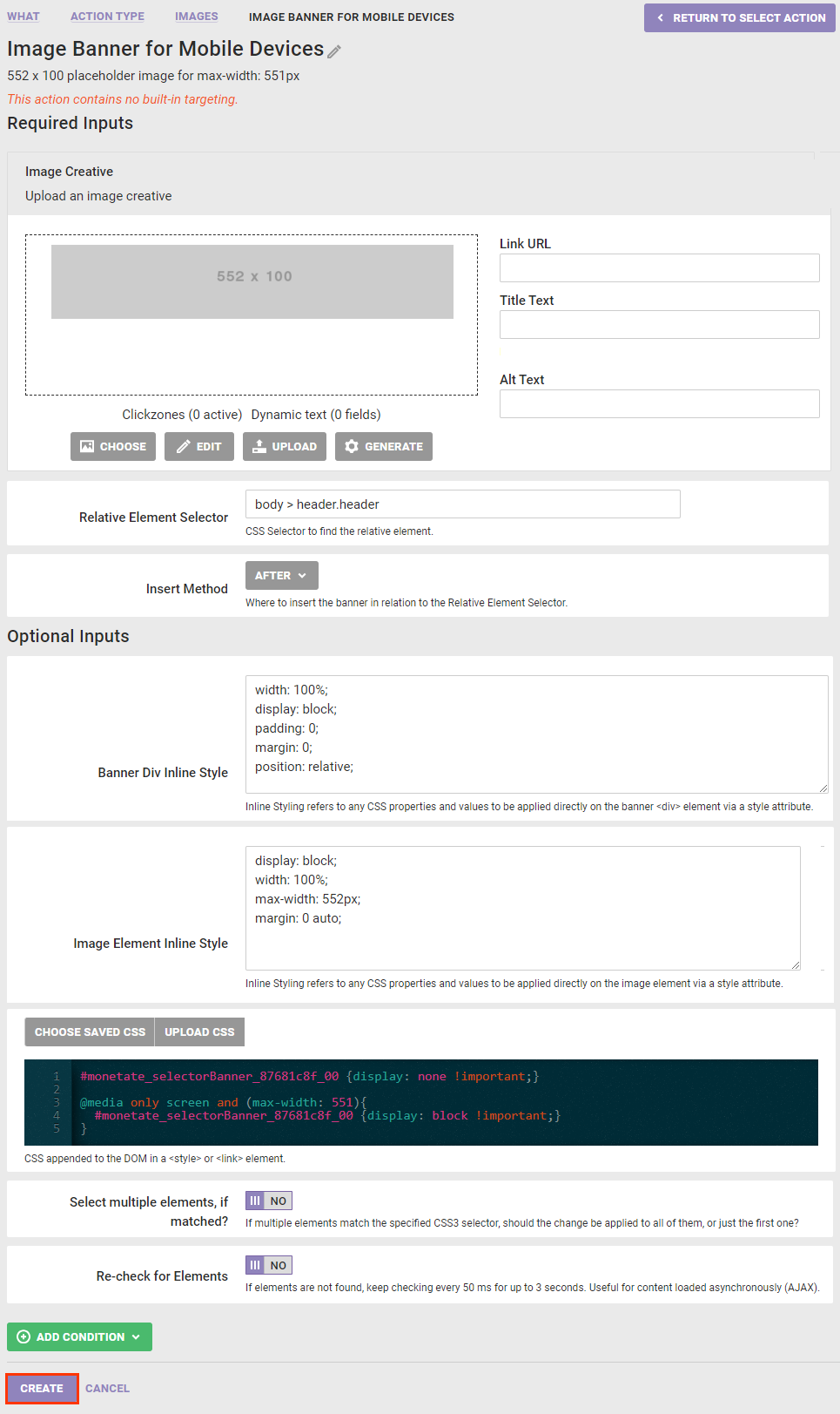
- Click Image on the Insert Content tab.
- Click GENERATE and then configure a placeholder image for the banner that is 1 pixel larger than the value of the
max-widthproperty for mobile devices.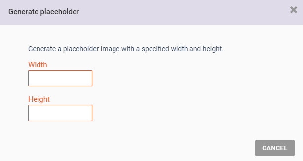
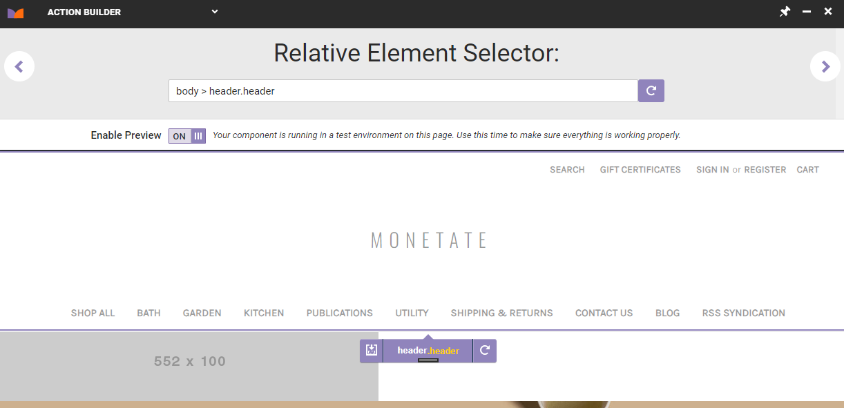
- Return to the navigation bar on the mobile site to find a selector that's persistent on both the mobile and desktop views. In this use case, the selector needed is
header.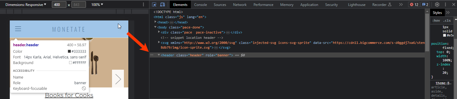
- Return to Action Builder, select a placeholder element near the persistent selector, and then click the forward arrow.
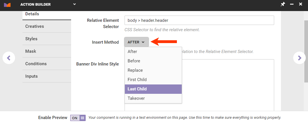
- On the Details tab, select After or Last child from Insert Method.
- Take the following actions to center the banner image below the navigation bar:
- Input into Banner Div Inline Style the CSS to center the banner container.
width: 100%;
display: block;
padding: 0;
margin: 0;
position: relative;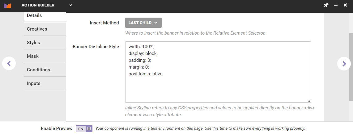
- Input into Image Element Inline Style the CSS for the banner image. The value of
max-widthshould be 1 pixel larger than the value of themax-widthproperty for mobile devices.display: block; width: 100%; max-width: 552px; margin: 0 auto;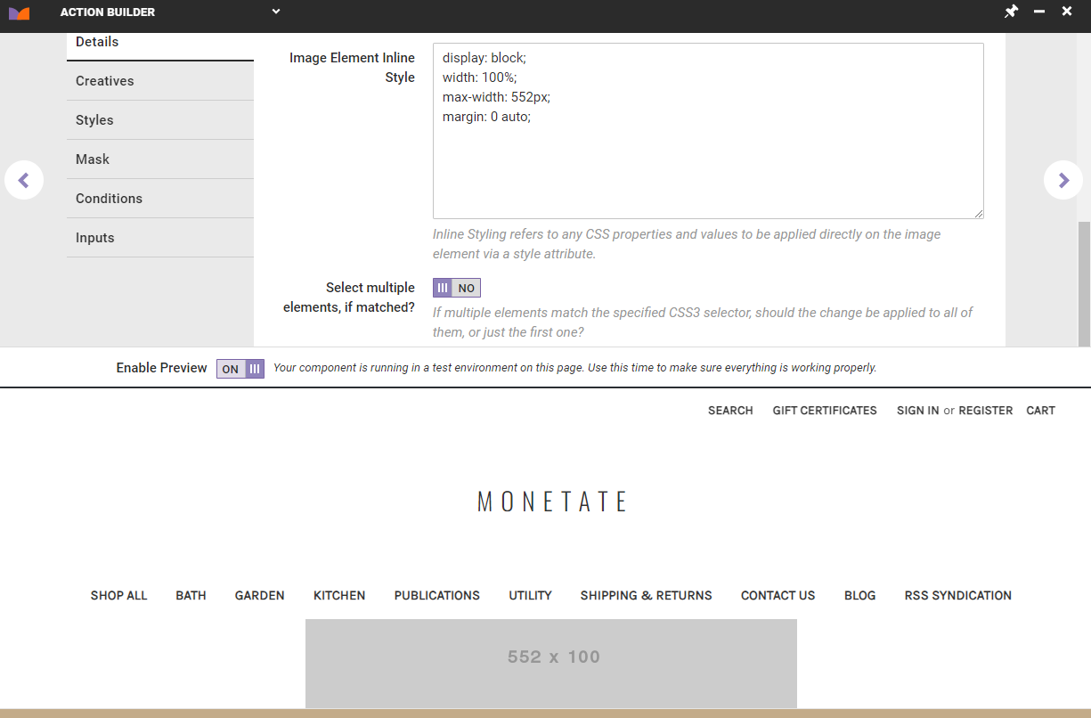
- Input into Banner Div Inline Style the CSS to center the banner container.
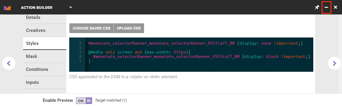
- Click the Styles tab in Action Builder, and then take the following actions:
- Copy and paste this CSS into the editor:
#monetate_selectorBanner_[unique ID] {display: none !important;} @media only screen and (max-width: [value]){ #monetate_selectorBanner_[unique ID] {display: block !important;} } - Replace the
[value]placeholder in@media only screen and (max-width: [value])with the actual value you recorded in the final step of Inspecting the Site in Device Mode.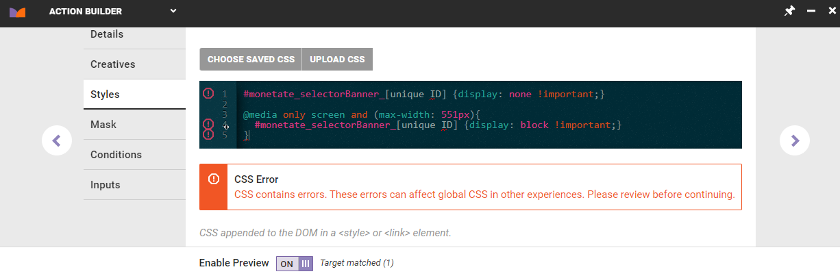
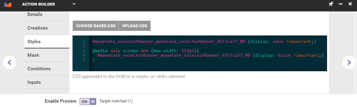
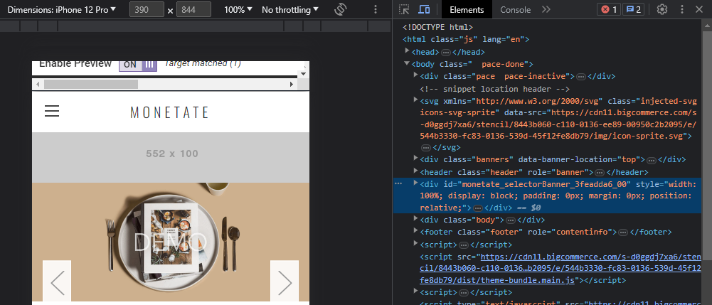
- Use Chrome DevTools to inspect the banner preview, and then copy the unique ID (for example,
id="monetate_selectorBanner_4557ca77_00").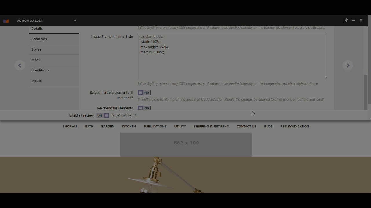
- Return to the Styles tab, and then paste the unique ID to replace the two placeholders in the CSS.
- Copy and paste this CSS into the editor:
- Optionally, test the nearly complete banner action.
- Minimize Action Builder.
- Relaunch Chrome DevTools, click Toggle Device Toolbar, and select a mobile device option.
- Verify that the banner action preview once again appears.
- Minimize Action Builder.
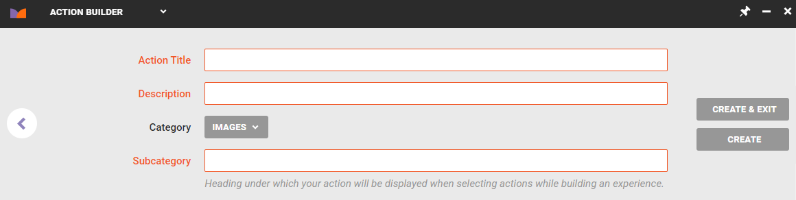
- Click the forward arrow in Action Builder, and then give the action a title, description, and subcategory. Finally, click CREATE & EXIT.
The action is now ready for you to use in a Web experience.
Creating the Experience
Follow these steps to create a Web experience to deploy the mobile banner.
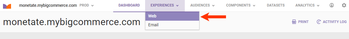
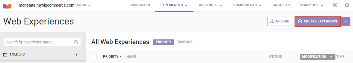
- Click EXPERIENCES in the top navigation bar, and then select Web.
- Click CREATE EXPERIENCE.
- Configure the WHY settings to select the experience type, the goal metric, and the secondary metrics.
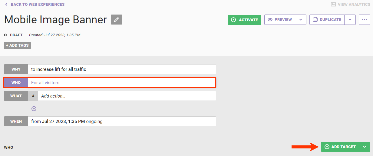
- Configure the WHO settings to target customers visiting your site on mobile devices.
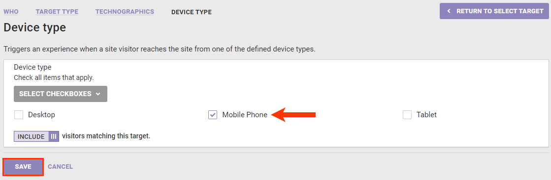
- Click WHO and then click ADD TARGET.
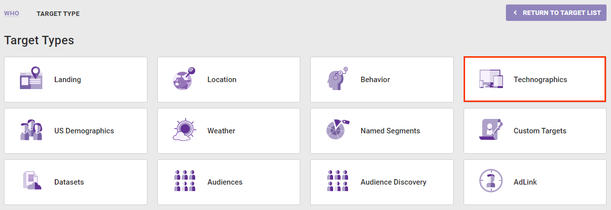
- Click Technographics.
- Click Device type.
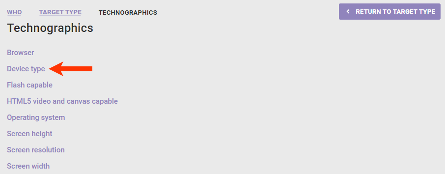
- Select Mobile Phone and then click SAVE.
- Click WHO and then click ADD TARGET.
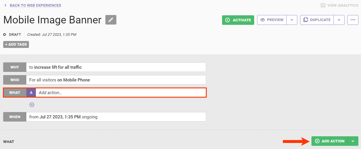
- Click WHAT and then click ADD ACTION.
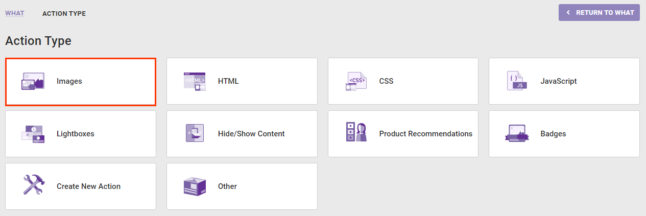
- Click Images.
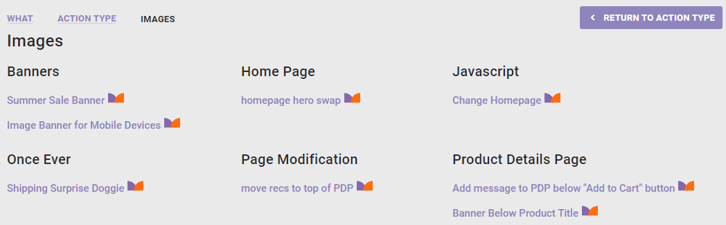
- Click the banner image for mobile devices action that you created.
- As necessary, configure any experience-level settings, and then click CREATE.
Before configuring the WHEN settings and activating the experience, preview it to ensure it works as anticipated.
Testing the Experience
Follow these steps to test the Web experience before activating it.
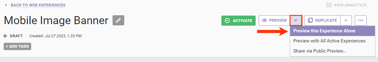
- Click the arrow to the right of PREVIEW, and then select Preview this Experience Alone.
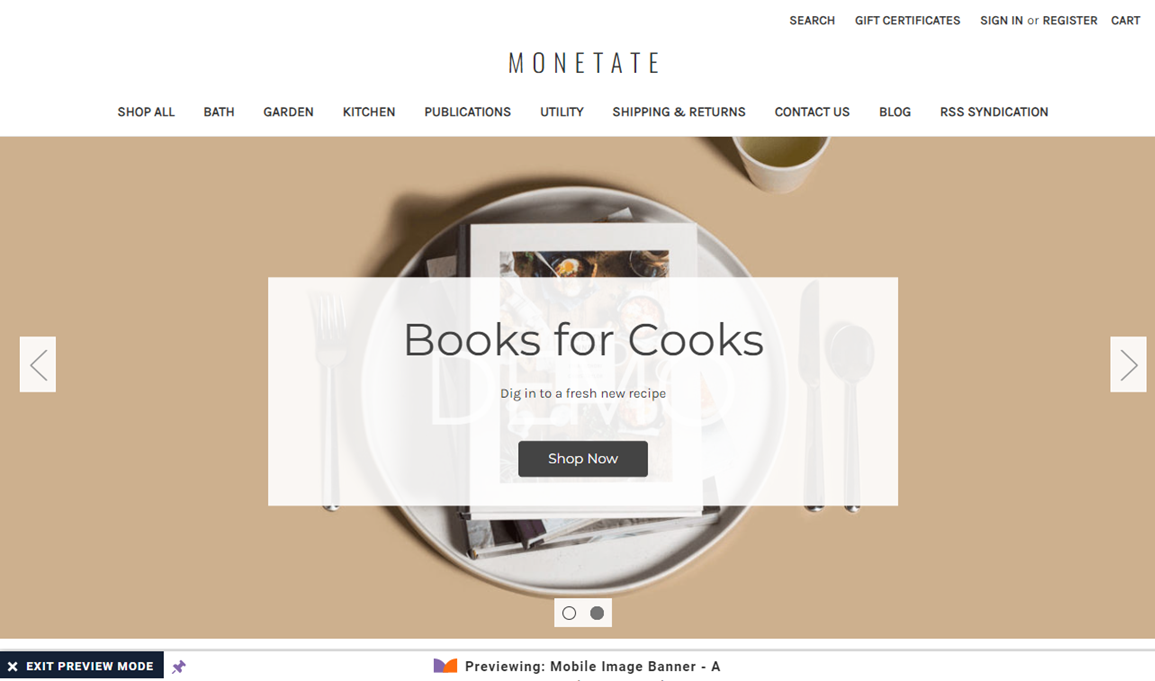
- Ensure that the banner does not appear on a desktop view of your site.
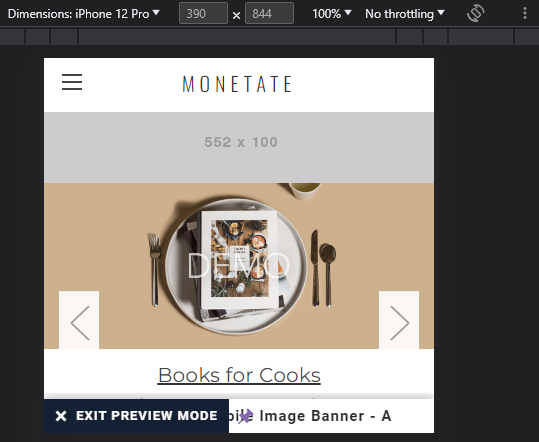
- Launch Chrome DevTools, click Toggle Device Toolbar, and select a mobile device option.
- Ensure that the banner appears correctly.
After you confirm that the action and experience work as expected, return to the Experience Editor page in the Monetate platform to configure the WHEN settings as necessary and then activate the experience.