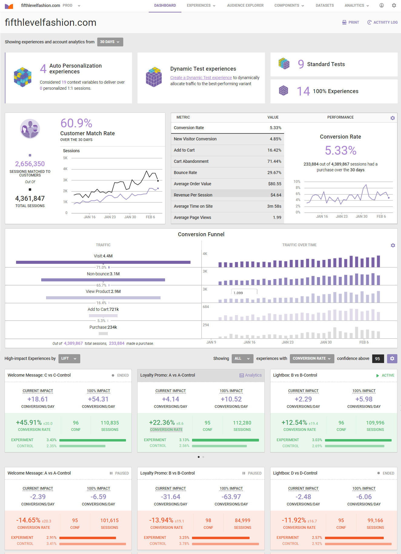
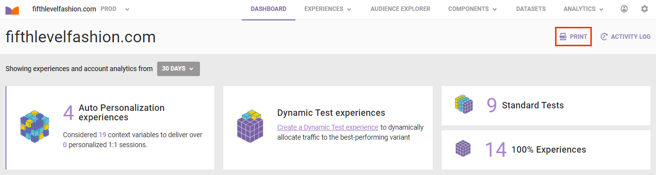
The platform dashboard is the landing page that you see when you log into Monetate. It provides you with a high-level overview of the experience types you've run, the metric performance across your account, and a snapshot of the conversion funnel across your site.
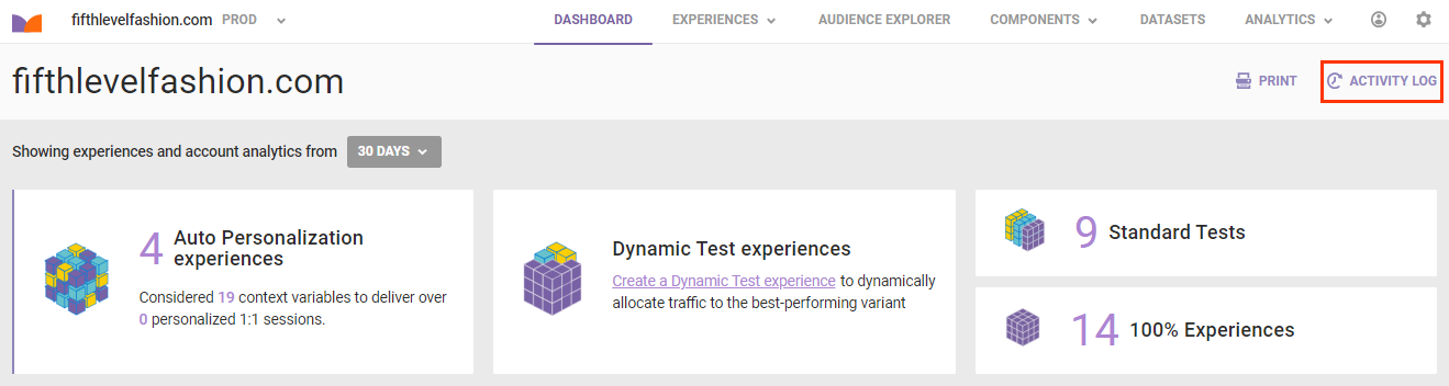
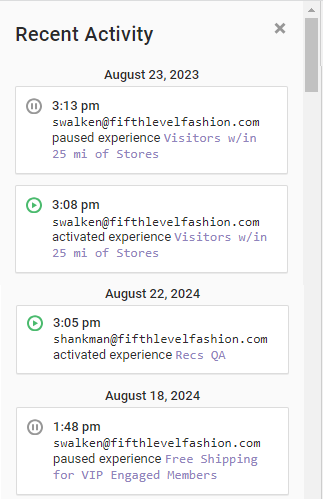
The activity log provides details when metrics change significance, someone edits an experience, a file upload completes, and more. To access it, click ACTIVITY LOG in the top-right corner of the page.
The activity log loads over the dashboard and lists the most recent activities to take place for your account.
If you want to print the dashboard, click PRINT in the top-right corner of the page.
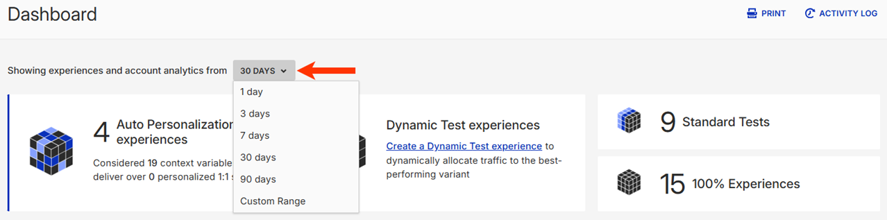
All data on the dashboard is available in several defined time frames or within a custom range that you define.
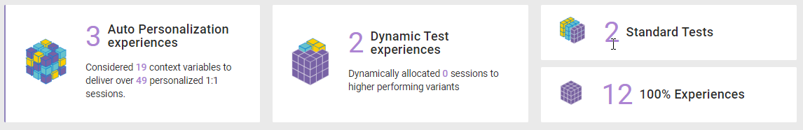
The Engine Summary at the top of the dashboard offers insights about the number of experiences you've run for each experience type. Additionally, for machine-driven experience types (Automated Personalization experiences and Dynamic Testing experiences), the dashboard provides information about context variables, personalized sessions, and dynamic traffic allocation.
The middle section of the dashboard is divided into two parts.
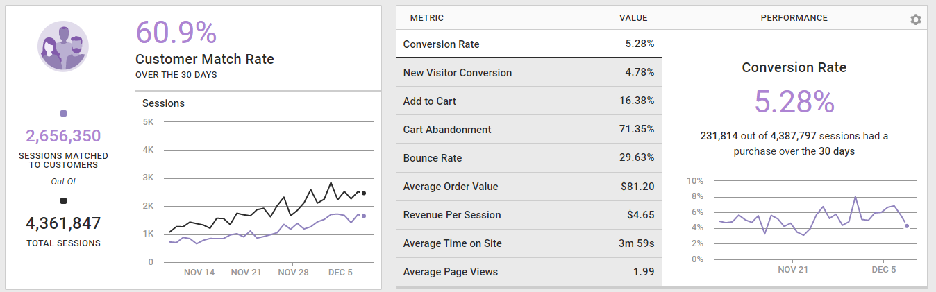
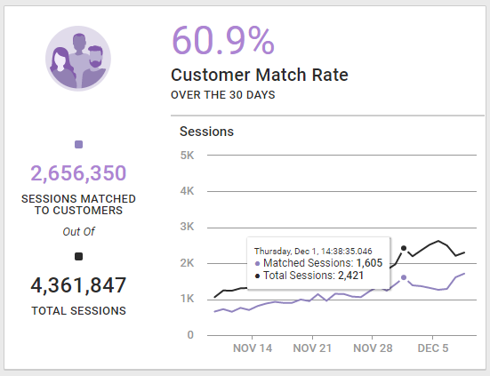
The left widget provides details about the customer match rate, functionality that's tied directly to the Customer View configuration. You can see the number of sessions matched to real people out of the total number of sessions. When you place your mouse pointer on the graph, a popup window appears with at-a-glance details for the match rate on a specific day.
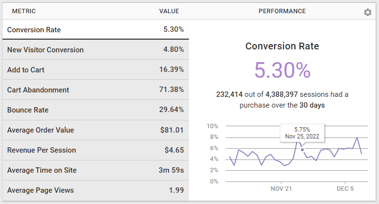
The widget on the right provides an account-level overview of all metrics for your site across all experiences during the selected time range. This is an aggregation of performance for all experiences that ran during this time. When the mouse pointer hovers on the graph, you can view at-a-glance details for the metric performance on a specific day.
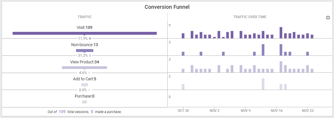
The Conversion Funnel at the bottom of the page helps you understand how your site visitors perform throughout the purchase journey. Analyzing this funnel can help you pinpoint opportunities where you can improve the flow of customers' path to purchase. The funnel is broken down into the following pieces:
- Visit: When someone arrived on your site
- Non-bounce: When someone visited your site and visited at least two different pages before leaving
- View Product: When someone clicks through to a product detail page
- Add to Cart: When someone adds a product to their cart
- Purchase: When someone completes a purchase
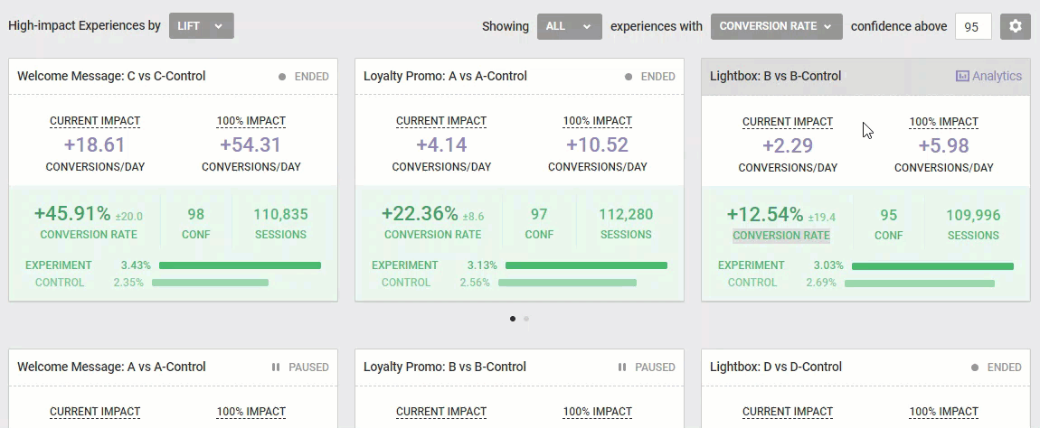
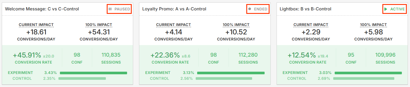
Below the Conversion Funnel charts are the impact cards for your account.
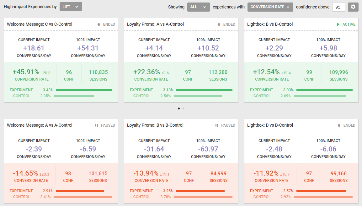
Impact cards show you which experiences are performing well and which ones might need adjustments. Impact cards with a green background display the three top-performing experiences based on the metric you selected from experiences with and the confidence interval you defined in confidence above. Cards with a red background show the three bottom-performing experiences based on the same metrics. When the mouse pointer hover to the right, an arrow appears that allows you to scroll to the next three experiences in the set. You can also scroll through impact cards by clicking the dots underneath.
Both sets of impact cards include the following data:
- Current Impact: The estimated influence of an experience on the cumulative site traffic
- 100% Impact: The estimated influence an experience would have on a metric if it was shown to the entire target audience
- Conversion Rate: The current conversion rate for this experience
- Confidence: The measurement of the likelihood that the observed change in a key performance indicator (KPI) didn't occur by random chance
- Sessions: The total number of sessions exposed to this experience
Additionally, each impact card in the right corner indicates whether the experience is active, ended, or paused.
Select from High-impact Experiences by one of these options for displaying the impact cards: Lift, Current Impact, or Potential Impact.
The Lift display option is based on the measured variance between an experiment and a control group. An experience with a lift of 3.5% is doing 3.5% better than the control.
The Current Impact display option shows the effect that the experience has had on a particular metric based on the traffic that has seen the experience so far.
Potential Impact measures the effect that the experience would have had on a particular metric based on if the experience was shown to 100% of the target group. Keep in mind, this isn't a predictive measure of what could happen if you show the experience to 100% of the target group in the future. It's a measure of what would have happened if the experience was shown to 100% of the target group to date, based on the overall traffic measure for that experience.
Select an option from Showing to define whether you want to include all experiences, active experiences, ended experiences, or paused experiences in the impact cards.
You can switch the metric that measures the success of the experiences by selecting an option from experiences with.
You can adjust the confidence interval to filter out experiences that haven't reached a specified confidence level by inputting a number into confidence above.
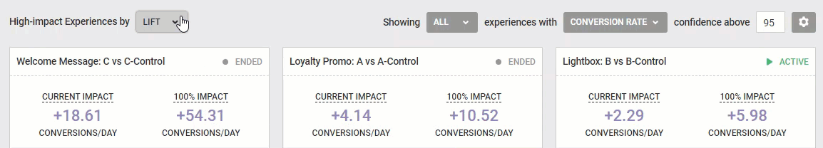
You can change the default metric by clicking the settings cog. When you change the metric, the impact cards automatically update. The default setting is Conversion Rate, but you can also look at experiences based on any out-of-the-box KPI or custom metrics that you may have built in Event Builder.