With Action Builder you can create new actions for any page of your site.
Technical Considerations
Before you can use Action Builder, you must meet these prerequisites:
- You must have the Administrator or the Action Building user role in the Monetate platform.
- You must implement the Monetate tag on a page from the corresponding account instance to run any of the platform's Builders on it.
You can use the Builder with the latest versions of Chrome, Firefox, Safari, and Microsoft Edge browsers.
Accessing Action Builder
Follow these steps to access Action Builder.
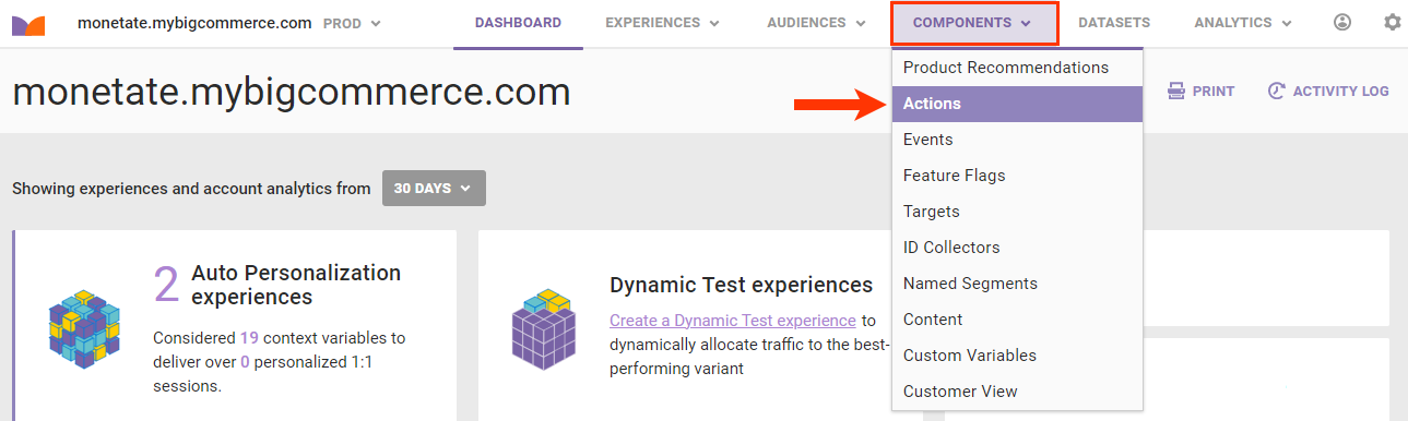
- Click COMPONENTS in the top navigation bar and then click Actions.
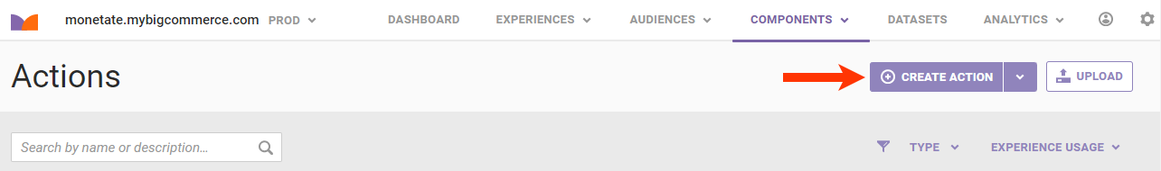
- Click CREATE ACTION.
In the top-right corner of Action Builder are buttons that let you pin it to the top or bottom of the browser window or tab, minimize it, or close it.
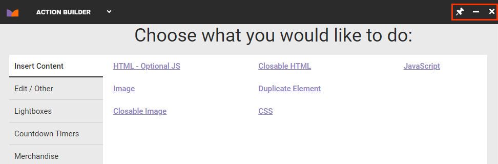
Action Types
Most actions fall into one of two categories: insert content and edit content.
Insert actions add the following elements to your site:
- Image
- HTML
- JavaScript
- CSS
- Background image
- Lightbox
- Countdown timer
- Recommendations slider (if your contract includes Monetate's Product Recommendations feature)
Edit actions work with or act on site elements in the following ways:
- Edit HTML
- Move, show, or hide an element or swap two current site elements
- Modify an attribute
Other actions you can build include setting a cookie, simulating a click event, and collecting data.
Using the Element Selector
Many actions use element selectors to determine where on the site an action happens and what site elements are affected. Therefore, the first step when building many actions is selecting an element.
To select an element in Action Builder, move your mouse pointer across your site, and a selector box appears around the current element. This box is the DOM selector tool. Use this tool to choose any element or element container on your site.
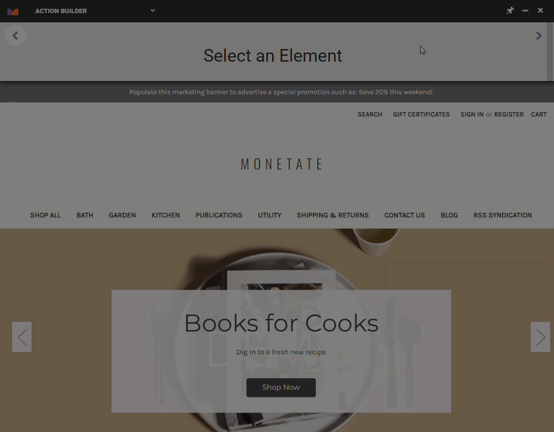
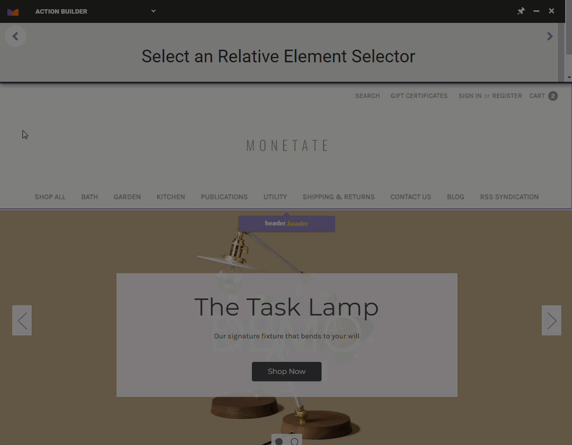
Once you click to select an element, the selector offers additional options. Click the element name to view relative elements.
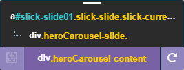
When you're building certain types of actions, such as inserting an image, you can click the icon to the left of the element name to select a placement option relative to the selected element.
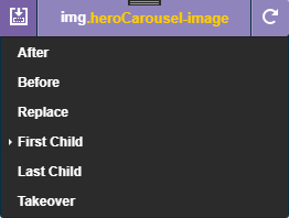
Click the icon to the right of the element name to reset the DOM selector tool and then select a new element.
If you want to run multiple actions at the same time, you can use a specific selector for one action and a variation of it for the second action. For example, you could set the selector for action A to #main > .content > .hero and then set the selector for action B to #main > div.content > div.hero.
If you don't use specific selectors, experience priority determines which action fires. See Experience Priority for more information.
Element-Related Options on the Details Tab
After you determine where on the page the action will occur, the options on the Details tab allow you to further customize certain aspects of the action and its relationship to the selected element.
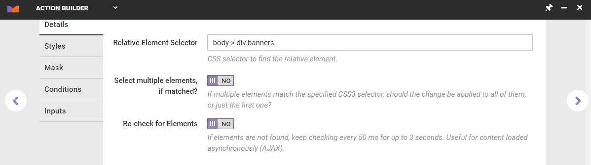
For some action types, you can input a new element selector path or edit the one you selected to change which site element the action affects. Some examples of valid paths include the following:
parentElement > nextChildElement.className > .nextClassname#element_ID_Name > nextChildElement
For certain action types, you can toggle Select multiple elements, if matched? to YES if you want the change the action makes to apply to all occurrences of the specified selector. If the setting remains on its default NO setting, then the change only the first match.
Toggle Re-check for Elements to YES to enable matched element polling. If you enable this setting, then the action continues to check for the selected element every 50 milliseconds for up to 3 seconds, even if it doesn't initially appear on the page. Enabling this option is useful if you have certain elements that don't fire immediately when the page loads. If the setting remains on its default NO setting, then the action only checks for the element once when the page loads.
See Element Selectors for more information.
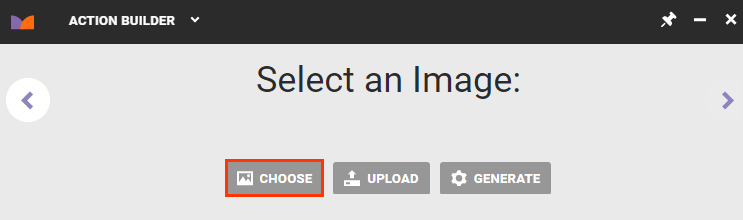
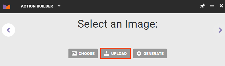
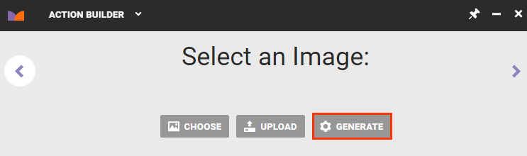
Inserting Images into Actions
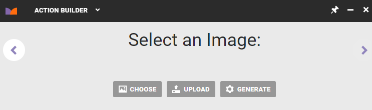
Action Builder has three ways to add an image: select an image from Content Manager, generate a placeholder image, or upload an image.
Using an Image in Content Manager
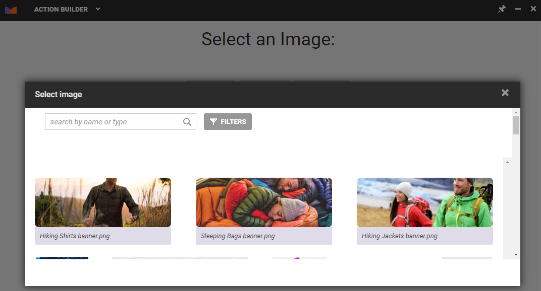
Follow these steps to select an image previously uploaded to the Monetate platform.
- Click CHOOSE.
- Find in the Content Manager modal the image you want to insert and then click to select it.
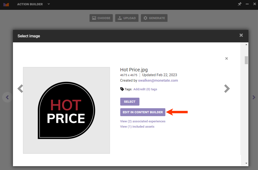
- Optionally, click EDIT IN CONTENT BUILDER if you want to modify the image before using it in the action you're building. See the Content Builder category of the knowledge base for more information. If you don't need to modify the image, then click SELECT.
- Click SELECT.
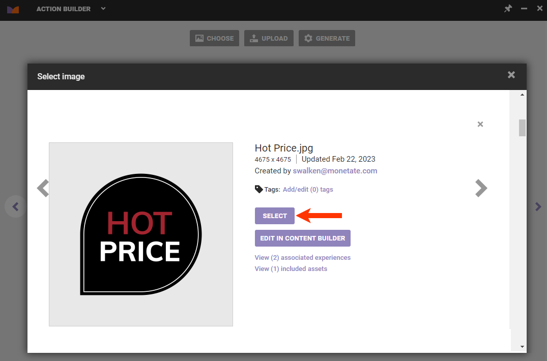
After you select an image, you can then select the element the action impacts.
Uploading an Image
Follow these steps to upload an image to the Monetate platform.
- Click UPLOAD.
- Drag and drop the file you want to upload, or click CLICK HERE to navigate to the location outside of the Monetate platform where the image file is stored.
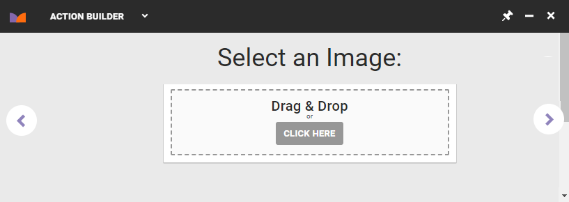
After the image uploads, you can then select the element the action impacts.
Generating an Image Placeholder
Follow these steps to generate an image placeholder that you can later replace with the real image for the action.
- Click GENERATE.
- Input the height and width in pixels for the placeholder.
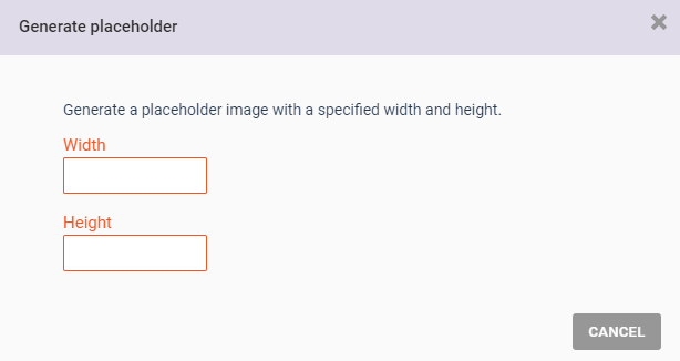
- Click SAVE.
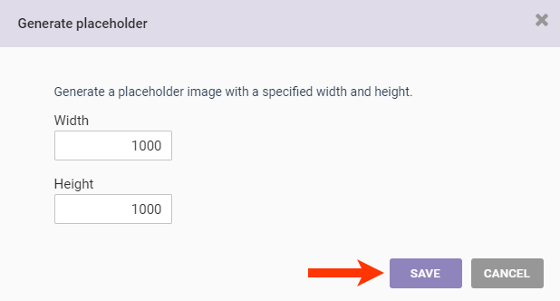
After you input the dimensions for the placeholder, you then select the element the action impacts.
Inserting a Countdown Timer
Use Action Builder to create and insert a countdown timer anywhere on your site.
- Click Countdown Timers.
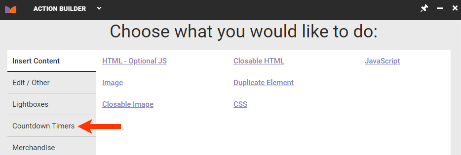
- Select the type of countdown timer you want to use in the action.
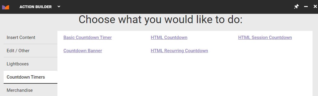
- If you selected Basic Countdown Timer or Countdown Banner in the previous step, use one of the three options explained in Inserting Images into Actions in this documentation to select a background or banner image, respectively. If you selected an HTML-based countdown timer option, skip to the next step.
- Use the element selector tool to specify where on the site you want the countdown timer to appear.
- Configure the options on the Details tab to customize the countdown timer. See Customize an Action for more information.
Inserting or Editing HTML Code
You can build an action that inserts or edits HTML code on your site without having to do any coding, unless you want to.
- Select HTML – Optional JS on the Insert Content tab if you want to include additional HTML code on your site.
- Select Edit HTML on the Edit/Other tab if you want to replace or modify existing HTML code on your site.
First, use the element selector tool to select where the HTML code should appear or where the HTML code the action edits exists. Next, configure the settings as necessary on the Details tab. After that, click the HTML tab to define the change you want the action to make.
The default view of the HTML code editor is the WYSIWYG view.
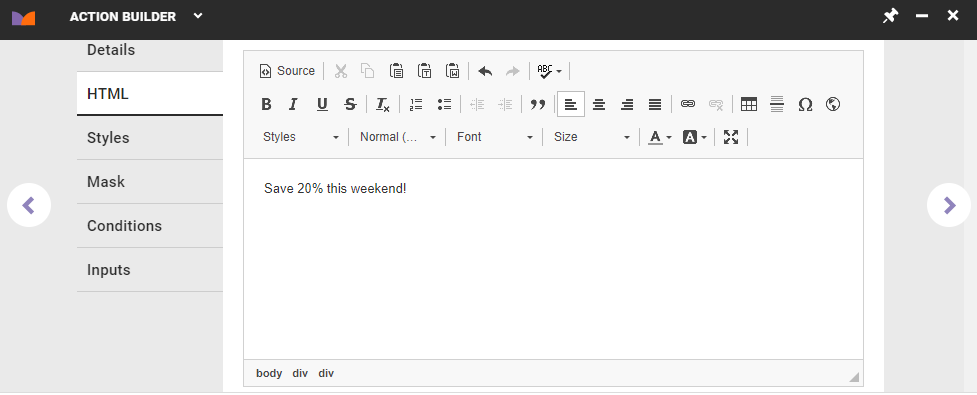
Click Source in the top-left corner of the editor to view and edit the code itself.
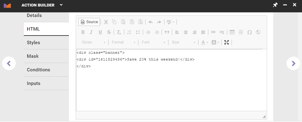
Click the triangle in the bottom-right corner of the code editor to resize it within the Action Builder panel.
Inserting or Editing CSS
The CSS option on the Insert Content tab allows you to include CSS that is appended to the DOM in a <style> or <link> element.
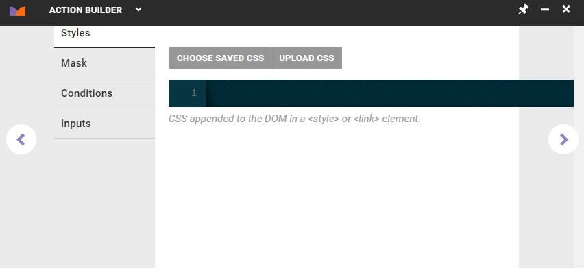
In addition to inputting code directly into the CSS editor, you can upload a file that contains the code, or you can reuse CSS that exists in Content Manager by clicking CHOOSE SAVED CSS and then selecting a CSS file on the Select CSS Creative modal.
The Styles tab also appears when you build certain other actions in Action Builder. The tab's content remains the same for these actions.
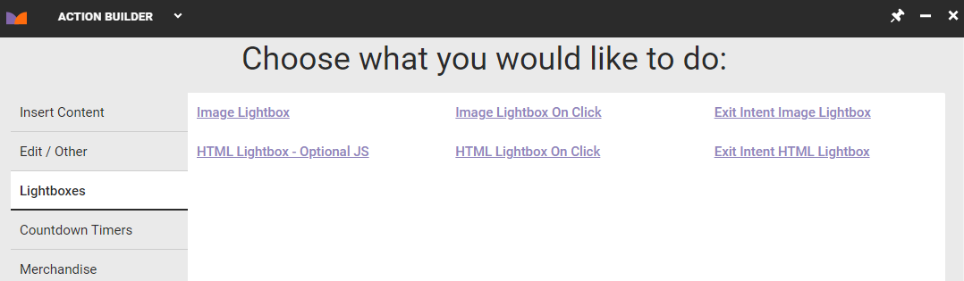
Inserting a Lightbox
The Lightboxes tab of Action Builder offers different types of lightbox actions that you can build.
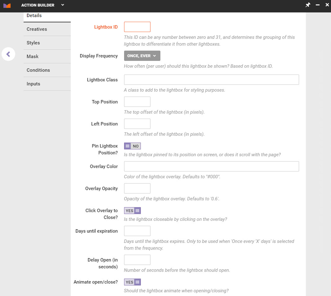
The Details tab contains the lightbox-specific settings.
Moving an Element
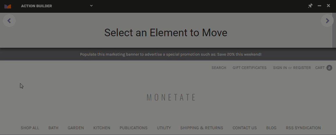
The Move action allows you to move a current element on your site to a new location on the page.
- Click the Edit/Other tab and then click Move Element.
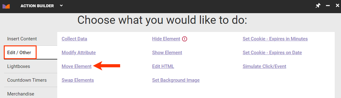
- Select the element that you want to move, and then click the forward button.
- Select the element whose position you want your first element to move into and then click the forward button.
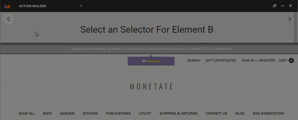
Swapping Two Elements
The Swap Elements action allows you to swap the position of two elements on your site.
- Click the Edit/Other tab, and then click Swap Elements.
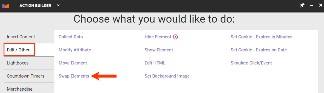
- Select the first element that you want to swap, and then click the forward button.
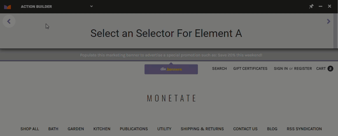
- Select the second element you want to swap, and then click the forward button.
Hiding an Element
The Hide Element action allows you to hide an existing element on your site.
- Click the Edit/Other tab, and then click Hide Element.
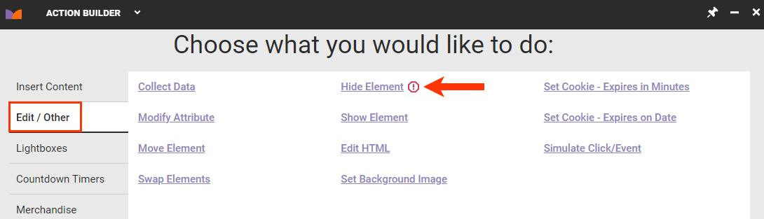
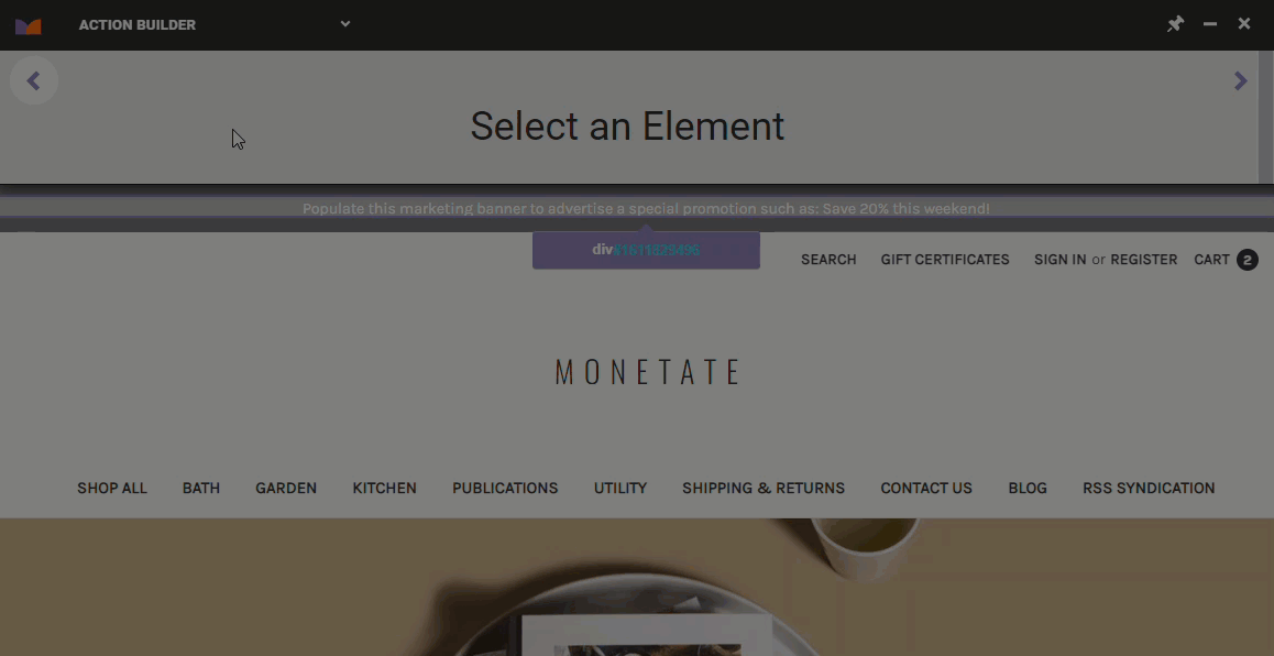
- Place your mouse pointer on the site element that you want to hide, and click it to see it disappear.
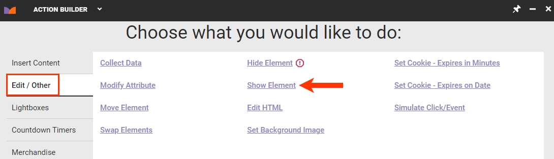
Showing an Element
The Show Element action allows you to show an element on your site that is currently hidden based on your site's code. For example, if you have discounted shipping rates that are normally hidden, then you can use a Show Element action to show them in a Web experience.
You can only use the Show Element action with elements on your site that are hidden.