You can further define and configure your action by entering optional information in the tabs that appear in Action Builder. The available tabs are contingent upon the action you create and may include the following:
- Details
- Creatives
- HTML
- Styles
- Conditions
- Inputs
Details
In the Details tab, you can configure available options for the action. The options for this tab are dependent on the action type, illustrated in the examples below.
For Image Actions
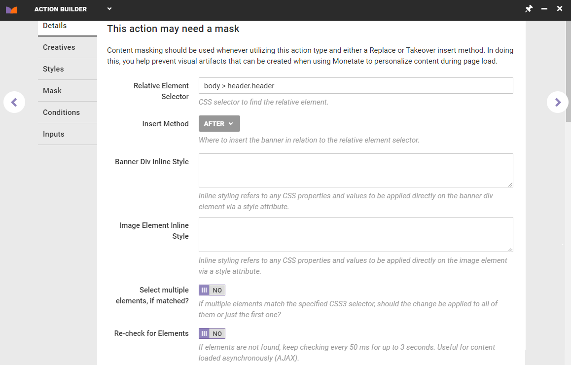
An image action gives you the options for element selector, selecting all elements, and polling for matched elements.
For Lightbox Actions
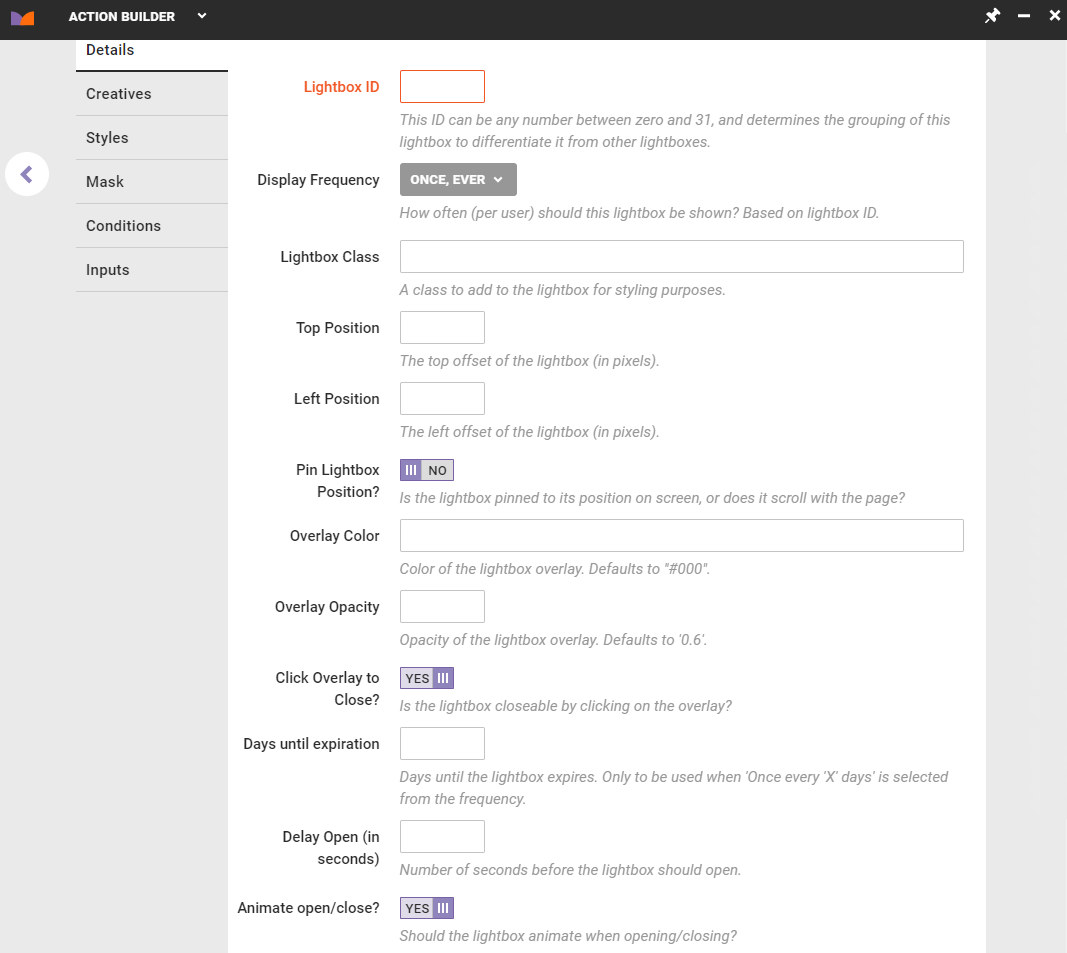
A lightbox action gives you the options for the lightbox ID, display frequency, lightbox container class, and more.
For Countdown Timer Actions
All the options to adjust the appearance of a countdown timer are on the Details tab.
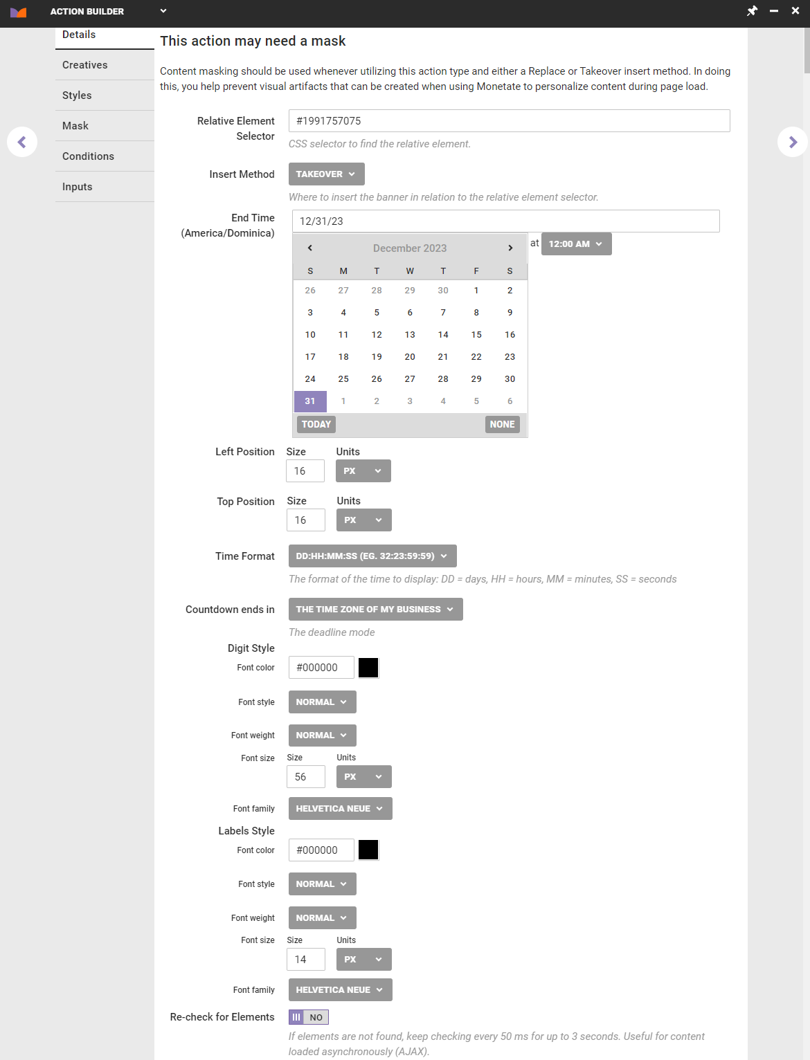
The options include the following:
- Relative Element Selector: Allows manual adjustment of the element selector
- Insert Method: Determines where, in relation to the selected element, the timer is inserted
- End Time: Determines the date and time when the countdown expires
- Left Position: Adjusts the timer's horizontal position on the background image
- Top Position: Adjusts the timer's vertical position on the background image
- Time Format: Determines the timer format in days, hours, minutes, and seconds
- Countdown ends in: Determines the time zone that the countdown ends in; use your time zone or set a rolling deadline that corresponds to the time zone of your site visitors
- Digit Style: Adjusts the font, color, style, weight, and size of the timer numerals
- Labels Style: Adjusts the font, color, style, weight, and size of the timer letters
- Re-check for Elements: Allows for polling to look for AJAX site elements
You can also add your own custom fonts to countdown timer actions. You can do this with CSS styling on the Styles tab in Action Builder. If the font you want to use is already present on your site, you can adapt the following CSS code so that it shows the digits in the font that you prefer:
.mt_countdown_timer_digits {
font-family: 'your font name' !important;
}
You can also change the font for the labels with the following code:
.mt_countdown_timer_labels {
font-family: 'your font name' !important;
}
The code below is an example of how to hide the seconds in your countdown timer:
.mt_countdown_timer_container div:nth-child(6),
.mt_countdown_timer_container div:nth-child(7) {
  display: none;
}
Creatives
The Creatives tab contains options that give you the ability to further define the action and edit the image using Content Builder. To edit the image, click EDIT to launch Content Builder with the image asset and any existing dynamic text and click zones included.
The Creatives tab only appears when you insert or edit an image, background image, or lightbox.
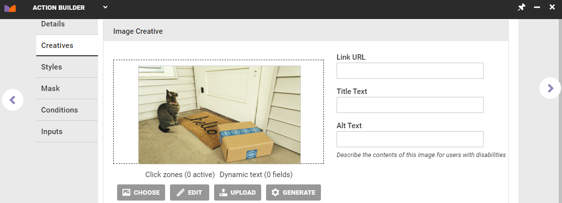
Refer to the documentation in the Content Builder category of the knowledge base for more information about editing an image using this tool.
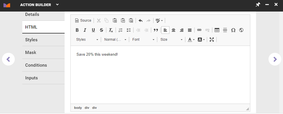
HTML
The HTML tab appears in Action Builder only when you're building an action that inserts or edits HTML code.
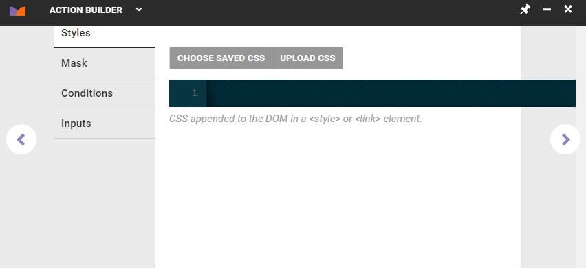
Styles
The Styles tab contains a CSS code editor for styling an action. You can specify the alignment, margins, and padding for the action. Changing the CSS here appends those changes inline to the element or the container.
CSS and Responsive Click Zones
To create responsive click zones for image actions, you must include a few CSS styles.
Image Container Styles
Set the max-width value to the width of the included content creative in pixels.
max-width: ###px;Image Styles
Set the max-width value to 100% to allow an image's click zones to scale with the image.
max-width: 100%;Mask
Use the settings on the Mask tab to enable content masking on your site.
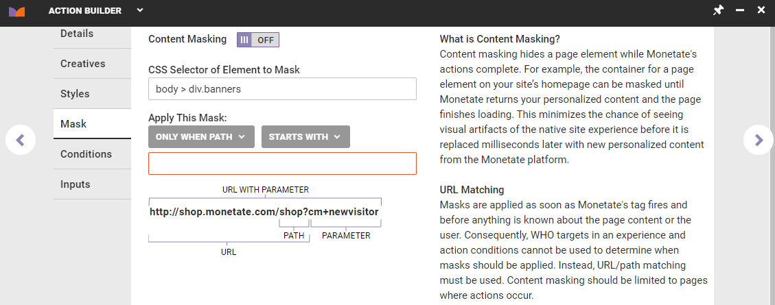
Content masking is important to allow certain actions to work as expected. You should enable content masking for any hide/show actions, especially if your site uses the synchronous version of the Monetate tag. See Content Masking for more information.
Conditions
Define the rules for when the action should appear on your site by configuring these options available on the Conditions tab:
- Page type
- URL
- Time
- Cart value
- Landing page
- Page breadcrumb
- Page category
- On product page
- On index page
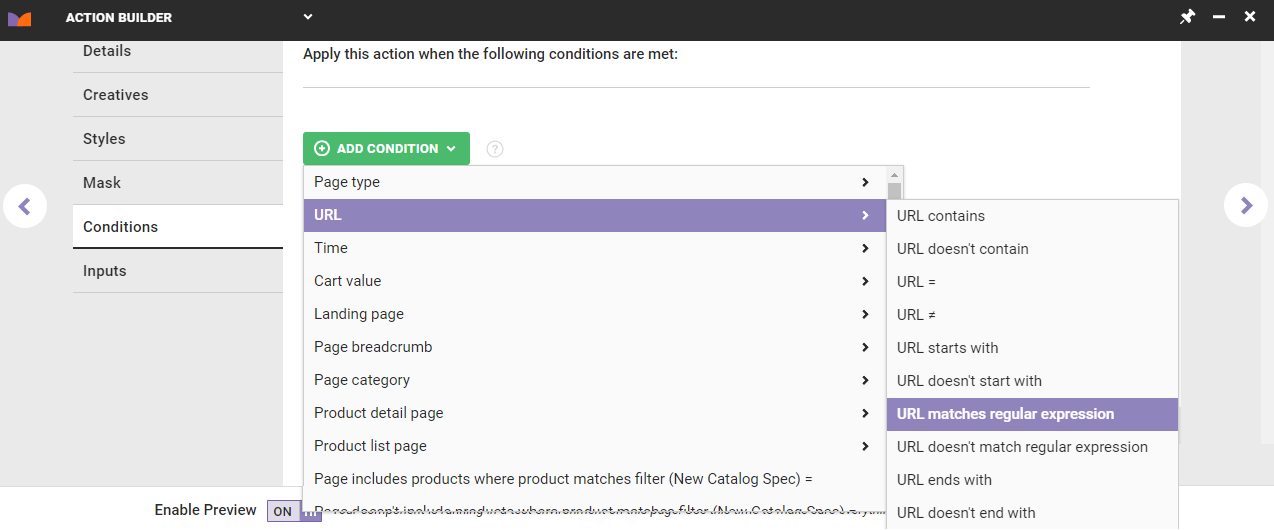
You can add conditions to an action for more-specific targeting or to ensure the action is only triggered under certain circumstances.
Inputs
Use the options on the Inputs tab to determine what action settings can be changed at the experience level. The selections you make on this tab are key for making an action reusable.
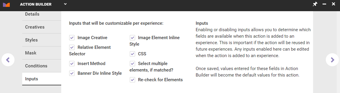
The options available on the Inputs tab depends on the action type.
Naming an Action
The final step of building an action in Action Builder is to name and save it. Give the action a unique name and include a brief description.
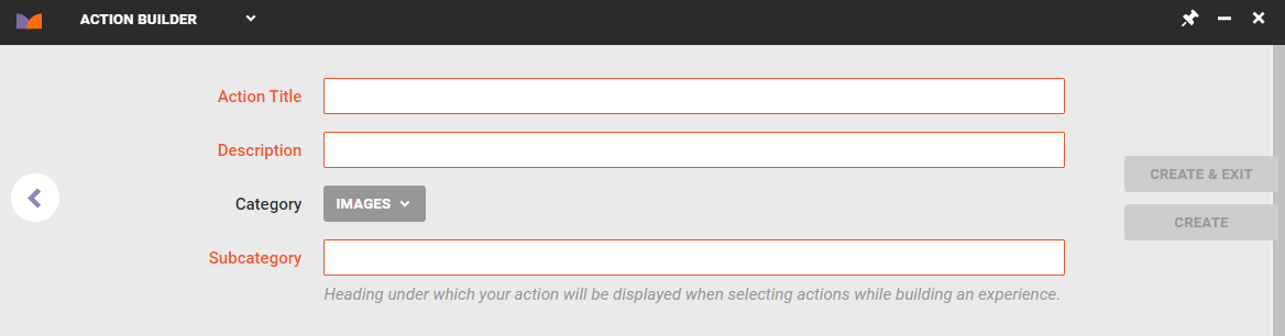
The category selected is based on the type of action you chose to build and corresponds to the options on the Action Type panel when you're configuring a Web experience. Therefore, you don't need to change that setting.
Inputting a subcategory is optional, but including one can help you keep the individual actions you create in each category organized because the subcategory you input in Action Builder is used as a heading on the panel of individual action options when configuring a Web experience.
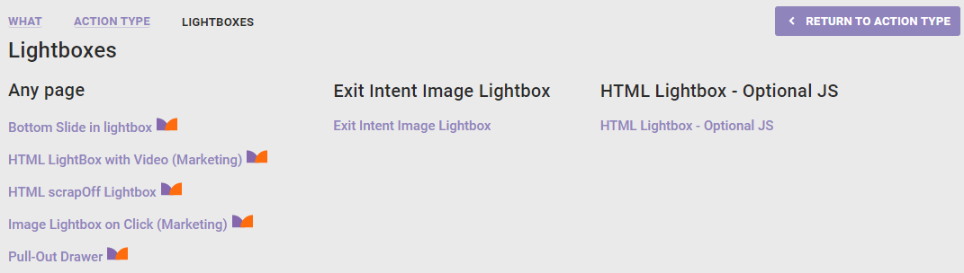
In the screenshot above, the "Any page," "Exit Intent Image Lightbox," and "HTML Lightbox — Optional JS" headings correspond to subcategories input in Action Builder.
Finally, click CREATE & EXIT.
Ensure that you test the new action before using it in a live experience. See Test an Action for instructions.