A lightbox is an image overlay that takes control of the rest of your site when a customer exhibits a certain behavior or arrives on a certain page type.
Lightboxes can be an effective way to direct customers' attention to a specific site element or image.
Types of Lightboxes
You can create these types of lightboxes in Monetate:
- Image: This standard lightbox focuses on an image.
- HTML with Optional JS: This lightbox action contains HTML and JavaScript that you can customize.
- Lightbox on Click: You can build an image-based version of this type of lightbox as well as a version that contains HTML and JavaScript. On-click lightboxes open when a customer clicks a specific element instead of on opening or arriving on a page.
- Exit Intent Lightbox: You can build an image-based version of this type of lightbox as well as a version that contains HTML and JavaScript. Exit-intent lightboxes open when a customer moves their mouse pointer out of the window.
Lightbox ID
The lightbox ID, which can be any number between zero and 31, determines the grouping for the lightbox. If you want to group the display frequency of a lightbox with other Monetate lightboxes, then choose an ID that matches those lightboxes. If a customer qualifies for more than one experience with the same ID, then the experience with the highest priority appears.
If you want a lightbox to remain independent of any grouping, ensure that its ID is different from all other Monetate lightboxes. If two lightboxes have the same ID and are running concurrently, then customers who qualify only see the lightbox with a higher experience priority. If the lightboxes have different IDs and a customer qualifies for both, then they could see both lightboxes in the same session.
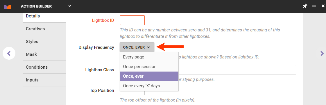
Understanding Lightbox Frequency
The Display Frequency setting determines how often a customer sees a lightbox, or stateful action, through the use of a cookie. The cookie is based on a lightbox identifier number between 0 and 31 and the option set for Display Frequency. When you set both inputs, they distinguish this experience's lightbox (or action) from any other lightboxes (or actions) using the same ID. You thus have total control over the frequency at which a lightbox is shown to a particular customer or audience segment.
Lightbox Session
Most session measurements within the Monetate platform correspond to the Monetate session. However, when calculating display frequency for lightboxes, Monetate uses the same definition that browsers use for session cookies. While this definition can vary from browser to browser, a session generally ends when the user closes the browser window or when the user has been inactive for a specified amount of time, typically 20 minutes.
Every Page
Lightboxes that display on every page don't require any cookie to control frequency. Therefore, a customer who qualifies for the lightbox experience sees it on every page if you don't set any other guidelines. You should set guidelines at the experience level for this frequency so that customers aren't overwhelmed by a lightbox on every page of your site. Otherwise, the frequency is "always show," as long as action conditions and WHO targets allow this action to fire.
Once Per Session
This setting is the one most commonly used. Customers see a lightbox one time per lightbox session.
The cookie name for the lightbox state is mt.s-lbx. It expires at the end of a session (s = session).
Once, Ever
Customers only see a lightbox once, ever. Use this setting sparingly due to its implications for the lightbox ID. If you used this setting one time with every available lightbox ID (0–31) and a user qualified to see every lightbox one time, then they would never see any other lightbox you create because you have already used all the available IDs.
The cookie name for this lightbox state is mt.i-lbx. It never expires (i = infinite), although the actual value is 10 years. A lightbox set to Once, Ever only uses the mt.i-lbx infinite cookie to ensure that it won't appear again and flip the mc.lightboxState.lightboxShown flag to tell Monetate's lightbox ops that the customer has seen this lightbox previously and should not be shown it again.
Once Every 'X' Days
Customers who qualify for the lightbox experience see it once and are eligible to see the lightbox again in a number of days that you specify if you don't set any other guidelines. If you use the Once Every 'X' Days option, then you must specify the number of days in the Days until expiration field in the Optional Inputs section of the action template.
When referring to user or customer for the Display Frequency setting, the Monetate ID determines the user. If the user clears their cookies, they're considered a new user and thus qualify for the lightbox again.
The cookie name for this lightbox state is mt.c-lbx. It expires in X number of days (c = custom).
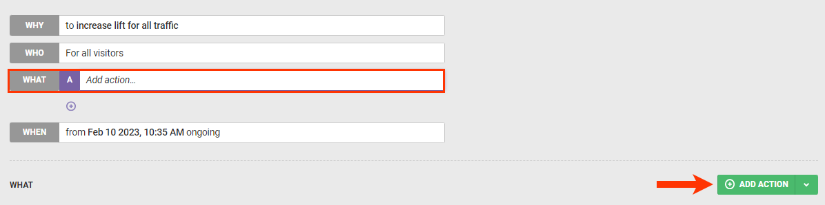
Adding a Lightbox to an Experience
Follow these steps to add a lightbox to a Web experience.
- On the Experience Editor page, click WHAT and then click ADD ACTION.
- Click Lightboxes.
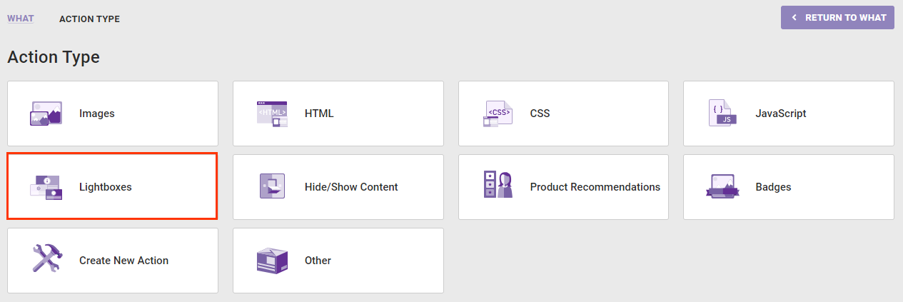
- Select the lightbox action template that you want to use.
- Configure the lightbox action.
Lightboxes serve to capture customers' attention, not annoy them. Monetate only serves a maximum of one lightbox per page and doesn't serve a series of lightboxes that fire when a customer closes the previous lightbox.
You can find options to build these lightbox actions on the Lightboxes tab of Action Builder.
Image Lightbox Action
The Image Lightbox action displays an image by filling the screen and dimming the rest of the page with a semitransparent overlay. You can close the lightbox by clicking either the overlay mask or a close button incorporated into the image with a click zone. The action also appends included CSS styles in the <head> of the page.
Required Components
Image Creative
Monetate displays the uploaded creative on the page as part of a full-page overlay. This image supports click zones used either as links or as a close button when you set the click zone URL to #close.
Lightbox ID
The lightbox ID is an identifier number that you select between 0 and 31 that's used to distinguish this experience's lightbox from any other lightboxes and their display frequencies. The cookie-based lightbox ID distinguish this action from any other lightboxes or banners with the same ID. The banner with this ID is then shown to a customer based on the display frequency settings and can be dismissed after it has loaded or on user interaction.
Display Frequency
This input works with the lightbox ID to control the frequency that a lightbox is shown to a specific customer or audience segment. Several options are available:
- Every page
- Once per session
- Once, ever
- Once every 'X' days
If you select Once every 'X' days, then you must specify the number of days in the Days until expiration field in the Optional Inputs section.
Optional Components
CSS Style
Monetate appends anything you add to the CSS editor to a stylesheet in the <head> portion of your site in a <style> block. These styles are available on this page for use with any page elements.
Lightbox Class
This input appends a class to the lightbox content wrapper for styling purposes.
By default, the lightbox has an ID of #monetate_lightbox_content_container. However, Monetate uses this ID to wrap all lightboxes, so an additional class is useful to apply specific styles only to certain lightboxes.
Top Position
This input sets the distance in pixels of the lightbox content from the top of the viewport. By default, the lightbox content is 15% of the total height of the customer's screen from the top of the viewport.
Left Position
This input sets set the distance in pixels of the lightbox content from the left side of the viewport. By default, the lightbox content is centered within the viewport.
Pin Lightbox Position
This setting controls the position property of the lightbox content.
If you set this input to NO, then Monetate sets the lightbox position to relative and the lightbox content doesn't scroll with the page. If you set the input to YES, then Monetate sets the lightbox content position to fixed and the lightbox content scrolls with the page.
Overlay Color
This input controls the background-color property of the lightbox overlay mask. It accepts HTML color codes (for example, red), hex color codes (for example, #ff0000), or RGB values (for example, rgb(255, 0, 0)). The default color is #000 (black).
Overlay Opacity
This input controls the opacity property of the lightbox overlay mask. It accepts any value between 0.00 and 1.00. The default value is 0.6.
Closeable via Overlay
This input determines whether the lightbox closes when the customer clicks the lightbox overlay mask.
If you select YES, then the lightbox closes when the customer clicks the overlay mask. If you select NO, then the lightbox doesn't close if the customer clicks the overlay mask.
If you select NO, then you must include a #close click zone. Otherwise, a customer cannot close the lightbox at all.
Days Until Expiration
Only use this input if you selected Once every 'X' days from Display Frequency. This option sets the number of days until the lightbox expires and accepts any numeric value.
Delay Open
This input sets the delay timer in seconds that Monetate waits until launching the lightbox. It accepts any numeric value.
Animate Open/Close
This setting controls whether the lightbox content fades in. If you select YES, then the lightbox fades in when the customer opens or closes it. If you select NO, then the lightbox appears on the page and closes without any animation.
HTML Lightbox with Optional JavaScript Action
The HTML Lightbox — Optional JS action displays HTML content by filling the screen and dimming the rest of the page with a semitransparent overlay. You can close the lightbox by clicking either the overlay mask or a close button incorporated into the HTML via a defined class attribute. The action also appends included CSS styles in the <head> of the page and runs any included JavaScript.
Required Components
HTML
The HTML content you input into the HTML code editor appears on the page as part of a full-page overlay that dims all other content on the page with a semitransparent mask.
Any HTML content with the proper class binds to the close button function. Close button classes should correspond to the optional close button class input or use the default lightboxClose class. You can also use a link with a #close href.
Lightbox Width
This input controls the width of the lightbox in pixels.
Lightbox Height
This input controls the height of the lightbox in pixels.
Lightbox ID
The basic lightbox identifier is a number that you select between 0 and 31. It's used to distinguish an experience's lightbox from any other lightboxes and their display frequencies.
Display Frequency
This input works with the lightbox ID to control the frequency that a lightbox is shown to a specific customer or audience segment. Several options are available:
- Every page
- Once per session
- Once, ever
- Once every 'X' days
If you select Once per 'X' days, then you must specify the number of days in Days until expiration, which is in the Optional Inputs section of the action configuration.
Optional Components
JavaScript
Monetate appends anything you input into the JavaScript editor to your site. It loads in a <script> tag and executes when the action fires. Any variables or functions are available on this page for reference by other page elements or additional actions.
CSS Style
Monetate appends anything you add in the CSS editor to a stylesheet in the <head> portion of your site within a <style> block. These styles are available on this page for use with any page element.
Close Button Class
By default, the HTML lightbox binds a close function to any element within the HTML content with a class of lightboxClose, but you can add an additional close button class with this input.
Top Position
This input sets the distance in pixels of the lightbox content from the top of the viewport. By default, the lightbox content is 15% of the total height of the customer's screen from the top of the viewport.
Left Position
This input sets set the distance in pixels of the lightbox content from the left side of the viewport. By default, the lightbox content is centered within the viewport.
Pin Lightbox Position
This setting controls the position property of the lightbox content.
If you select NO, then Monetate sets the lightbox position to relative and the lightbox content doesn't scroll with the page. If you select YES, then Monetate sets the lightbox content position to fixed and the lightbox content scrolls with the page.
Overlay Color
This input controls the background-color property of the lightbox overlay mask. It accepts HTML color codes (for example, red), hex color codes (for example, #ff0000), or RGB values (for example, rgb(255, 0, 0)). The default color is #000 (black).
Overlay Opacity
This setting controls the opacity property of the lightbox overlay mask. It accepts any value between 0.00 and 1.00. The defaults value is 0.6.
Closeable via Overlay
This input determines whether the lightbox closes when the customer clicks the lightbox overlay mask.
If you select YES, then the lightbox closes when the customer clicks the overlay mask. If you select NO, then the lightbox doesn't close if the customer clicks the overlay mask.
If you select NO, then you must include a #close click zone. Otherwise, a customer cannot close the lightbox at all.
Days Until Expiration
Only use this input if you selected Once every 'X' days from Display Frequency. This option sets the number of days until the lightbox expires and accepts any numeric value.
Delay Open
This input sets the delay timer in seconds that Monetate waits until launching the lightbox. It accepts any numeric value.
Animate Open/Close
This setting controls whether the lightbox content fades in. If you select YES, then the lightbox fades in when the customer opens or closes it. If you select NO, then the lightbox appears on the page and closes without any animation.
Image Lightbox On Click Action
The Image Lightbox On Click action displays an image by filling the screen and dimming the rest of the page with a semitransparent overlay. A customer triggers this lightbox when they click a defined page element and closes it by clicking either the overlay mask or a close button incorporated into the image with a click zone. The action also appends included CSS styles in the <head> of the page.
Required Components
Relative Element Selector
Input the element selector in the Relative Element Selector field. This selector defines what element on the page the customer must click to trigger the lightbox. For additional information on selectors, refer to Element Selectors.
Image Creative
Monetate displays the uploaded image on the page as part of a full-page overlay. This image supports click zones used as links or as a close button when you set the click zone URL to #close.
Lightbox ID
The lightbox ID is an identifier number that you select between 0 and 31 that's used to distinguish this experience's lightbox from any other lightboxes and their display frequencies. The cookie-based lightbox ID distinguish this action from any other lightboxes or banners with the same ID. The banner with this ID is then shown to a customer based on the display frequency settings and can be dismissed after it has loaded or on user interaction.
Display Frequency
This input works with the lightbox ID to control the frequency that a lightbox is shown to a specific customer or audience segment. Several options are available:
- Every page
- Once per session
- Once, ever
- Once every 'X' days
If you select Once every 'X' days, then you must specify the number of days in the Days until expiration field in the Optional Inputs section.
Optional Components
Pin Lightbox Position
This input controls the position property of the lightbox content.
If you select NO, then Monetate sets the lightbox position to relative and the lightbox content doesn't scroll with the page. If you select YES, then Monetate sets the lightbox content position to fixed and the lightbox content scrolls with the page.
Top Position
This input sets the distance in pixels of the lightbox content from the top of the viewport. By default, the lightbox content is 15% of the total height of the customer's screen from the top of the viewport.
Left Position
This input sets set the distance in pixels of the lightbox content from the left side of the viewport. By default, the lightbox content is centered within the viewport.
Overlay Color
This input controls the background-color property of the lightbox overlay mask. It accepts HTML color codes (for example, red), hex color codes (for example, #ff0000), or RGB values (for example, rgb(255, 0, 0)). The default color is #000 (black).
Overlay Opacity
This input controls the opacity property of the lightbox overlay mask. It accepts any value between 0.00 and 1.00. The default value is 0.6.
CSS Style
Anything you add to the CSS editor is appended to a stylesheet in the <head> portion of your site in a <style> block. These styles are available on this page for use with any page elements.
Select All Elements
The Select multiple elements, if matched? toggle allows you to apply the action to the first occurrence of the element selector or all occurrences of the selector, if multiple exist.
Selecting NO applies the action to the first occurrence. Selecting YES applies the action to all occurrences.
Days Until Expiration
Only use this input if you selected Once every 'X' days from Display Frequency. This option sets the number of days until the lightbox expires and accepts any numeric value.
HTML Lightbox On Click Action
The HTML Lightbox On Click action displays HTML content by filling the screen and dimming the rest of the page with a semitransparent overlay. You can close the lightbox by clicking either the overlay mask or a close button incorporated into the HTML with a defined class attribute. The action also appends included CSS styles in the <head> of the page.
Required Components
HTML
The HTML content you input into the HTML code editor appears on the page as part of a full-page overlay that dims all other content on the page with a semitransparent mask.
Any HTML content with the proper class binds to the close button function. Close button classes should correspond to the optional close button class input or use the default lightboxClose class. You can also use a link with a #close href.
Lightbox Width
This input controls the width of the lightbox in pixels.
Lightbox Height
This input controls the height of the lightbox in pixels.
Lightbox ID
The basic lightbox identifier is a number that you select between 0 and 31. It's used to distinguish an experience's lightbox from other lightboxes and their display frequencies.
Display Frequency
This input works with the lightbox ID to control the frequency that a lightbox is shown to a specific customer or audience segment. Several options are available:
- Every page
- Once per session
- Once, ever
- Once every 'X' days
If you select Once per 'X' days, then you must specify the number of days in Days until expiration, which is in the Optional Inputs section of the action configuration.
Optional Components
CSS Style
Monetate appends anything you add in the CSS editor to a stylesheet in the <head> portion of your site in a <style> block. These styles are available on this page for use with any page element.
Close Button Class
By default, the HTML lightbox binds a close function to any element within the HTML content with a class of lightboxClose, but you can add an additional close button class with this input.
Pin Lightbox Position
This setting controls the position property of the lightbox content.
If you set this input to NO, then Monetate sets the lightbox position to relative and the lightbox content doesn't scroll with the page. If you set the input to YES, then Monetate sets the lightbox content position to fixed and the lightbox content scrolls with the page.
Top Position
This input sets the distance in pixels of the lightbox content from the top of the viewport. By default, the lightbox content is 15% of the total height of the customer's screen from the top of the viewport.
Left Position
This input sets set the distance in pixels of the lightbox content from the left side of the viewport. By default, the lightbox content is centered within the viewport.
Overlay Color
This input controls the background-color property of the lightbox overlay mask. It accepts HTML color codes (for example, red), hex color codes (for example, #ff0000), or RGB values (for example, rgb(255, 0, 0)). The default color is #000 (black).
Overlay Opacity
This input controls the opacity property of the lightbox overlay mask. It accepts any value between 0.00 and 1.00. The defaults value is 0.6.
Days Until Expiration
Only use this input if you selected Once every 'X' days from Display Frequency. This option sets the number of days until the lightbox expires and accepts any numeric value.
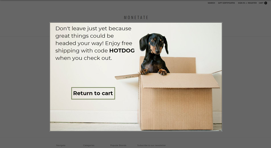
Exit Intent Image Lightbox Action
The Exit Intent Image Lightbox action displays an image by filling the screen and dimming the rest of the page with a semitransparent overlay. This lightbox is triggered when the customer moves their mouse pointer over a defined area of the viewport. The customer can close the lightbox by clicking either the overlay mask or a close button included in the image using a click zone. The action also appends included CSS styles in the <head> of the page and runs any included JavaScript.
Required Components
Image Creative
The uploaded creative image appears on the page as part of a full-page overlay that dims all other content on the page with a semitransparent mask. This image creative supports click zones for links. You can also use a click zone as a close button by setting the click zone URL to #close.
Lightbox ID
The lightbox ID is an identifier number that you select between 0 and 31 that's used to distinguish this experience's lightbox from any other lightboxes and their display frequencies. The cookie-based lightbox ID distinguish this action from any other lightboxes or banners with the same ID. The lightbox with this ID is then shown to a customer based on the display frequency settings and can be dismissed after it has loaded or on user interaction.
Display Frequency
This input works with the lightbox ID to control the frequency that a lightbox is shown to a specific customer or audience segment. Several options are available:
- Every page
- Once per session
- Once, ever
- Once every 'X' days
If you select Once every 'X' days, then you must specify the number of days in the Days until expiration field in the Optional Inputs section.
Optional Components
Lightbox Opens on Mouseout
This input controls whether the lightbox opens when the customer's mouse pointer leaves the viewport.
If you select YES, then the lightbox appears when the mouse pointer leaves the browser. If you select NO, then the lightbox appears on page load, like a normal lightbox.
Closeable via Overlay
The Click Overlay to Close setting determines if the lightbox closes when the customer clicks the lightbox overlay mask.
If you select YES, then the lightbox closes when the customer clicks the overlay mask. If you select NO, then the lightbox doesn't close if the customer clicks the overlay mask.
If you select NO, then you must include a #close click zone, or else a customer cannot close the lightbox at all.
JavaScript
Anything you add in the JavaScript editor is appended to your site. It is loaded in a <script> tag and executed when the action fires. Any variables or functions are available on this page to be referenced by other page elements or additional actions.
Pin Lightbox Position
This setting controls the position property of the lightbox content.
If you select NO, then the lightbox position is set to relative and the lightbox content doesn't scroll with the page. If you select YES, then the lightbox content position is set to fixed and the lightbox content scrolls with the page.
Left Position
This input sets the distance in pixels of the lightbox content from the left side of the viewport. By default, the lightbox content is centered within the viewport.
Top Position
This input sets the distance in pixels of the lightbox content from the top of the viewport. By default, the lightbox content is 15% of the total height of the customer's screen from the top of the viewport.
Overlay Color
This input controls the background-color property of the lightbox overlay mask. It accepts HTML color codes (for example, red), hex color codes (for example, #ff0000), or RGB values (for example, rgb(255, 0, 0)). Its default color is #000 (black).
Overlay Opacity
This input controls the opacity property of the lightbox overlay mask. It accepts any value between 0.00 and 1.00. The defaults value is 0.6.
CSS Style
Anything you add in the CSS editor is appended to a stylesheet in the <head> portion of your site within a <style> block. These styles are available on this page for use with any page elements.
Delay Open
This input determines how long in seconds the lightbox must wait to open. It accepts any numeric value.
Ignore Mouse Exiting Options
The Ignore mouse exiting on left, Ignore mouse exiting on right, Ignore mouse exiting on top, and Ignore mouse exiting on bottom settings determine if the lightbox is or is not triggered if the customer's mouse pointer leaves the window in the direction specified.
Selecting YES means that the mouse pointer can leave the window from the designated direction without triggering the lightbox. Selecting NO means that the lightbox is triggered when a customer moves their mouse pointer out of the window in the direction specified in the setting.
These settings can prevent a customer from unnecessarily triggering the lightbox unless a customer exhibits "exit intent." For example, if you want to allow a customer who uses Windows to move their mouse pointer to the bottom-left corner of their browser window, presumably to click the Start button, then you would select YES for Ignore mouse exiting on left and Ignore mouse exiting on bottom to target the experience to all Windows users.
If a customer moves their mouse pointer up to the browser navigation bar or to the close button, typically at the top right of the browser on Windows devices, then you can safely presume they want to close the browser window or tab or to navigate to another site. This behavior displaying an intent to exit your site is when you want to trigger the lightbox.
Days Until Expiration
Specify in Days until expiration the frequency interval if you selected Once every 'X' days for Display Frequency. This field accepts any numeric value.
Animate Open/Close
This setting controls whether the lightbox content fades in. If you select YES, then the lightbox fades in when the customer opens or closes it. If you select NO, then the lightbox appears on the page and closes without any animation.
Exit Intent HTML Lightbox Action
The HTML Exit Intent Lightbox action displays HTML content by dimming the rest of a page with a semitransparent overlay. Monetate triggers this lightbox when a customer moves their mouse pointer over a defined area of the viewport. The customer closes the lightbox by clicking either the overlay mask or a close button included in the image via a click zone. This action also appends included CSS styles in the <head> of the page.
Required Components
HTML
HTML content that you input into the HTML code editor is displayed on the page as part of a full-page overlay that dims all other content on the page with a semitransparent mask.
Any HTML content with the proper class binds to the close button function. Elements within the HTML that have a class of lb-close or #close href act as close buttons.
Lightbox Width
This input controls the width of the lightbox in pixels.
Lightbox Height
This input controls the height of the lightbox in pixels.
Lightbox ID
The basic lightbox identifier number between zero and 31 that you select. It sets a cookie-based lightbox ID to distinguish this action from any other lightboxes or banners with the same ID and their display frequencies. The lightbox with this ID is then shown to a customer based on the display frequency settings and can be dismissed after it has loaded or on user interaction.
Display Frequency
This input controls the frequency that a lightbox is shown to a particular customer or audience segment. Select one of several available options:
- Every page
- Once per session
- Once, ever
- Once every 'X' days
If you select Once per 'X' days, then you must specify the number of days in Days until expiration in the Optional Inputs section.
Optional Components
Open Lightbox on Mouseout
This setting controls whether the lightbox opens when a customer's mouse pointer leaves the viewport. If you select YES, then the lightbox appears when the mouse pointer leaves the browser. If you select NO, then the lightbox displays on page load like a normal lightbox.
This functionality doesn't work on mobile devices, such as smartphones and tablets. You must select NO for the lightbox to appear on these devices.
Closeable via Overlay
The Click Overlay to Close? setting determines whether the lightbox closes when the customer clicks the lightbox overlay mask. If you select YES, then the lightbox closes when a customer clicks anywhere on the overlay. If you select NO, then the lightbox doesn't close when the customer clicks the overlay.
If you select NO, then you must include a #close click zone, or else the customer can't close the lightbox at all.
JavaScript
Anything you input in the JavaScript editor is appended to your site. Monetate loads it in a <script> tag and executes it when the action fires. Any variables or functions are available on this page for reference by other page elements or additional actions.
Pin Lightbox Position
This input controls the position property of the lightbox content.
If you select NO, then Monetate sets the lightbox position to relative and the lightbox content doesn't scroll with the page. If you select YES, then Monetate sets the lightbox content position to fixed and the lightbox content scrolls with the page.
Left Position
This input sets set the distance in pixels of the lightbox content from the left side of the viewport. By default, the lightbox content is centered within the viewport.
Top Position
This input sets the distance in pixels of the lightbox content from the top of the viewport. By default, the lightbox content is 15% of the total height of the customer's screen from the top of the viewport.
Overlay Color
This input controls the background-color property of the lightbox overlay mask. It accepts any HTML color codes (for example, red), hex color codes (for example, #ff0000), or RGB values (for example, rgb(255, 0, 0)). The default color is #000 (black).
Overlay Opacity
This input controls the opacity property of the lightbox overlay mask. It accepts any value between 0.00 and 1.00. The default value is 0.6.
CSS Style
Monetate appends anything you add to the CSS editor to a stylesheet in the <head> portion of your site within a <style> block. These styles are available on this page for use with any page elements.
Delay Open
Use Delay Open (in seconds) to determine how long in seconds you want Monetate to wait to launch the lightbox. It accepts any numeric value.
Ignore Mouse Exiting Options
The Ignore mouse exiting on left, Ignore mouse exiting on right, Ignore mouse exiting on top, and Ignore mouse exiting on bottom settings determine if the lightbox is or is not triggered if the customer moves their mouse pointer out of the window in the direction specified.
Selecting YES means that the mouse pointer can leave the window from the designated direction without triggering the lightbox. Selecting NO means that the lightbox is triggered when a customer moves their mouse pointer out of the window in the direction specified in the setting.
These settings can prevent a customer from unnecessarily triggering the lightbox unless they exhibits "exit intent." For example, if you want to allow a customer who uses Windows to move their mouse pointer to the bottom-left corner of their browser window, presumably to click the Start button, then you would select YES for Ignore mouse exiting on left and Ignore mouse exiting on bottom to target the experience to all Windows users.
If a customer moves their mouse pointer up to the browser navigation bar or to the close button, typically at the top right of the browser on Windows devices, then you can safely presume they want to close the browser window or tab or to navigate to another site. This behavior displaying an intent to exit your site is when you want to trigger the lightbox.
Days Until Expiration
Specify in Days until expiration the frequency interval if you selected Once every 'X' days for Display Frequency. This field accepts any numeric value.
Animate Open/Close
This setting controls whether the lightbox content fades in. If you select YES, then the lightbox fades in when the customer opens or closes it. If you select NO, then the lightbox appears on the page and closes without any animation.