
Follow these steps to create a Product Recommendations action that uses a single recommendation strategy or a slotted recommendation.
- Click COMPONENTS in the top navigation bar and then select Actions.
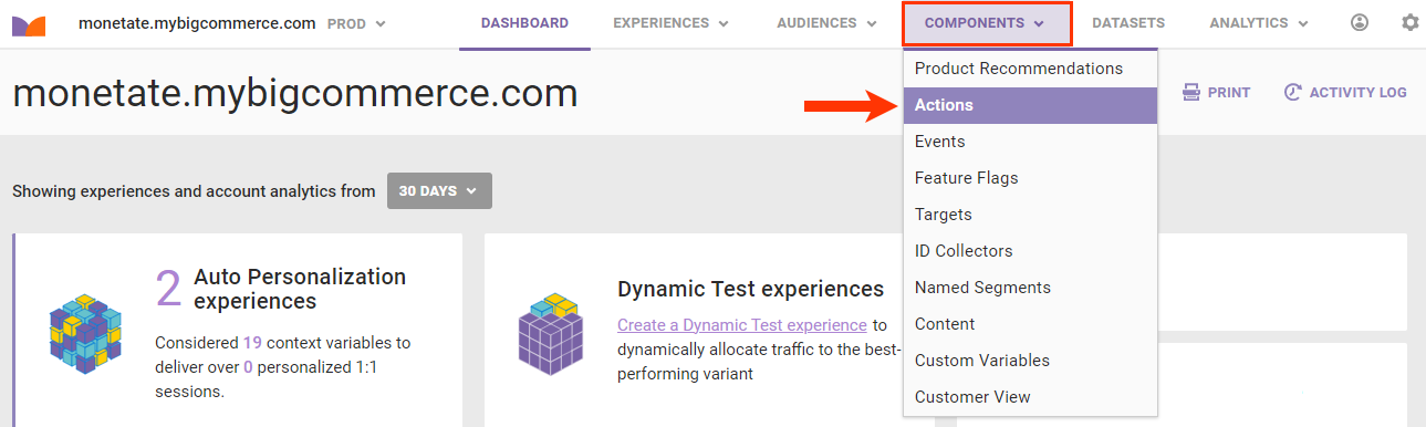
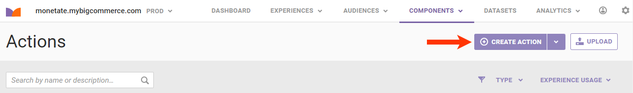
- Click CREATE ACTION.
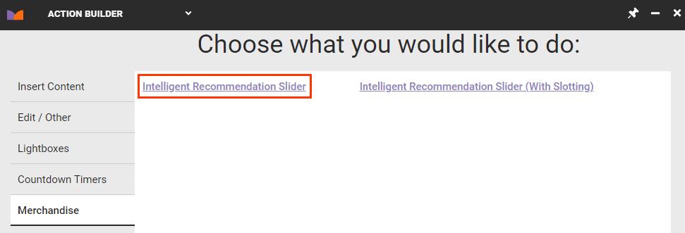
- Click the Merchandise tab and then click Intelligent Recommendation Slider.
- Select where on the page of your site you want the recommendation slider to appear, and then click the forward arrow. See Element Selectors for more information.
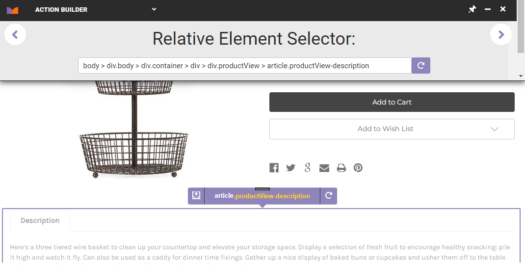
Clicking the forward arrow takes you to the Details tab.
Configuring the Details Settings
Follow these steps to configure the source of the recommendations that appear in the slider and the appearance of the slider.
- Configure as necessary the element-related options on the Details tab.
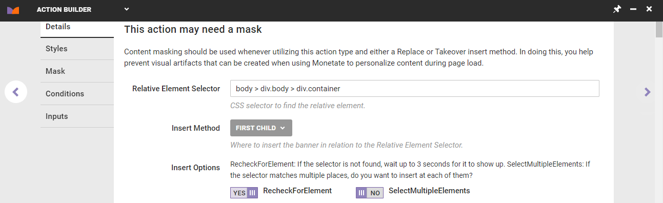
- Edit the selected node in Relative Element Selector.
- Select an option from Insert Method to determine where the recommendations slider should be inserted relative to the selected node in Relative Element Selector.
- Switch RecheckForElement from YES to NO only if you do not want Monetate to recheck for the selected node for up to 3 seconds if it doesn't find it immediately.
- Switch SelectMultipleElements from NO to YES if you want the platform to display the recommendations at every occurrence of the selected node on the page if it finds multiple occurrences.
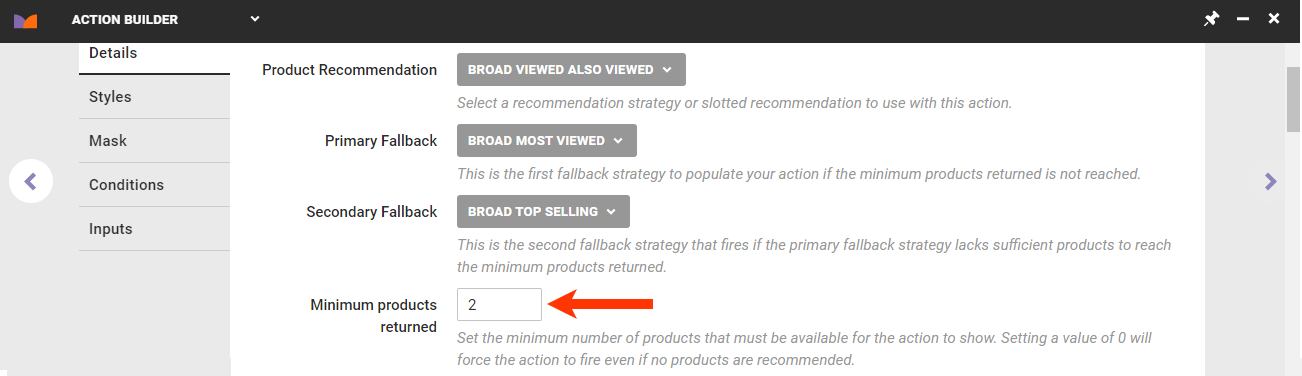
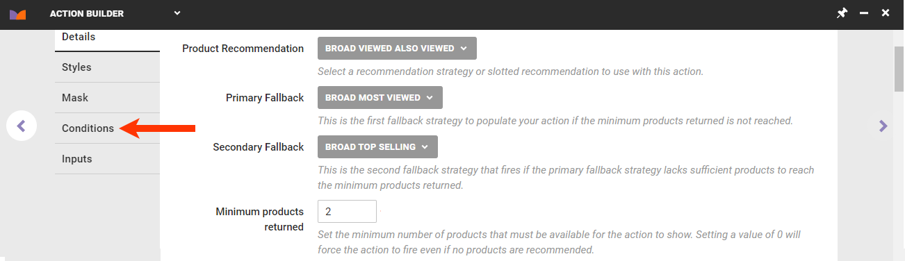
- Configure the sources of the recommended products.
- Select the main recommendation strategy or slotted recommendation that you want the action to use.
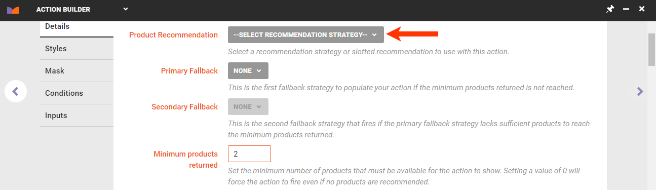
- Select the first fallback recommendation strategy from Primary Fallback that you want the action to use to supplement the main recommendation strategy or slotted recommendation if it can't display enough recommended products to meet the minimum that triggers the action.
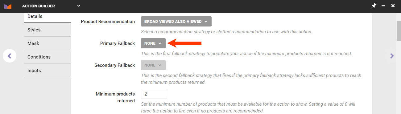
- Select the second fallback recommendation strategy from Secondary Fallback that you want the action to use if both the main recommendations source and the first fallback strategy can't display enough recommended products to meet the minimum that triggers the action.
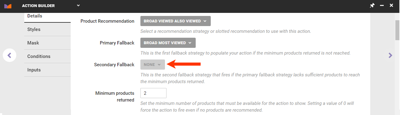
- Select the main recommendation strategy or slotted recommendation that you want the action to use.
- Enter into Minimum products returned the minimum number of recommended products that must be identified by the product recommendation sources for the action to appear on your site.
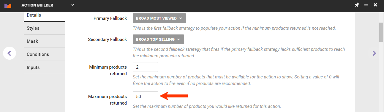
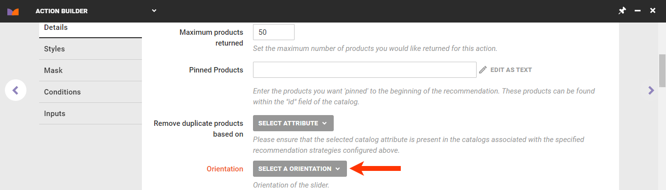
- Enter into Maximum products returned the maximum number of products to include in the recommendations results.
- Enter into Pinned Products the product IDs for any products that you want to always appear at the beginning of the slider.
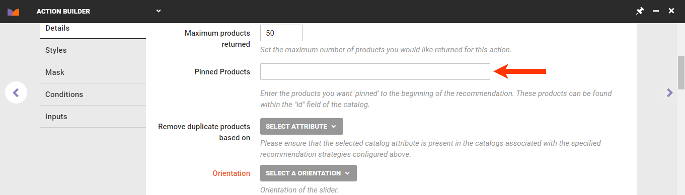
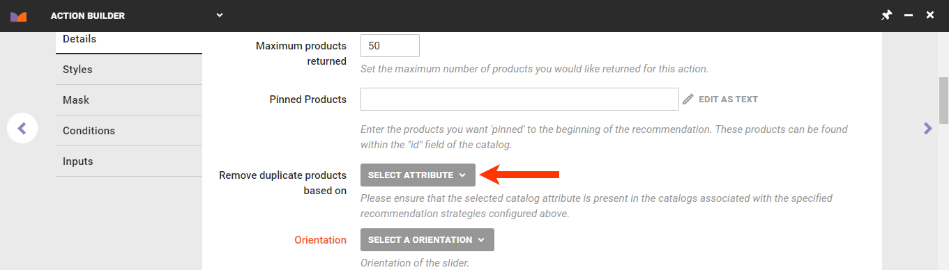
- Select a product catalog attribute on which duplicate recommended products are removed from the results.
- Select the movement of each panel of product images in the slider:
- Horizontal – Left to Right
- Horizontal – Right to Left
- Vertical
- Optionally, customize the HTML code that builds the slider structure in the Slider Container Template code editor.
- Add slide navigation buttons by adding the attributes
data-prev-buttonanddata-next-button. - If you use arrow images for navigation, then you must include elements with the attribute
data-prev-buttonanddata-next-buttonfor them to appear. - Optionally, including dynamic text by selecting and configuring an option from SELECT DYNAMIC TEXT. Refer to Add Dynamic Text to Creatives for more information about the options.
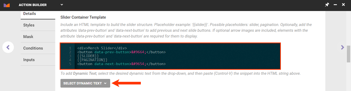
- Add slide navigation buttons by adding the attributes
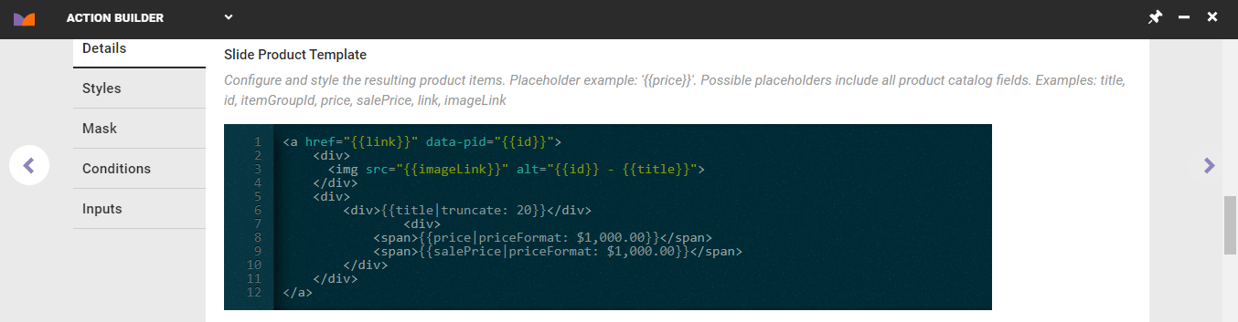
- Optionally, customize the HTML code that builds the product slides in the Slide Product Template editor. See Modifying the Slide Product Template in this documentation for more information.
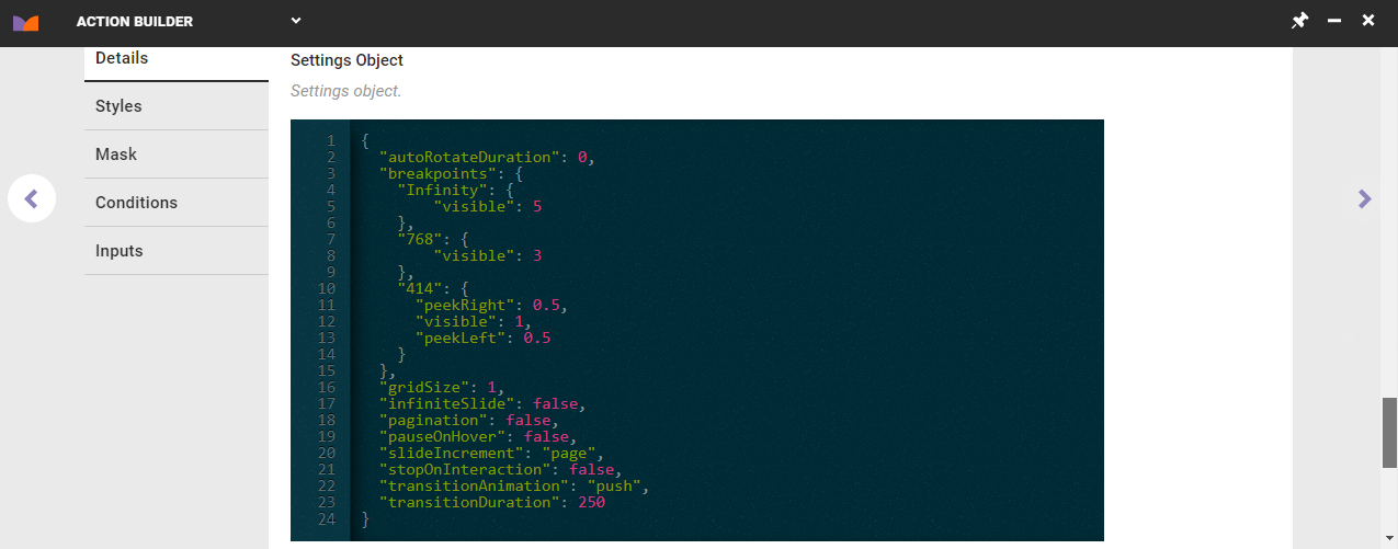
- Optionally, customize the slide visibility options in the Settings Object CSS editor. See Modifying the Slide Visibility Template in this documentation for more information.
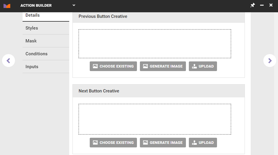
- Add an image file to Previous Button Creative and to Next Button Creative, respectively, to be used for the slider navigation buttons.
- Click CHOOSE EXISTING to select an image from Content Manager.
- Click GENERATE IMAGE to generate an image placeholder.
- Click UPLOAD to select an image file on your computer or other external location and then upload it to the platform.
Click the forward arrow on the right-hand side of the Action Builder panel if you are ready to name and save the action. Click another tab on the left-hand side of the panel to continue configuring the new action.
Modifying the Slider CSS
Follow these steps to optionally modify the slider's CSS.
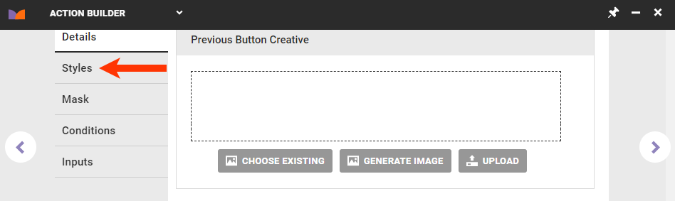
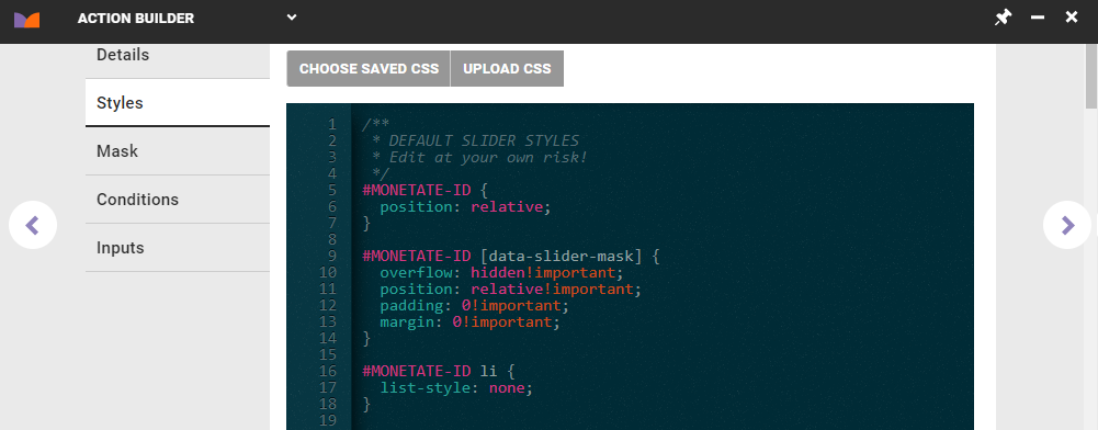
- Click the Styles tab.
- Modify the CSS in the template. Ensure you use the placeholder
#MONETATE-IDas the selector for the action's wrapper ID.- Click CHOOSE SAVED CSS to select CSS already uploaded to the platform.
- Click UPLOAD CSS to select a file containing CSS on your computer or other external location and then upload it to the platform.
- Manually edit the CSS in the code editor.
Click the forward arrow on the right-hand side of the Action Builder panel if you're ready to name and save the action. Click another tab on the left-hand side of the panel to continue configuring the new action.
Applying Content Masking
Content masking hides an element or holds an element on a page until after Monetate's actions complete, which thus allows all site elements to appear at the same time. The Mask tab contains the settings for applying a content mask to the action you're creating.
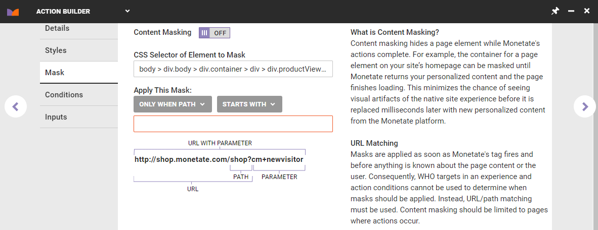
See Content Masking for more information on the circumstances for applying content masking and how to configure it.
Click the forward arrow on the right-hand side of the Action Builder panel if you're ready to name and save the action. Click another tab on the left-hand side of the panel to continue configuring the new action.
Adding Action Conditions
Follow these steps to optionally apply conditions that determine the circumstances that trigger the action you're creating.
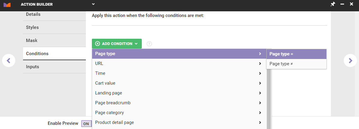
- Click the Conditions tab.
- Click ADD CONDITION, select a category, and then select an operator for the specific category option. See Action Conditions for more information.
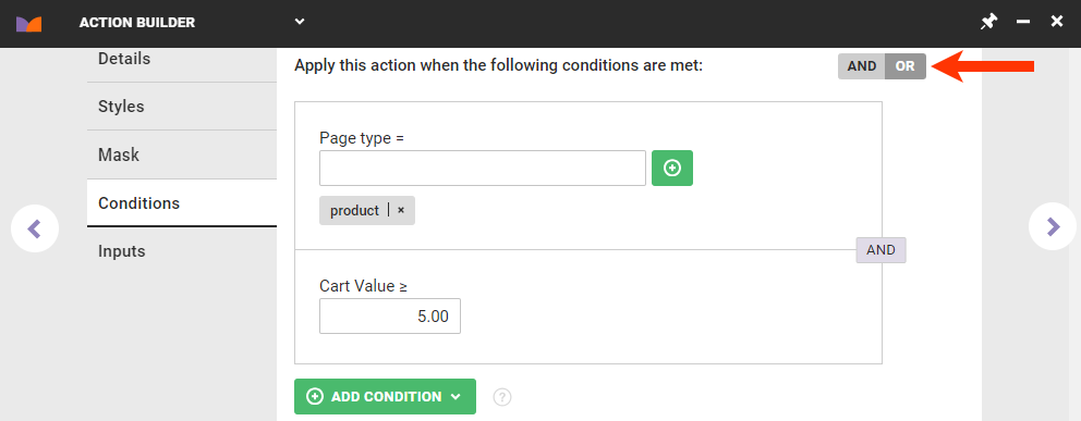
- Repeat these steps if you need to create additional action conditions, and then toggle the logic switch to OR if you want the action to fire only if one of the conditions is met. See How Action Conditions Work Together in Action Conditions for more information.
Click the forward arrow on the right-hand side of the Action Builder panel if you're ready to name and save the action. Click another tab on the left-hand side of the panel to continue configuring the new action.
Enabling Action Inputs
The options on the Inputs tab determine which settings are available when the action that you're creating is added to an experience. All options are enabled by default.
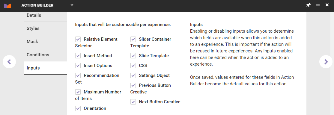
For example, if you want to be able to select which recommendation strategy or slotted recommendation that the action uses each time it's added to an experience, then you must ensure that you enable Recommendation Set.
The options on the tab correspond to fields, settings, and code that you configured on the Details tab and the Styles tab. If you disable, or uncheck, any option on the Inputs tab and then finish creating the action, then however you configured that option's corresponding setting on the Details tab or the Styles tab becomes fixed, and a user cannot change it when configuring the action in an experience.
Click the forward arrow on the right-hand side of the Action Builder panel if you're ready to name and save the action. Click another tab on the left-hand side of the panel to continue configuring the new action.
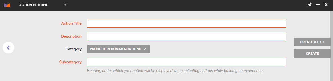
Saving the Action
Clicking the forward arrow when you're on any of the tabs takes you to the final step of creating the action. Follow these steps to complete the action and save it.
- Input a name into Action Title.
- Input a brief summary of the action's key configurations into Description.
- Input into Subcategory the heading under which you want the action listed when it appears on the Product Recommendations panel of an experience's WHAT settings.
- Click CREATE & EXIT.
See Test an Action for instructions to deploy the action you built on your site to ensure it works as you expect.
Modifying the Slide Product Template
You can modify the slide product template using placeholders that contain valid values, such as {{price}}. In addition to price, possible placeholder values include all product catalog attributes, including title, id, itemGroupId, salePrice, link, and imageLink.
You can also modify the slide product template with these code snippets:
truncate— Sets the maximum number of characters of the returned data that appear before the rest is truncated{{title|truncate: 20}}priceFormat— Formats a price based on a template of 1,000; supports currency symbols before or after the price, comma separators, and infinite decimal places to accommodate such prices points as EUR 1.000,00{{price|priceFormat: $1,000.00}}appendParam— Adds parameters to a URL; added with a question mark (?) if the URL has no existing parameters or added with an ampersand (&) after the URL's existing parameters{{link|appendParam: source=monetate}}{{link|appendParam: source=monetate&experience=intelligentRecommendations}}
Modifying the Slide Visibility Template
You can use a variety of JSON code snippets to modify the Settings object template, which determines various factors for the movement of slides within the slider.
Use the autoRotateDuration snippet to determine how long the slider pauses in milliseconds before automatically advancing to the next slide display. The default value is 0, which disables autorotation.
The breakpoints snippet determines the breakpoints and how many slides are visible or partially visible. Consider this example:
 "breakpoints": {
    "Infinity": {
        "visible": 5
    },
    "768": {
        "visible": 3
    },
    "414": {
      "peekRight": 0.5,
      "visible": 1,
      "peekLeft": 0.5
    }
  },
This code results in the following behavior:
- When displayed on a screen up to 414 pixels wide, one full slide appears with half a slide to the left and to the right of it is each partially displayed
- When displayed on a screen sizes 414–768 pixels, three full slides appear
- When displayed on a screen 768 pixels wide or greater (established by
Infinity), five full slides appear
Use gridSize to enable a grid layout. The default value is 1. For example, a value of 3 sets three rows for a horizontal slider or three columns for a vertical slider.
The infiniteSlide snippet determines if the slider scrolls infinitely or stops at the end. The default value is false.
The pagination snippet determines if page navigation buttons appear. The value options are as follows:
none— No pagination appears; default settingdots— Displays a single dot for each slidedots-page— Displays a dot for each page of slides (for example, three dots appear in a slider with 18 total slides that appear six slides to a page)thumbnails— Creates a thumbnail version of each slide
Use pauseOnHover to determine if the slider pauses autorotation on slide hover if autoRotateDuration is set. The default value is false.
The slideIncrement snippet determines if the slider transitions by page or by single slide. The value options are as follows:
page— Slider transitions by page of slides; default settingsingle— Slider transitions one single slide at a time
Use stopOnInteration to determine if the slider stops autorotating when the customer interacts with it if autoRotateDuration is set. The default value is false.
Use transitionAnimation to set the animation style for transitioning between slides. The value options are as follows:
push— A slide moves in from the side for a horizontal slider and from the bottom for a vertical slider; default settingfade— The current slide fades out and the new one fades innone— No animation is used
Use transitionDuration to determine how long the slide transition animation lasts in milliseconds. The default value is 250.